Enhancing Trust in WebMD’s Symptom Checker
Project Overview
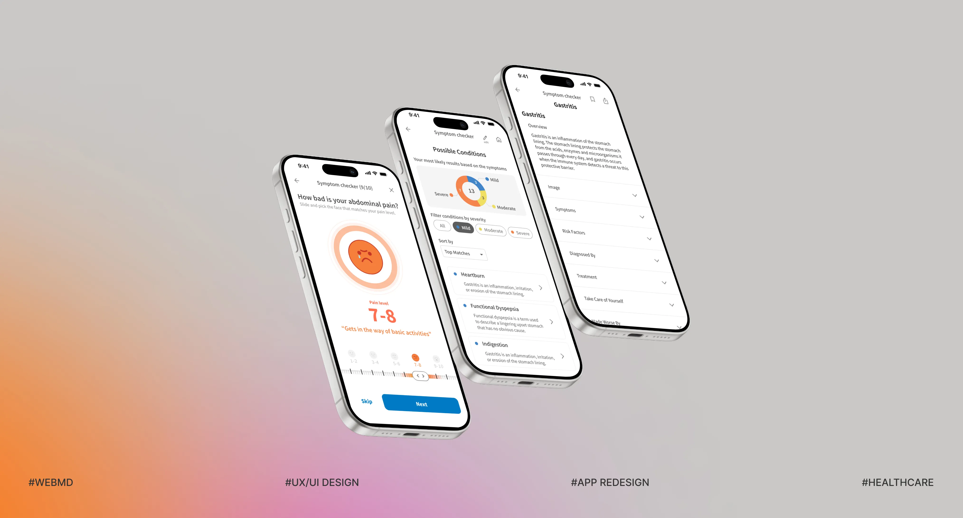
WebMD’s Symptom Checker provides users with possible conditions based on their symptoms. However, users often face information overwhelming and irrelevant results. This project aims to enhance users' trust in the experience by improving clarity, relevance, and decision support.
- Project type
- Team Project (70%)
- Duration
- 7 Weeks
- Role
- UX/UI Design, User Research, Prototyping, Usability Test
- Tools
- Figma, FigJam
Background
Why Is Searching for Health Information So Stressful?
Can a Mild Symptom Like a Headache Trigger Unnecessary Anxiety?
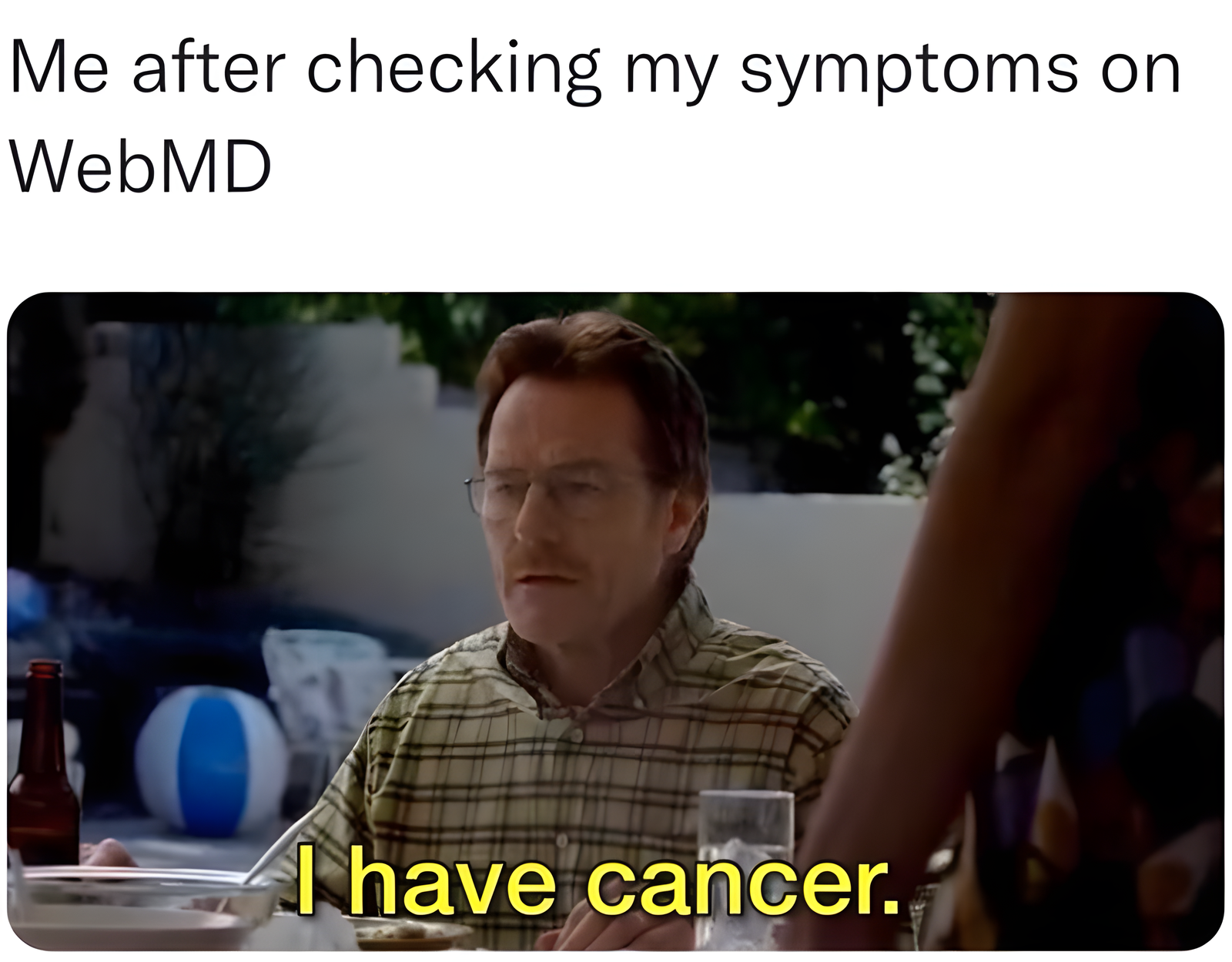
When people feel unwell, they often search online before seeing a doctor, and tools like WebMD can increase anxiety when information feels unclear or overwhelming. This project focuses on improving information structure and interaction flow to help users feel more confident when making health decisions.
Main Features
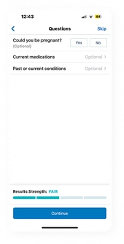
More Specific Symptom Questions
The current flow asked only five short, general questions, making results feel inaccurate and untrustworthy. I redesigned it with targeted, context-aware questions — leading to more accurate results and stronger user trust.
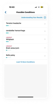
Data-Informed Results
Current results often prioritized unrelated conditions, which reduced user trust. I redesigned the logic using user response data to improve relevance and clarity. Now, users get results that are easier to trust and understand.
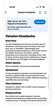
Simplifying Medical Information
Users had to scan through 800+ characters of dense text, making it hard to find key information. I redesigned the layout into concise accordions with 180 characters per section. Now, content is easier to scan and understand.
Discover
WebMD’s Symptom Checker Provides a Lot of Health Information. But Are Users Able to Use It Effectively?
Secondary Research
Why WebMD Fails to Support Confident Decisions: Too Much Information, Too Few Symptom Questions
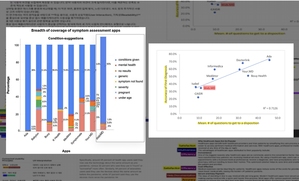
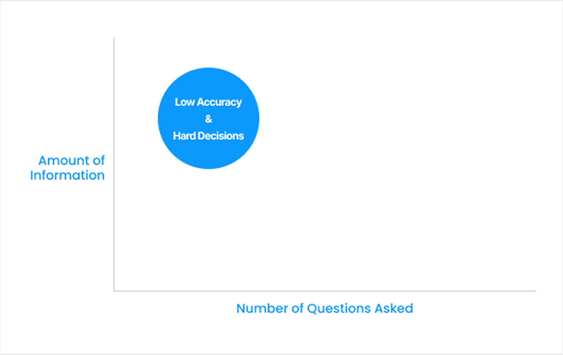
We reviewed 23 academic papers on digital health decision-making behavior related to WebMD to understand why users struggle to make decisions with WebMD. We assumed that too much information with too few questions leads to lower accuracy and more difficult decision-making.
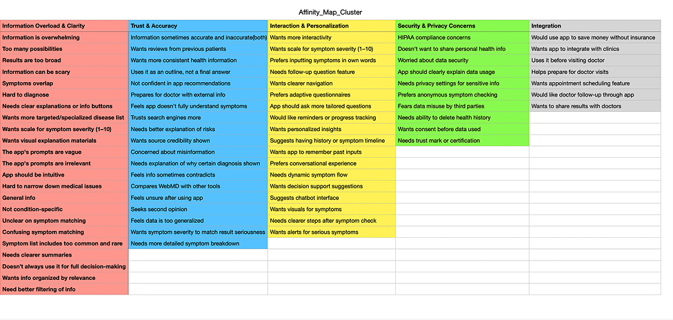
App Review Analysis
Recurring Confusion and Low Trust in Results
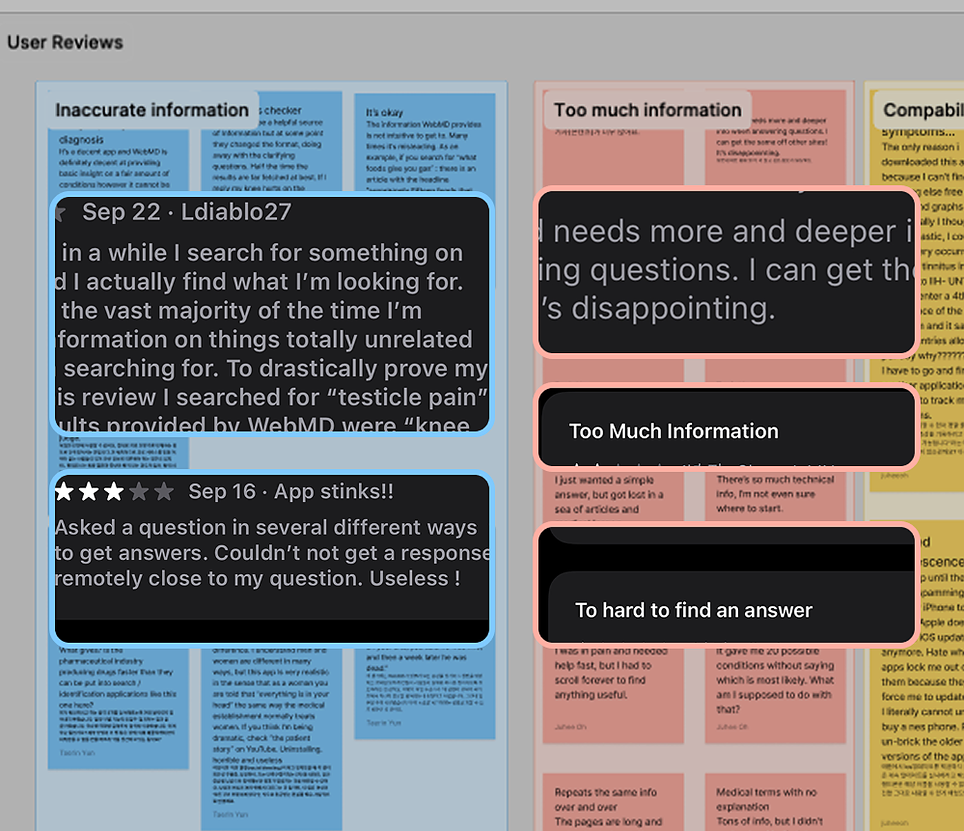
We conducted affinity mapping on user reviews and identified recurring frustration with result accuracy, as well as difficulty determining what actions to take based on the information provided.
Survey
Trust Issues Caused by Unclear Health Information
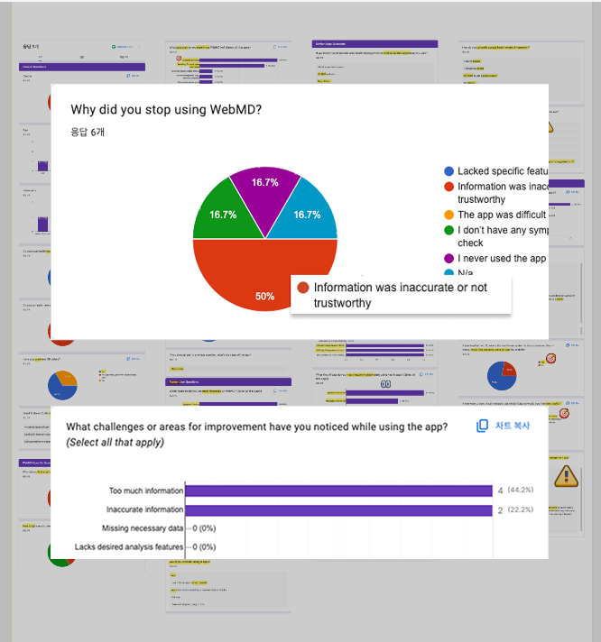
We surveyed 9 participants to understand key pain points when using WebMD’s Symptom Checker. More than half reported that inaccurate and overwhelming information made it difficult to find what they actually need.
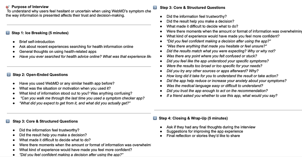
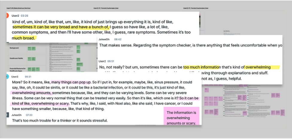
1:1 Depth Interview
Low Confidence Leads to Inaction
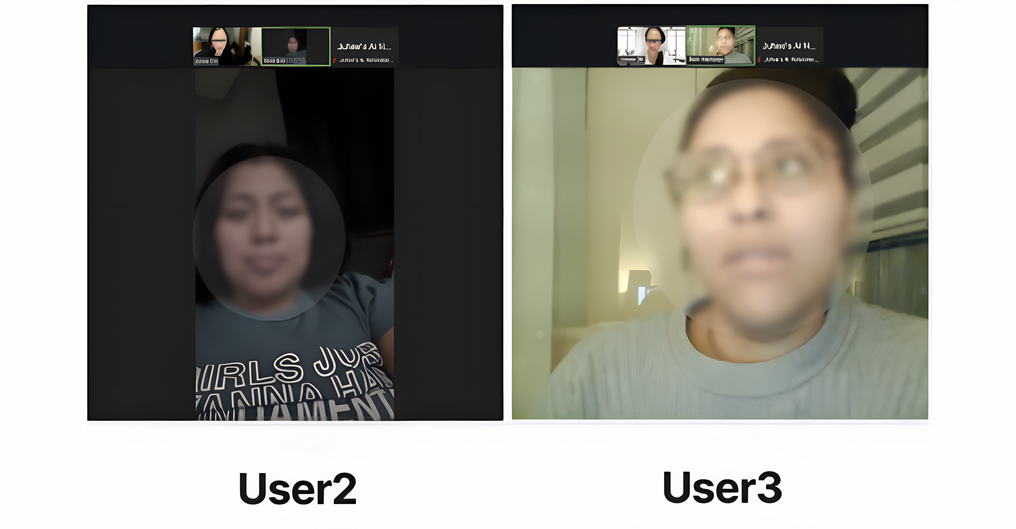
We conducted semi-structured interviews with 3 participants to understand how low trust in symptom checker results affects user behavior. Even after receiving results, users often doubted their reliability and feared making the wrong decision—making low confidence a key barrier to taking action.
Define
Users Struggle to Trust Health Information Which Prevents Them From Taking Action
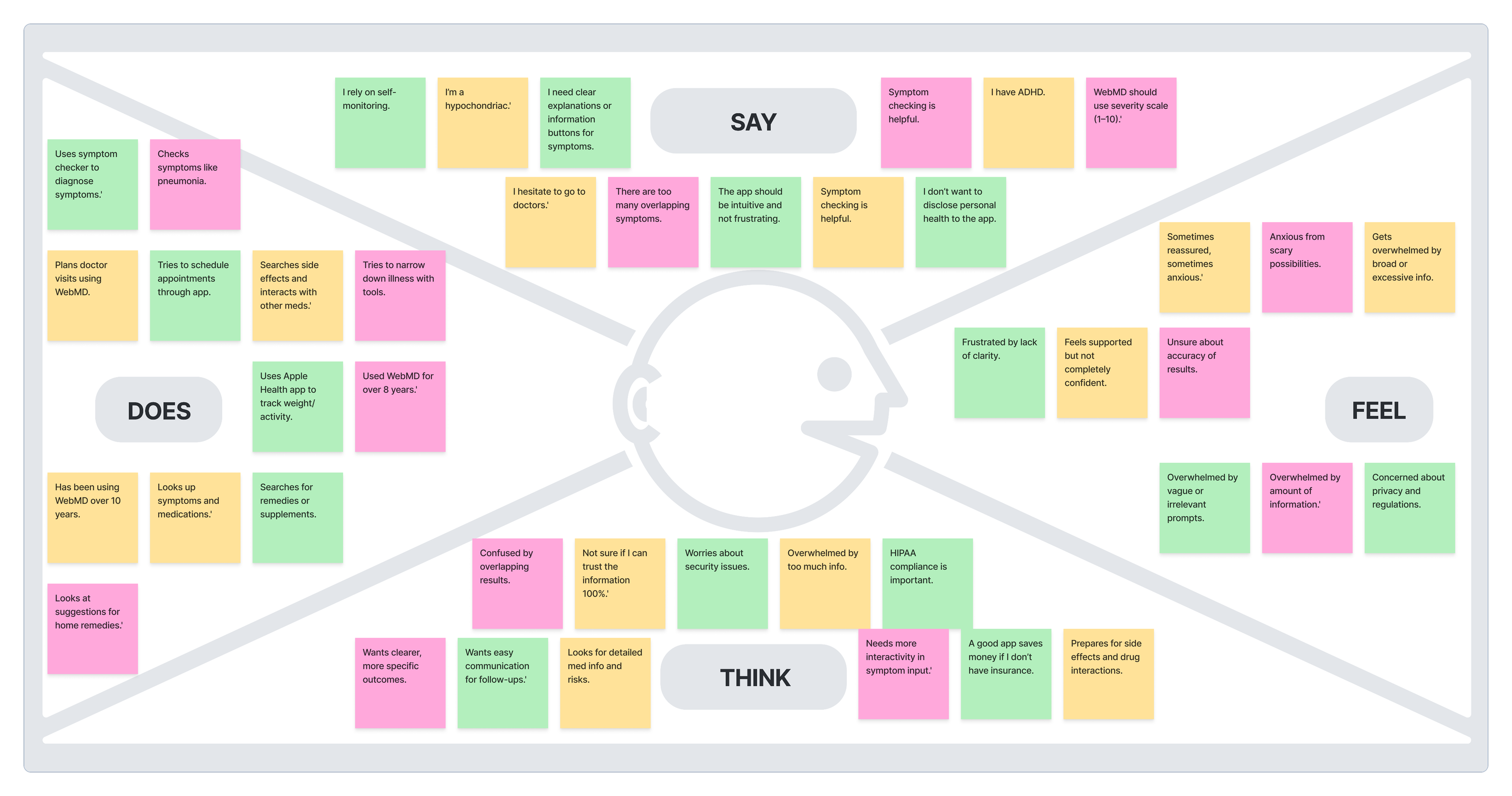
Empathy Map
Understanding Users’ Emotions, Needs, and Behaviors
We created empathy maps to better understand users’ experiences with WebMD’s Symptom Checker. This helped us identify key emotions (overwhelm, confusion), core needs (clearer information, trustworthy results), and behavioral patterns when navigating health information.
Persona and User Journey Map
Defining Target Users and Key Experience Gaps
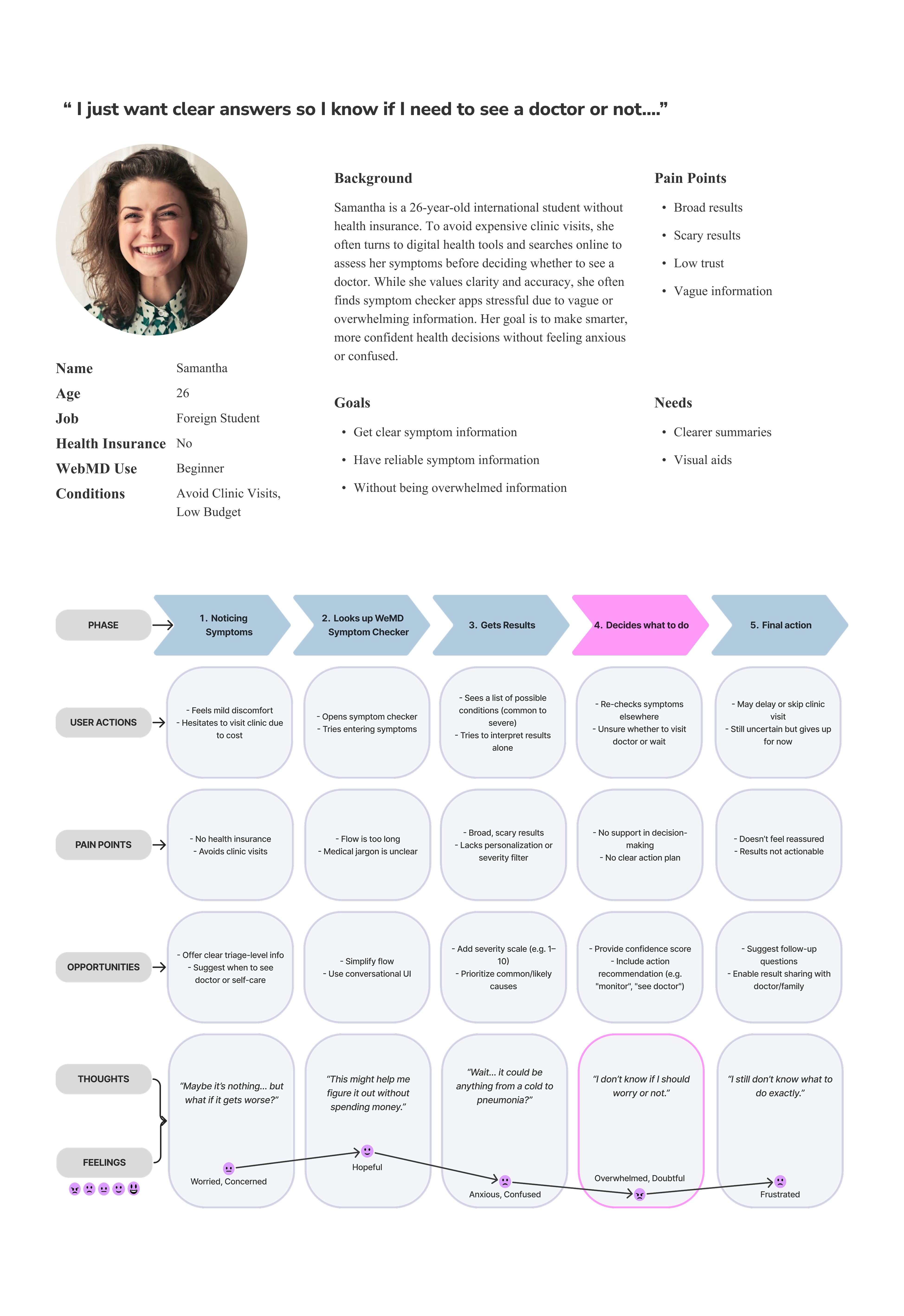
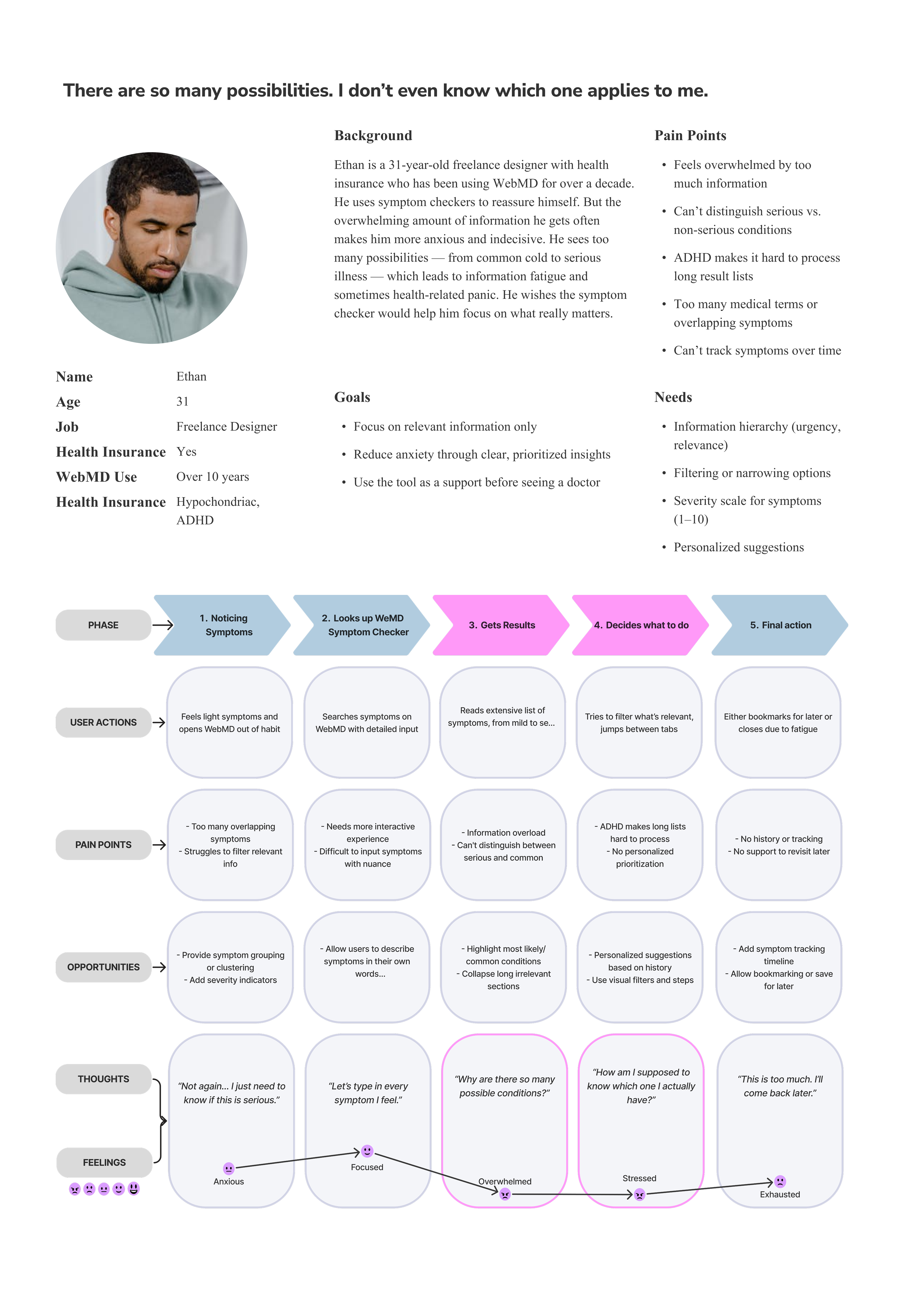
We defined two personas: one representing the core WebMD user that reflects the majority of users, and the other representing an extreme user who experiences the strongest impact of unclear information.
The first persona represents a common WebMD user—a student without health insurance who relies on symptom checkers for reassurance but struggles to trust unclear results and take confident action.
The second persona represents an extreme case—an experienced user with ADHD who is heavily impacted by WebMD’s text-heavy information, leading to overwhelm and difficulty making decisions.
Develop
How Might We Help Users Feel Confident and Take Action Based on Symptom Checker Results?
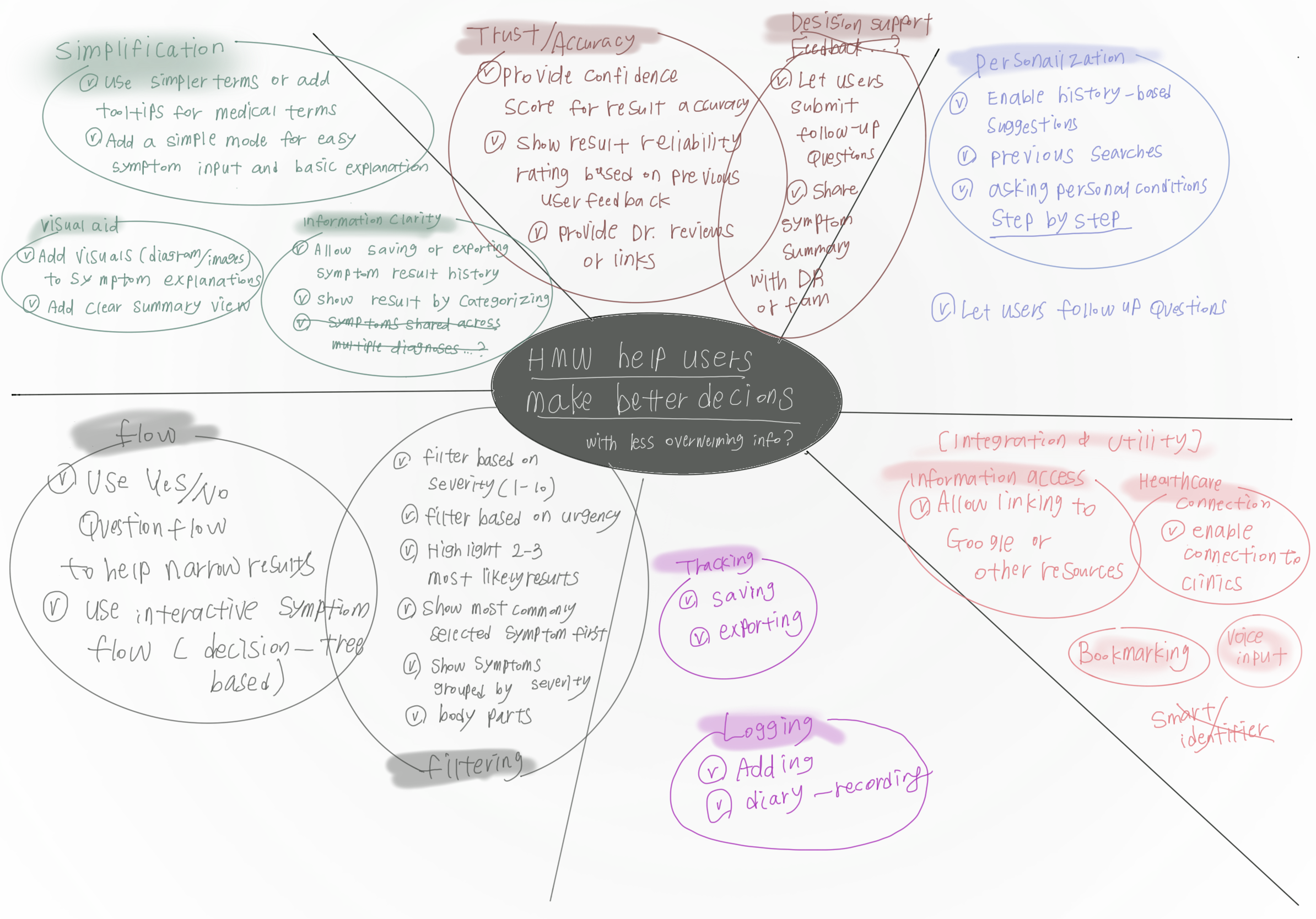
Brainstorming
Exploring Solution Directions to Reduce Overload and Support Confident Decisions
Through ideation, we generated 30+ ideas focused on improving clarity and supporting user confidence. Key directions included simplification, trust-building, personalization, and flow continuity.
2×2 Prioritization Matrix
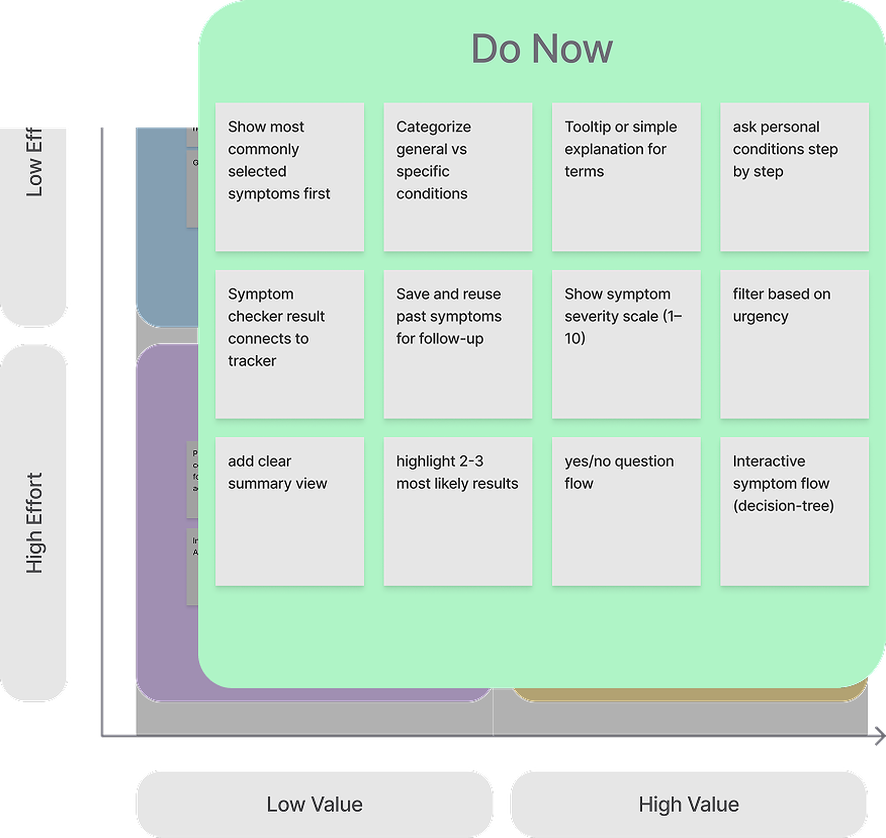
Defining an MVP by Prioritizing Accuracy to Restore Trust
I prioritized features based on how effectively they could restore user trust and confidence. Accuracy was the main focus, as improving accuracy was the fastest way to help users feel confident enough to take action.
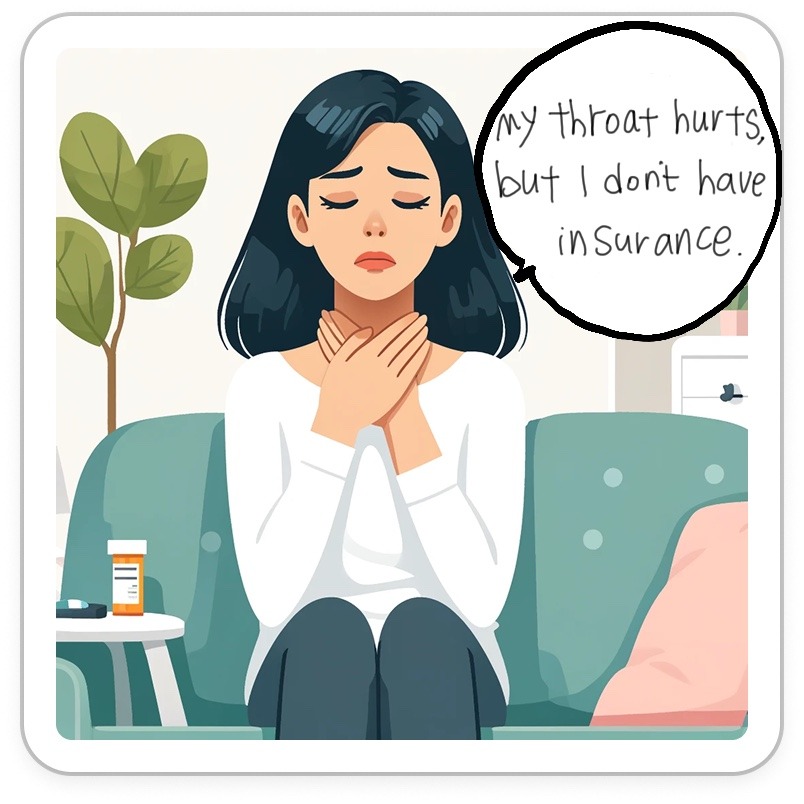
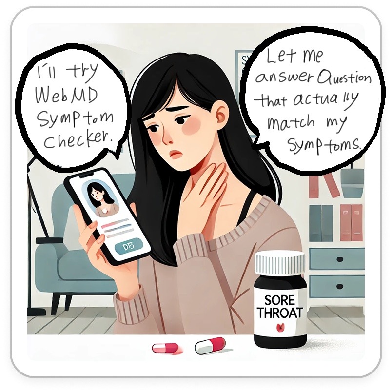
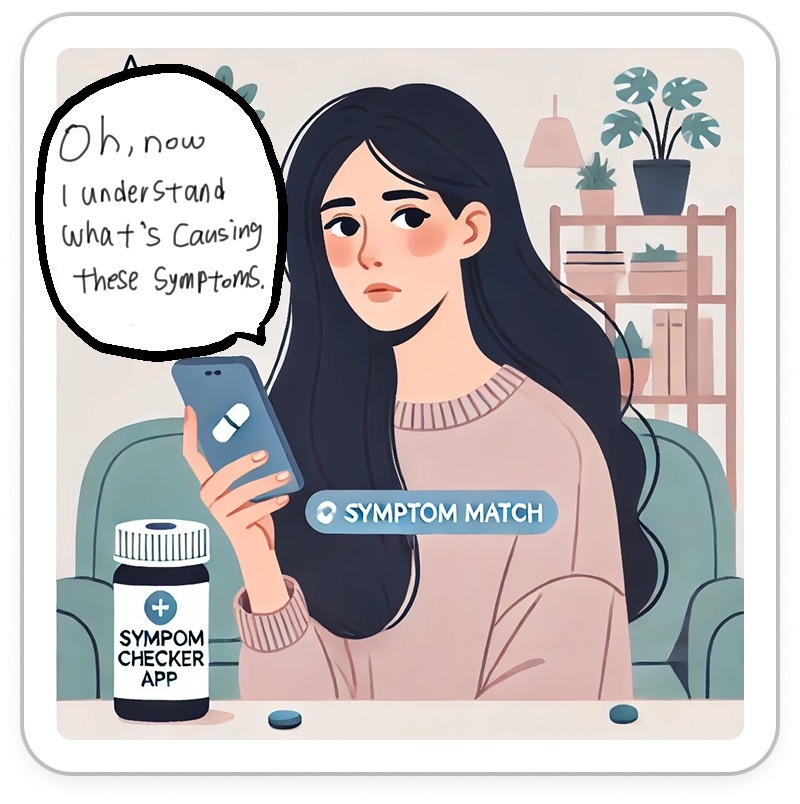
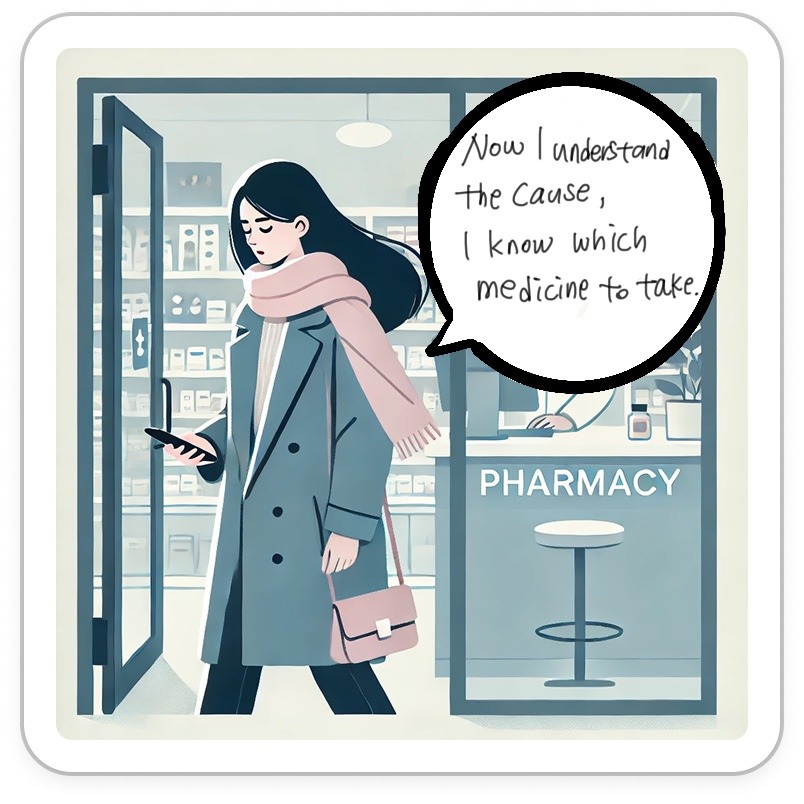
Storyboard
What Changes When Users Feel Reassured Instead of Confused?
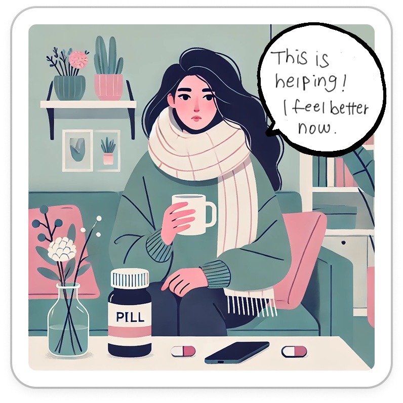
This storyboard illustrates how a clearer, more supportive symptom checker experience helps users better understand their symptoms, trust the results, and make more confident health decisions.
User Flow
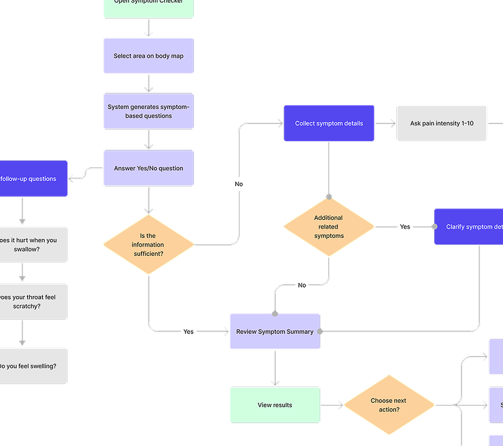
Don’t Overwhelm Users. Help Users Make Better Health Decisions
This user flow shows how the redesigned symptom checker guides users step by step, helping them clarify symptoms, understand results more easily, and make more confident health decisions without feeling anxious or confused.
Sketches
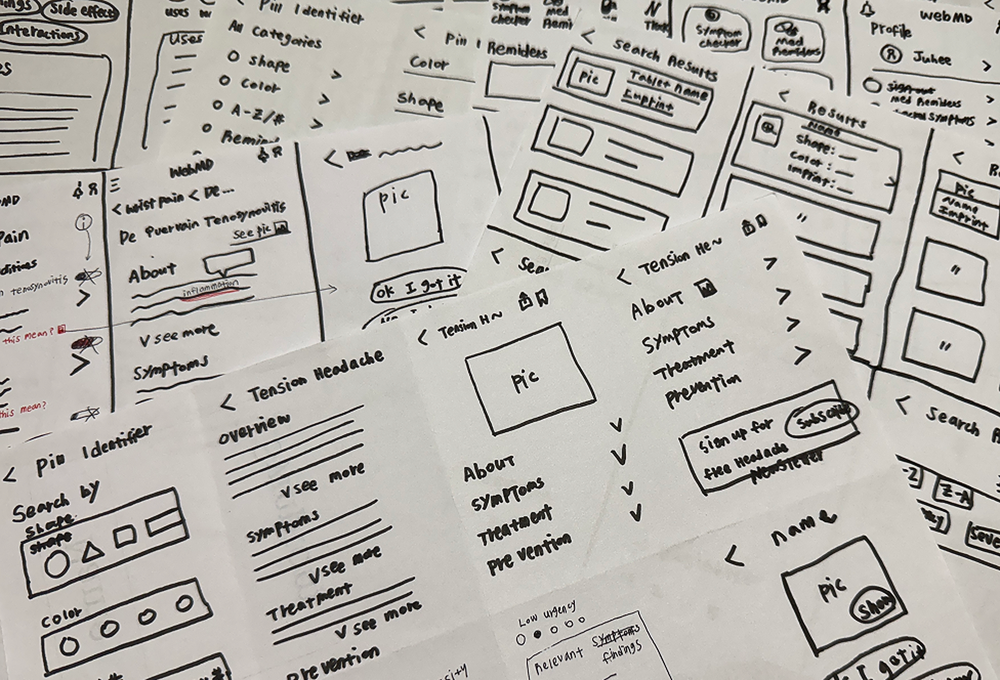
Sharing Ideas Through Rapid Sketching
After research, we used quick sketches to explore key ideas and align on feature direction. This helped us clarify concepts early and communicate efficiently within the team.
Deliver
Can Users Make More Confident Health Decisions?
Wireframe
Focusing on Clarity and Decision Support
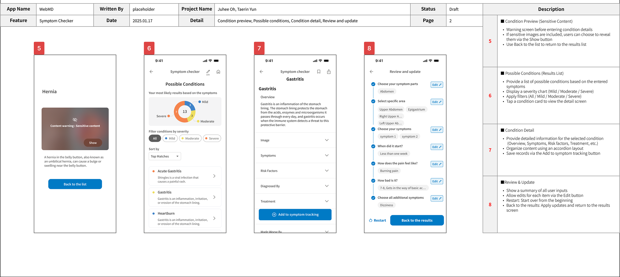
I used low-fidelity wireframes to test whether the structure itself could reduce confusion and support clearer decision-making.
Design System
Designing a Visual System That Reinforces Trust
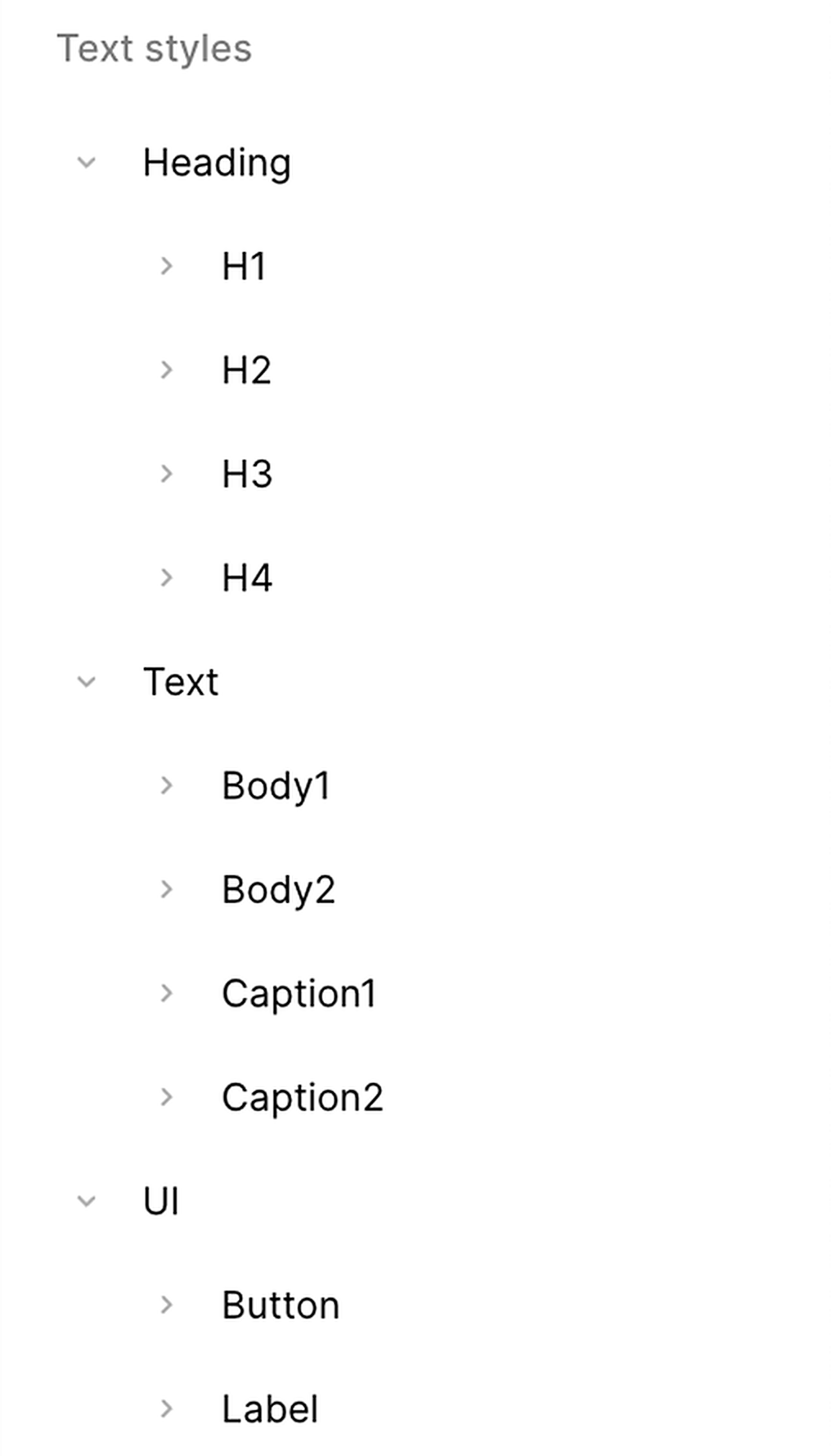
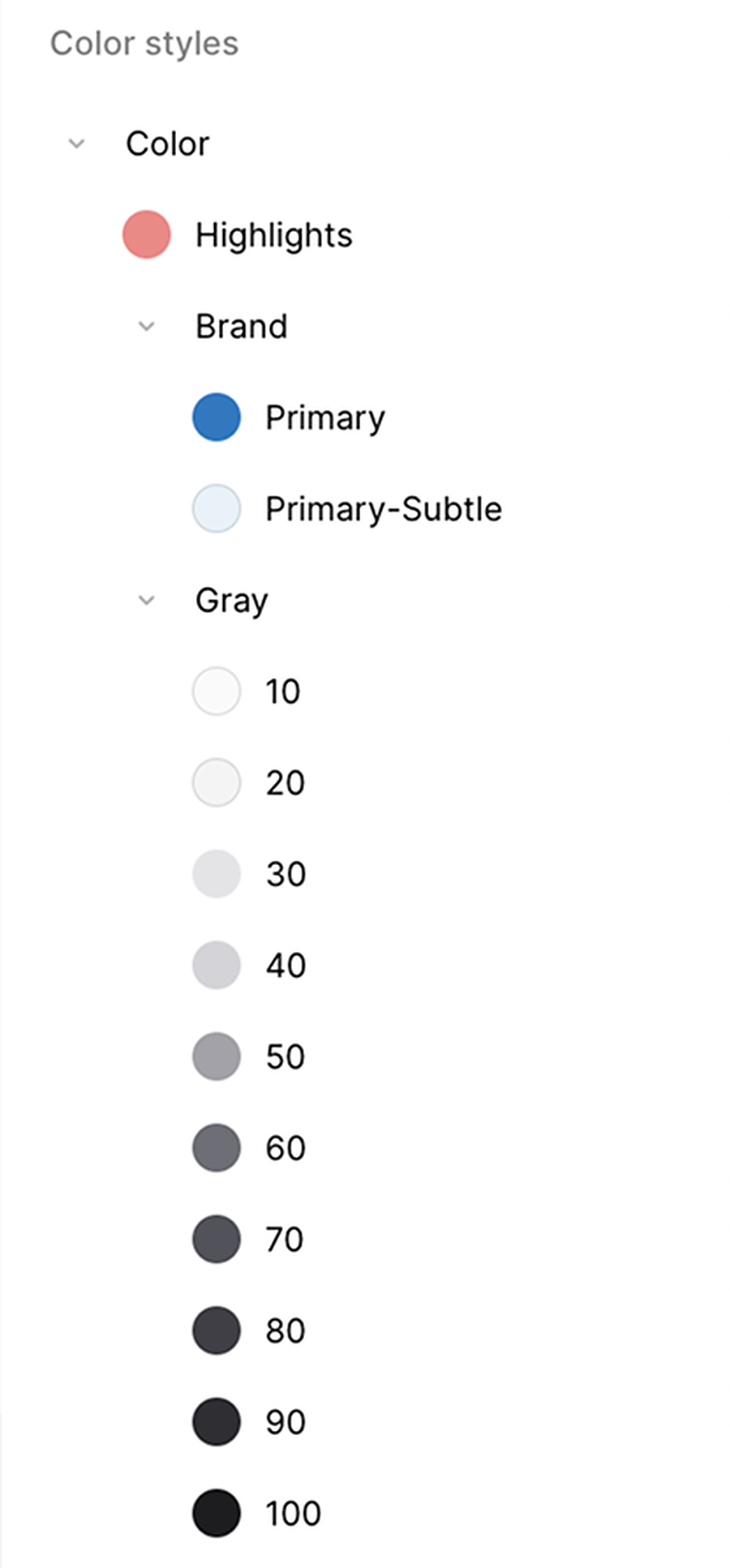
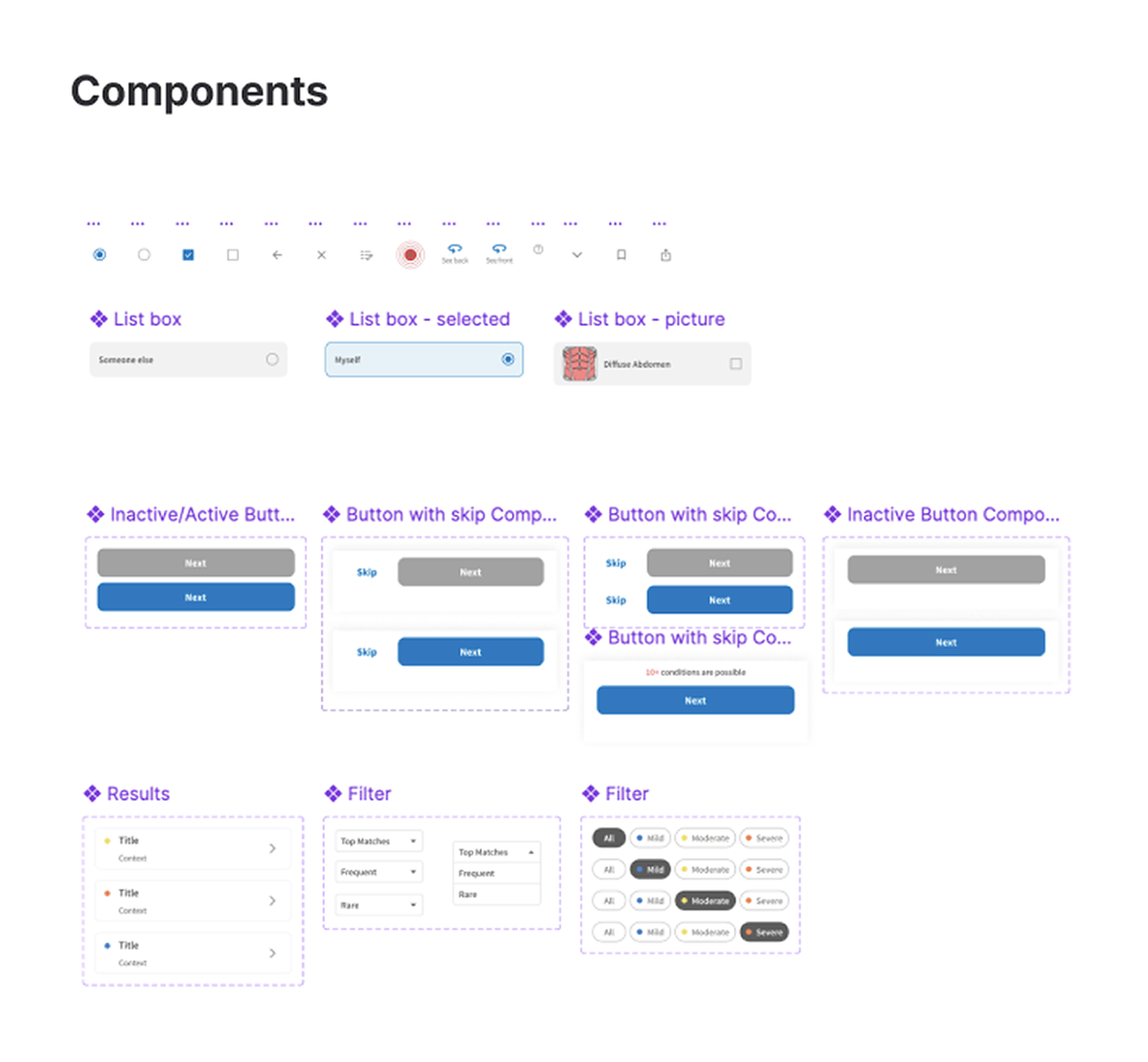
I defined a design system focused on clear hierarchy to prevent information overload, calm typography and spacing to reduce perceived pressure, and consistent components to make the experience feel predictable and trustworthy.
Final Designs
The Solution: Trust and Clarity in Health Decisions
Final Design 1/4
Progressive Questions
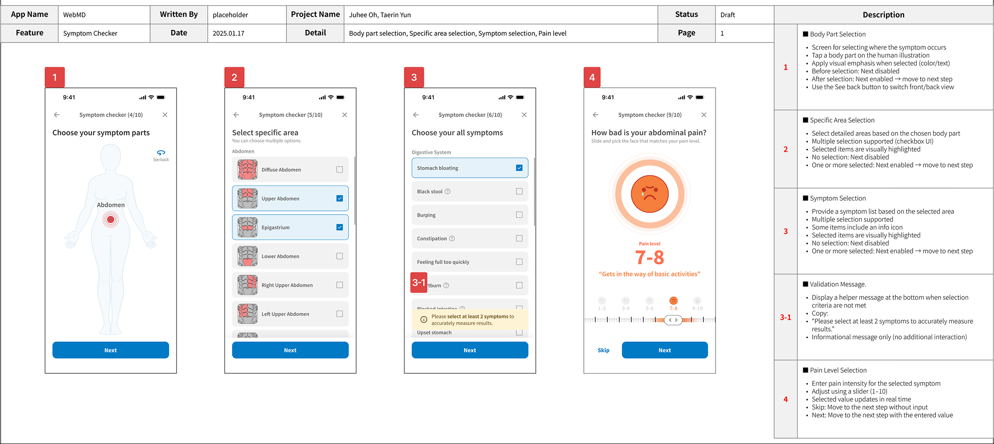
Guides users through step-by-step, context-aware questions. Users can enter details such as symptom duration, pain type, and pain level, and select additional symptoms they might otherwise miss.
Final Design 2/4
Prioritized Results
Visualizes results based on user responses to help users quickly understand possible conditions. Users can filter conditions by severity and sort results by top matches, frequency, or rarity.
Final Design 3/4
Scannable Medical Content
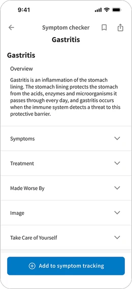
Organizes medical information into clear, accordion sections for easier scanning. Users can choose which sections to view and track symptoms directly from the condition detail page.
Final Design 4/4
Visual Learning Support
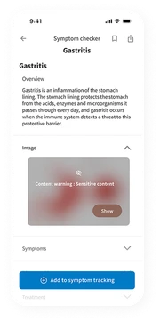
Provides visual references to improve understanding of medical terms, while allowing users to control whether they view sensitive content.
Usability Test
Evaluating Clarity and Confidence in Use
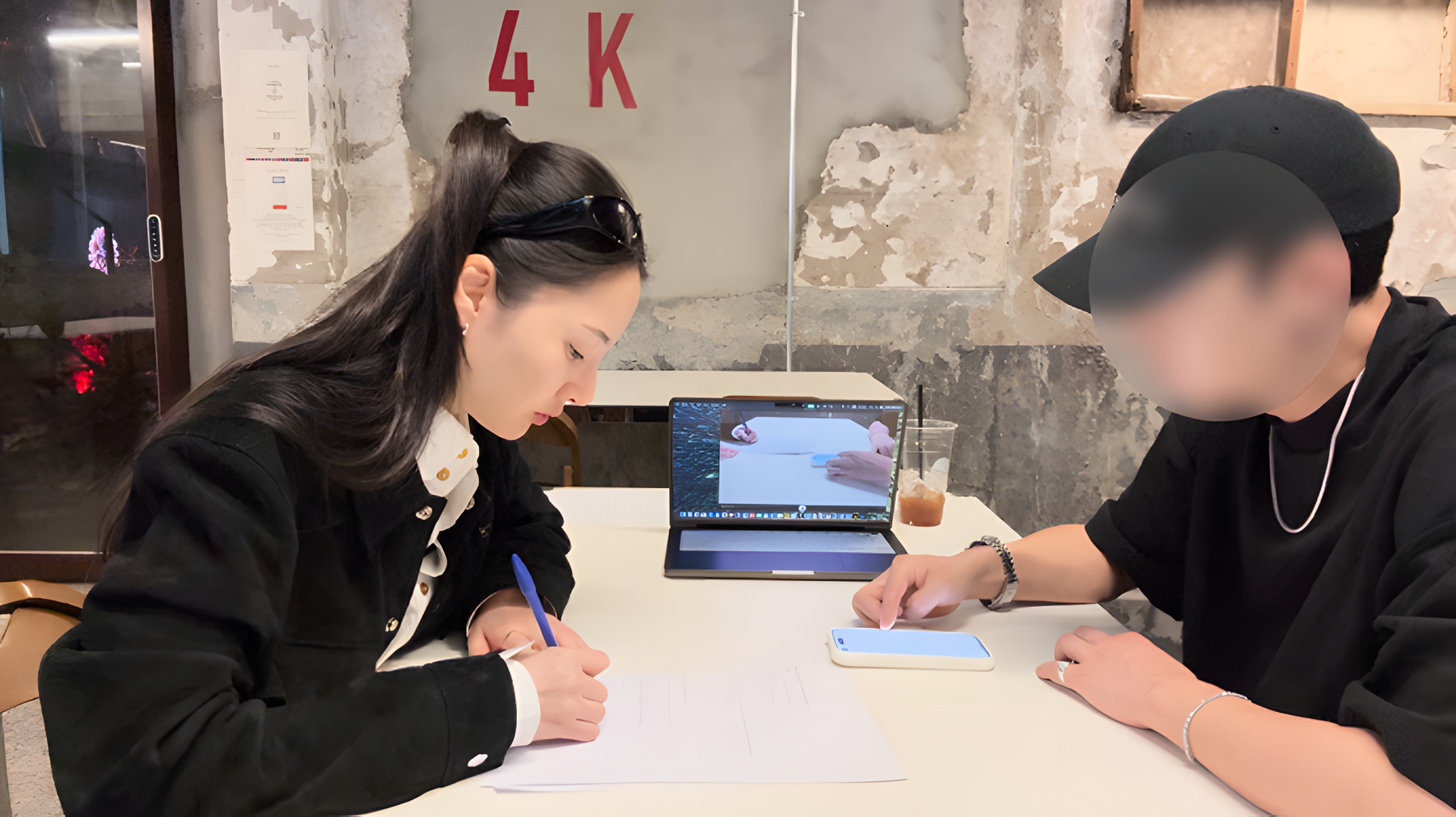
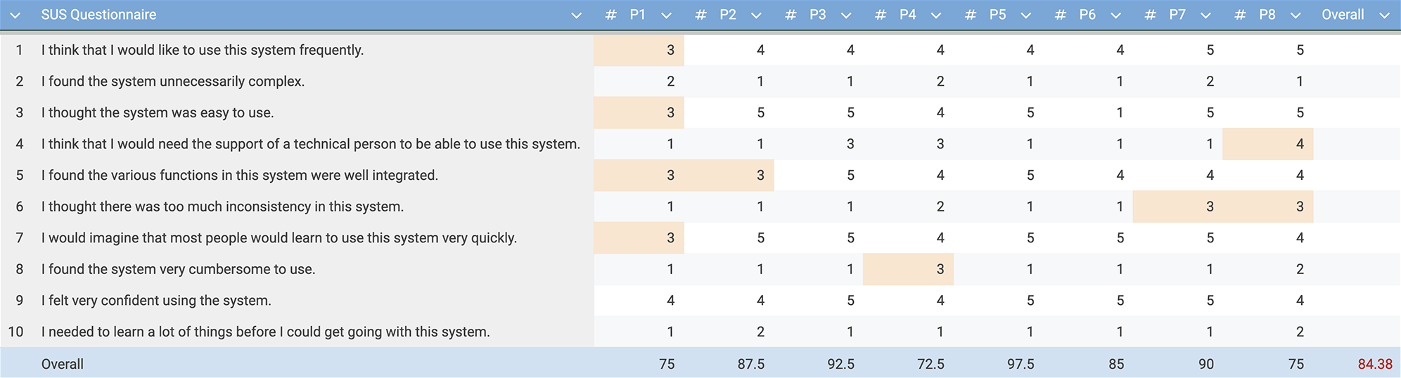
We conducted a usability test with 8 participants across 5 key tasks to observe how users interacted with the redesigned experience in real scenarios. The product achieved an average SUS score of 84.38.
High-scoring participants felt the redesigned flow provided enough clarity to trust the results and decide what to do next. However, lower scores often came from moments when guidance was hard to notice. This suggests that clearer visual cues could reduce hesitation and help users feel more confident.
Iteration
Iterating for Better Clarity and Confidence
Based on usability testing, I identified moments where users hesitated due to unclear guidance and information priority. To address this, I refined the interface by making key messages more visible and reorganizing content to better match user expectations.
Symptom Selection Guidance
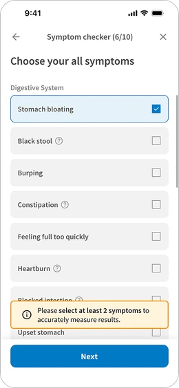
“I didn’t notice the message that says I need to select at least two symptoms.”
Users often missed the minimum symptom requirement, which caused hesitation. To improve visibility, I added visual emphasis using color and borders, making the guidance easier to notice at the right moment.
Medical Information Prioritization
“I’m more curious about how to treat this than seeing an image.”
Users were primarily looking for actionable information. Based on this feedback, I moved treatment-related content higher in the layout so users could quickly find what they cared about most.
Takeaways
What I Focused On
01Information Structure Shapes Health Decisions
I realized that how medical information is structured directly affects users’ understanding, trust, and ability to act. Clear hierarchy, progressive disclosure, and scannable content are not visual choices, but critical design decisions that shape real-world health behavior.
02Designing for Trust, Not Just Accuracy
In healthcare, perceived trust is as important as technical accuracy. Through this project, I learned to design experiences that help users feel confident in the process — by making reasoning visible, prioritization clear, and outcomes understandable.
03Privacy as a Core UX Principle
I realized that in healthcare, privacy is not a feature but a foundation. By designing optional exposure to sensitive content and giving users control over visibility, I learned how UX can respect dignity while still supporting understanding.