WWF: Beyond the First Donation
Project Overview
I reviewed how WWF Korea's website connects conservation content to donations. For four of six animal pages, the donation button led to a general campaign without carrying over the selected animal. I used these findings to reorganize the information architecture and propose a way for supporters to choose, review, and manage donations across the causes they care about. I built the key screens as an interactive web prototype.
- Project type
- Proposal for WWF Korea
- Duration
- 2 Weeks
- Role
- Research, Information Architecture, UI Design
- Tools
- Claude Code, Codex
Background
Can supporters see what their donations support?
WWF Korea reported total revenue of KRW 10.462 billion in FY2025, up 37% from the previous year. It was also running participation channels such as the Click to Give app, Earth Hour, and the Wonderple campaign. My research focused on what happens after someone donates. On the public website, it was difficult to find a flow for reviewing their chosen donations alongside related conservation work and adjusting their choices.
The goal was to propose a way for supporters to choose and keep managing the causes they support. The prototype screens are in Korean, matching the proposed service.
Key Features
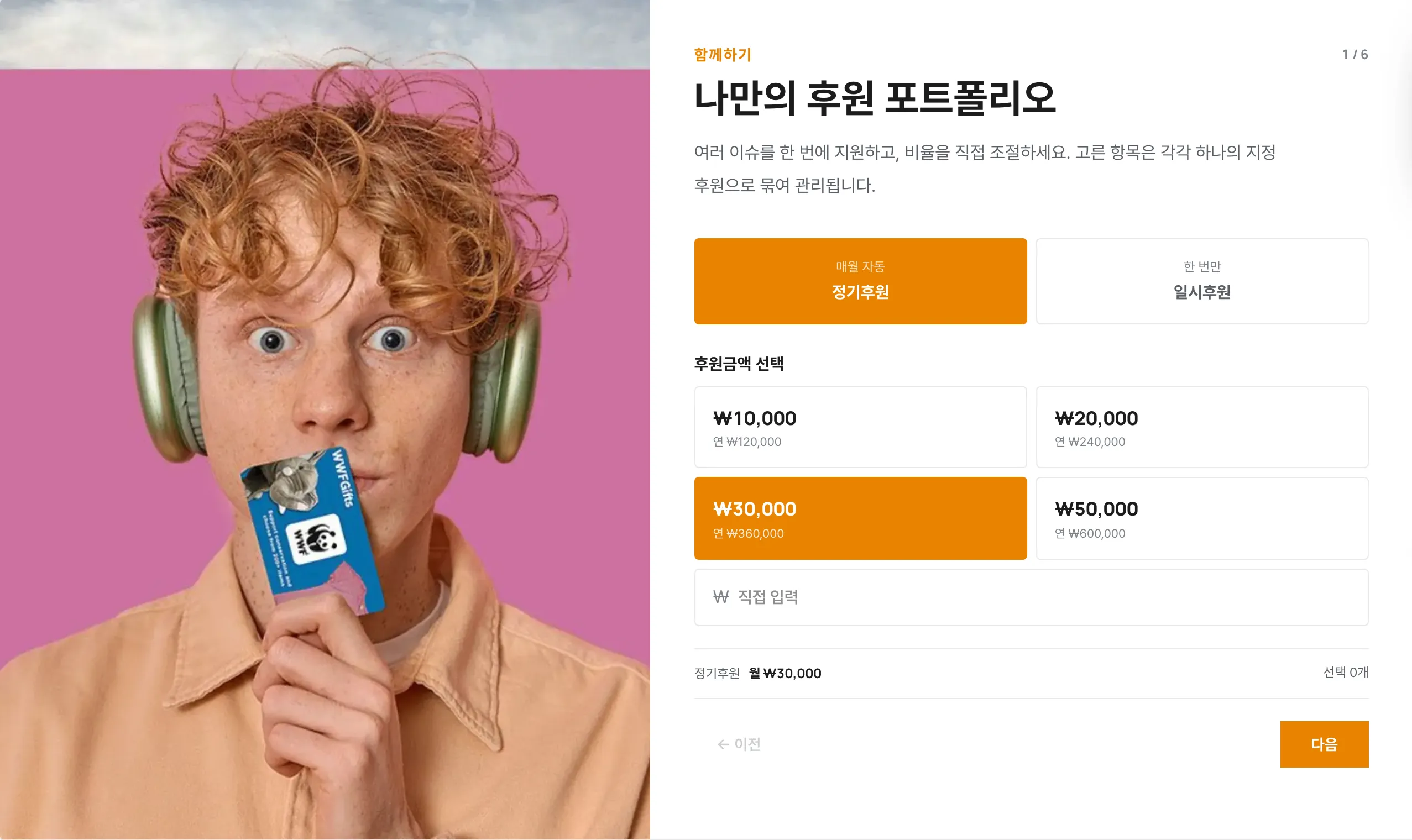
Choose what to protect and build a donation mix
I created a flow for choosing causes and animals, then adjusting the amount for each. Each item was proposed as a separate designated donation, with the interface showing the full mix and each item’s share.
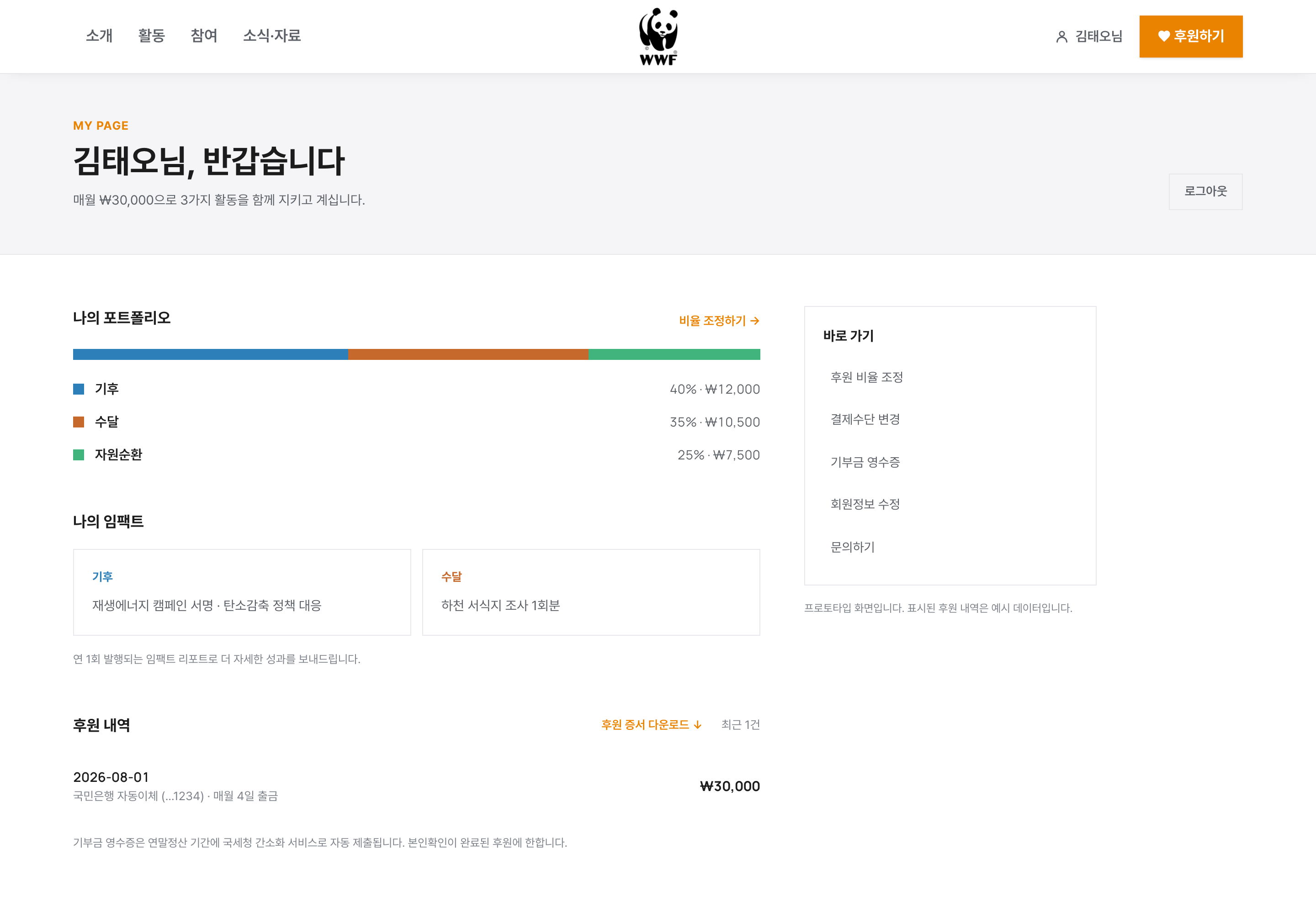
A place to return, review, and adjust
I designed the account page as a starting point for reviewing donations alongside related conservation work and changing the selected causes and amounts. Donation history and certificate downloads sit in the same place, with the aim of giving supporters a reason to return after donating.
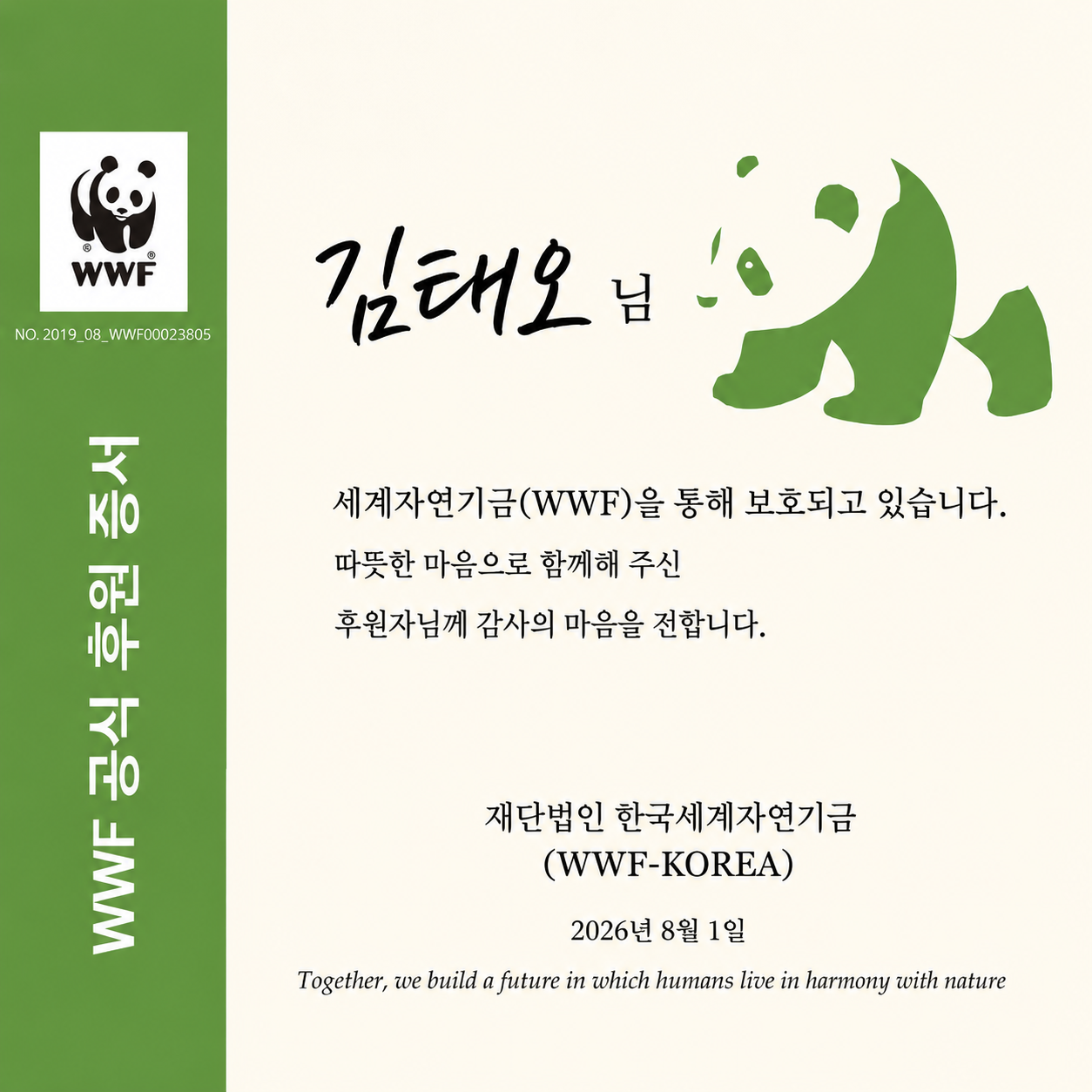
Share the choice, not the amount
To reduce the pressure of disclosing a donation amount, I put the selected causes on the certificate instead. Its sharing link was designed to open the donation flow with the same mix selected.
Discover
Can people donate to exactly what they came to support?
Public-source Research
Grounding the research in published figures
I used annual reports, press releases, and the website to map the organization’s income, spending, and digital assets. Individual donations accounted for 50% of income, and the annual report already listed a membership program and initiatives to encourage return visits as future plans. I shaped the proposal around making those stated plans concrete.
Awareness
- Multiple channels and campaigns
Entry points
- New routes such as Click to Give
First donation
- Separate flows for each campaign
- Handoff to an external payment page
After donating
- Hard to review choices alongside activities
- Donation adjustment flow needs work
Website Audit
Following the donation journey, link by link
I defined the audit scope to ground the proposal in the live site. I collected 51 official pages listed in sitemap.xml and classified 219 homepage links by destination. I checked the responses and content behind navigation and footer links, then followed donation buttons on animal pages through to the payment screen.
Sitemap audit
- 51 official pages
- Baseline inventory
Homepage links
- 219 links
- Classified by destination
Navigation and footer
- Checked 25 menu items
- Response status and content
Donation paths
- Six animal pages → donation buttons
- Checked payment destinations
Finding 1
Click Support Sea Turtles. The sea turtle is missing.
If someone reads about otters and clicks the donation button, is the otter already selected on the next screen? I checked this for all six animals. Only two passed. The other four led to the same general campaign, regardless of the animal named on the button.
This made preserving the selected animal from the detail page through to the donation screen a clear design task.
Selection preserved: 2
- Otter
- Snow leopard
General campaign: 4
- Spotted seal
- Sea turtle
- Black woodpecker
- Asiatic black bear
Finding 2
The animal pages already existed
Detail pages for all six animals and a link format for opening specific donation campaigns were already in place. Reaching an animal page required two levels of navigation. The homepage also retained 124 links to an old bulletin board, even though the content had moved to new addresses.
I prioritized making existing content easier to find and fixing its connections. I proposed moving animal pages higher in the navigation and updating the old bulletin board links to point to the relocated content.
Define
The same work appeared under different names.
Taxonomy Audit
Conservation categories and donation categories did not line up
WWF Global used six areas, the website navigation used four, and the annual report used three. I found three pairs of related categories with different names, such as Biodiversity in the activity menu and Endangered Animal Protection in the donation menu. I saw this mismatch as a barrier to understanding how a chosen donation connects to reported conservation work.
WWF Global
- Climate and energy, oceans, wildlife
- Forests, freshwater, food (6)
Website navigation
- Climate, plastics, biodiversity, and more
- (4 areas + corporate partnerships)
2025 annual report
- Climate, nature conservation, resource circulation (3)
Information Architecture
Carry the choice from conservation content into the donation flow
The guiding principle was to let people choose a cause while reading about it, then carry that choice into the donation flow. I reorganized five top-level menus and 25 submenus into four menus and a Donate button. The annual report’s three-area structure informed the proposal, while the interface used Climate, Resource Circulation, and Biodiversity. I placed the six animals directly under Our Work and moved participation campaigns into Get Involved. I also mapped each of the 25 existing menu items to its proposed location.
About
- Organization and history
- Transparency and people
- Jobs and volunteering together
Our Work
- Climate, resource circulation, biodiversity
- Direct access to six animal pages
- Corporate partnerships
Get Involved
- Surface Anystay
- Earth Hour and Happy Anniversary
- Conservation education and online participation
News and Resources
- News and resources together
- Press coverage, reports, and videos
Donate button
- Individuals, businesses, and schools
- Surface Click to Give
- Donation receipts and inquiries
Nonprofit Constraints
Define the boundaries before adding features
Designing a donation experience meant considering both the evidence behind impact claims and the units in which funds are spent. I created a plain-language glossary covering greenwashing, designated donations, and benefits offered in return for donations, then turned those considerations into design principles for the proposal.
Evidence for impact
- Base actual results on public sources
- Label prototype data separately
Match program units
- Align designated donations with spending units
- Include a Where Most Needed option
No material rewards
- No gifts tied to donation tiers
- Keep giving distinct from buying
Real imagery
- No AI-generated images
- Avoid portraying animals as human characters
Develop
What screens would let supporters build their own donation mix?
Core Concept
Adjust the mix on screen. Manage each donation separately.
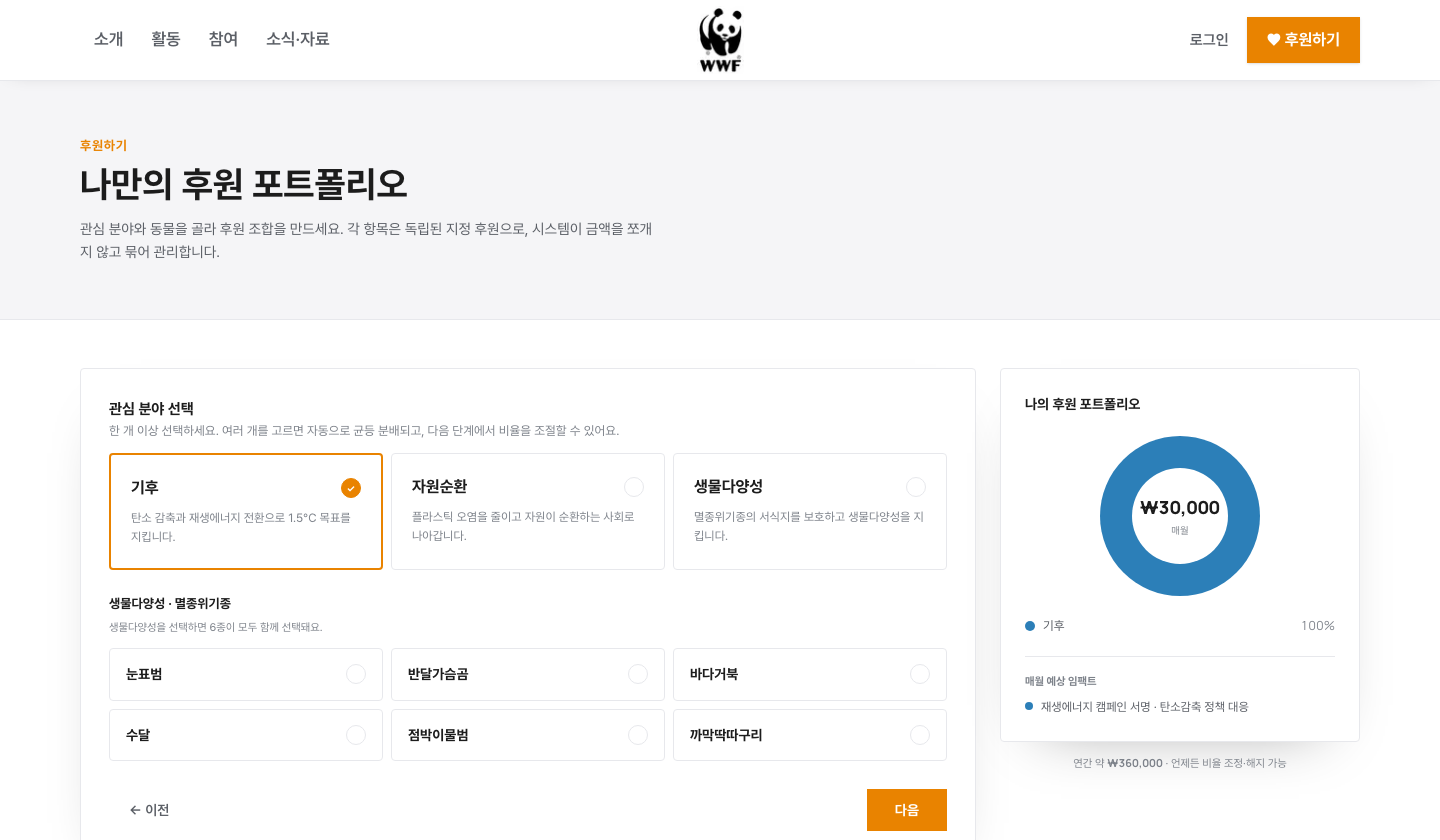
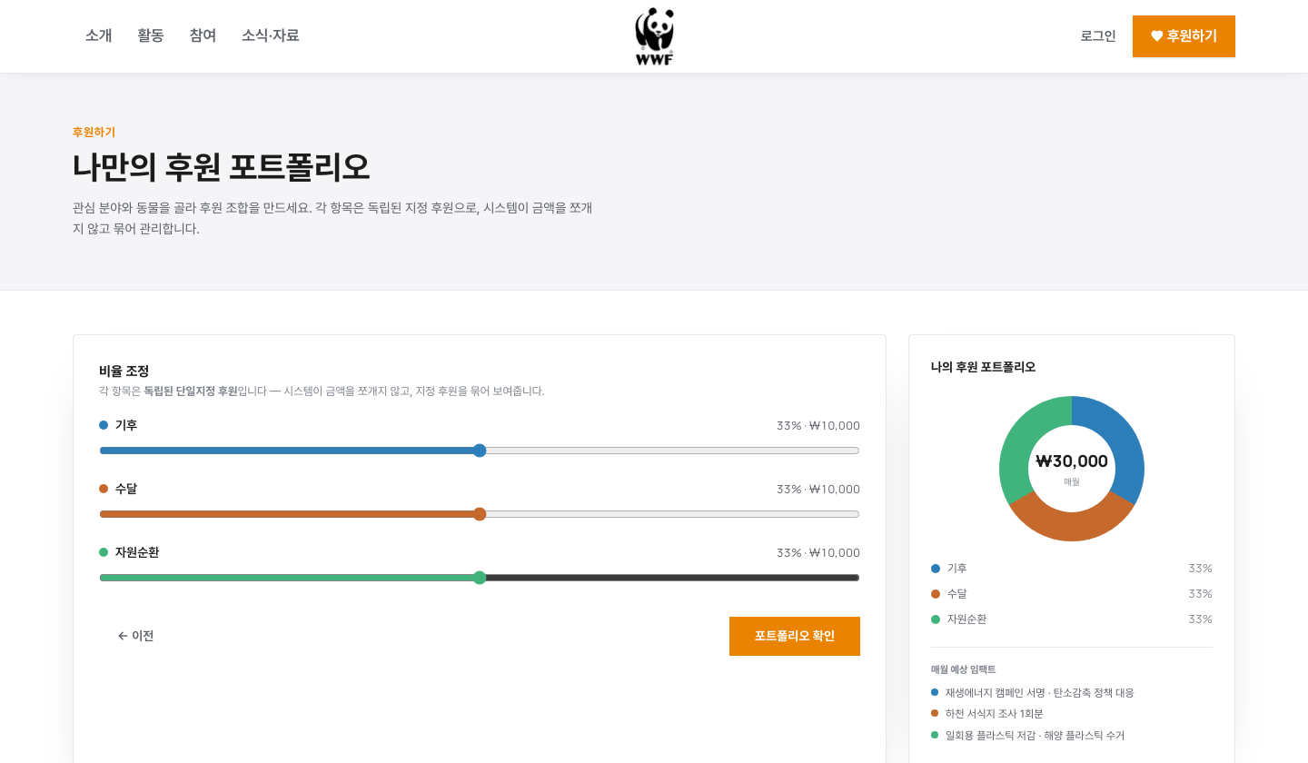
The initial concept split one monthly donation across activities by percentage. To reduce the integration burden on the existing donor management system, I revised the proposal so that each item would be a separate designated donation, displayed together in one place. Sliders and a donut chart let supporters adjust individual amounts and review their relative shares. Whether this model could work in practice remained dependent on integration with the donor management system.
Naming
A name that reflects what supporters choose to protect
The prototype used Donation Portfolio to explain how several donations were grouped together. For a live service, I also proposed names such as What I Protect and My Pledge. The aim was to emphasize conservation choices and commitments while reducing financial language that could suggest an investment return.
Deliver
Let reviewers try the proposal for themselves.
Interactive Proposal
I built and deployed the key screens while writing the proposal
While writing the proposal, I also built and deployed the key screens as a web prototype. Reviewers could open a link to try choosing causes, adjusting amounts, and reviewing the donation mix. Payments and the existing donor management system were not connected, and the proposal explicitly identified the screens as a prototype for reviewing the flow.
Final Proposal
From conservation content to a donation
Homepage
A starting point for discovering causes and choosing support
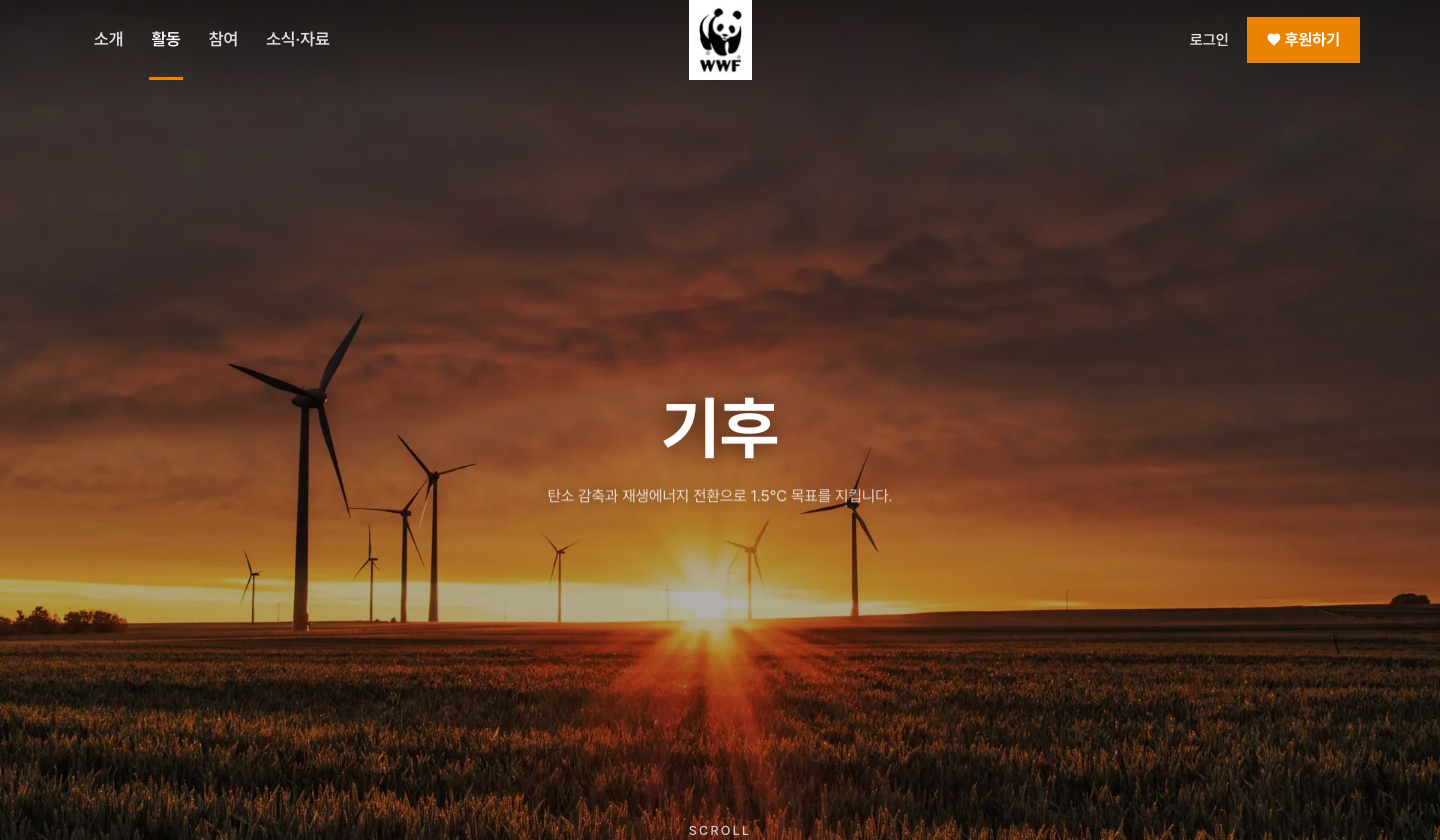
The proposed homepage introduces conservation work and leads visitors to activity details and the donation builder.
Activity Detail
Keep the chosen cause selected on the next screen
Activity pages follow a shared sequence: the problem, its causes, current figures, conservation work, and results. I implemented the donation button so it opens the builder with that activity already selected. This addressed the loss of context found on four of the six animal donation paths.
Donation Builder
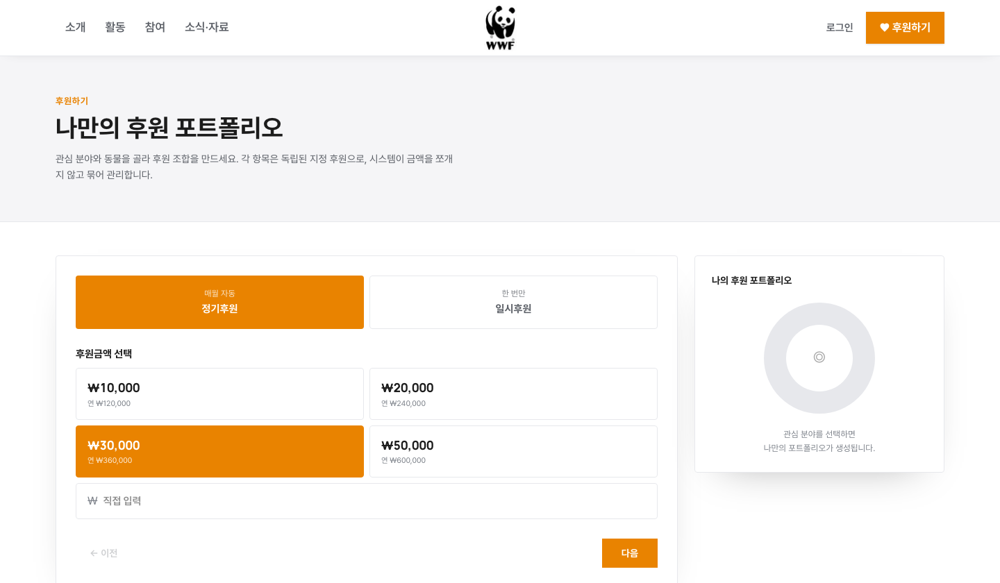
Amount → Causes → Proportions → Review
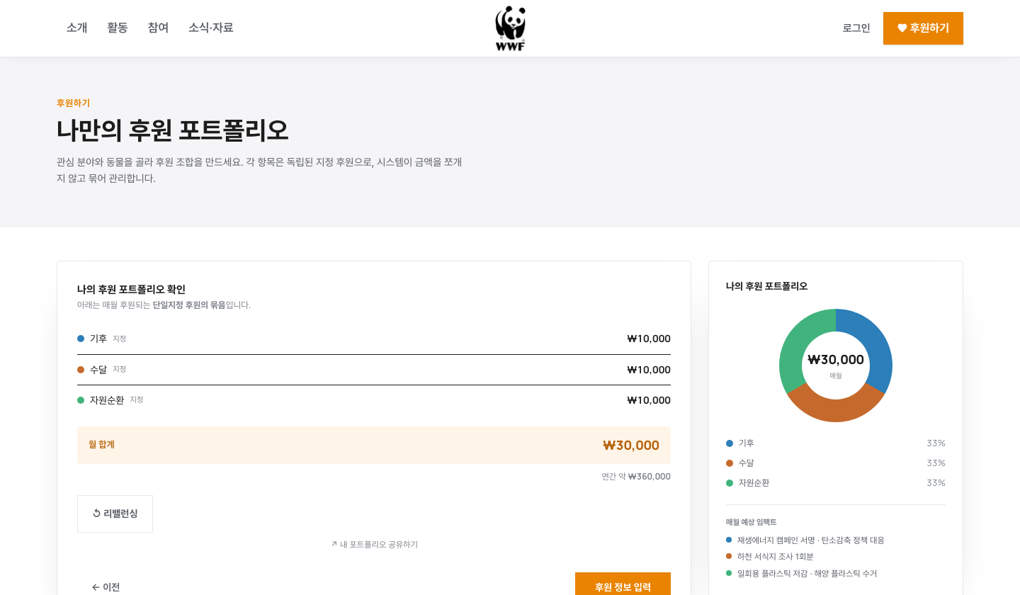
I divided the flow into four steps: donation frequency and amount, cause selection, proportion adjustments, and final review. A summary card stays on the right to keep the full mix visible at each step. Projected impact in the prototype illustrates activities related to the selected causes; it does not calculate or guarantee actual outcomes for a given donation amount.
1. Amount
2. Causes
3. Proportions
4. Review
Sharing
One person's choices become someone else's starting point
I implemented a prototype flow that generates a certificate after the donation completion step and opens a preselected donation mix from its sharing link. The recipient can keep that mix or change it. The aim was to extend participation-sharing practices, such as Earth Hour’s lights-off posts and Wonderple’s plastic-bottle collection posts, into the donation experience.
Outcome
Completed as a proposal
I completed the website audit, information architecture redesign, and an interactive prototype of the key screens. The project ended at the proposal stage because integration with the existing donor management system (CRM) was difficult. Operating the proposed model would require the existing system to process each supporter’s selected causes and amounts.
This case study documents proposal work, not a contracted deliverable for WWF Korea. The photos and videos in the prototype are external materials used temporarily to illustrate the proposal.
Takeaways
What I learned from this project
01Direct observation gives a proposal a clearer foundation
Comparing animal pages with their donation destinations let me explain exactly which connections needed to change. Checking existing content and links helped define the proposal’s scope and priorities.
02Check the system behind the screens first
Grouping separate designated donations changed the concept, but it did not resolve integration with the existing system. Next time, I would first check how donation items and amounts can be registered and changed. Knowing those constraints earlier would have changed the proposal’s scope.
03Nonprofit constraints become concrete design principles
I distinguished actual results from sample data and put chosen causes on certificates instead of donation amounts. Understanding the context of nonprofit giving led to specific decisions about impact claims and sharing.
Other projects
 Brand Renewal ProposalWITIM Wingo Brand Renewal
 Service PlanningAn AI Tutor That Knows Your Learning Context, Not One Feedback for Everyone
 Service DesignDetecting and Preventing Voice Phishing Scams
 App RedesignEnhancing Trust in WebMD’s Symptom Checker
 Responsive Web RedesignRedesigning for Stronger Brand Storytelling