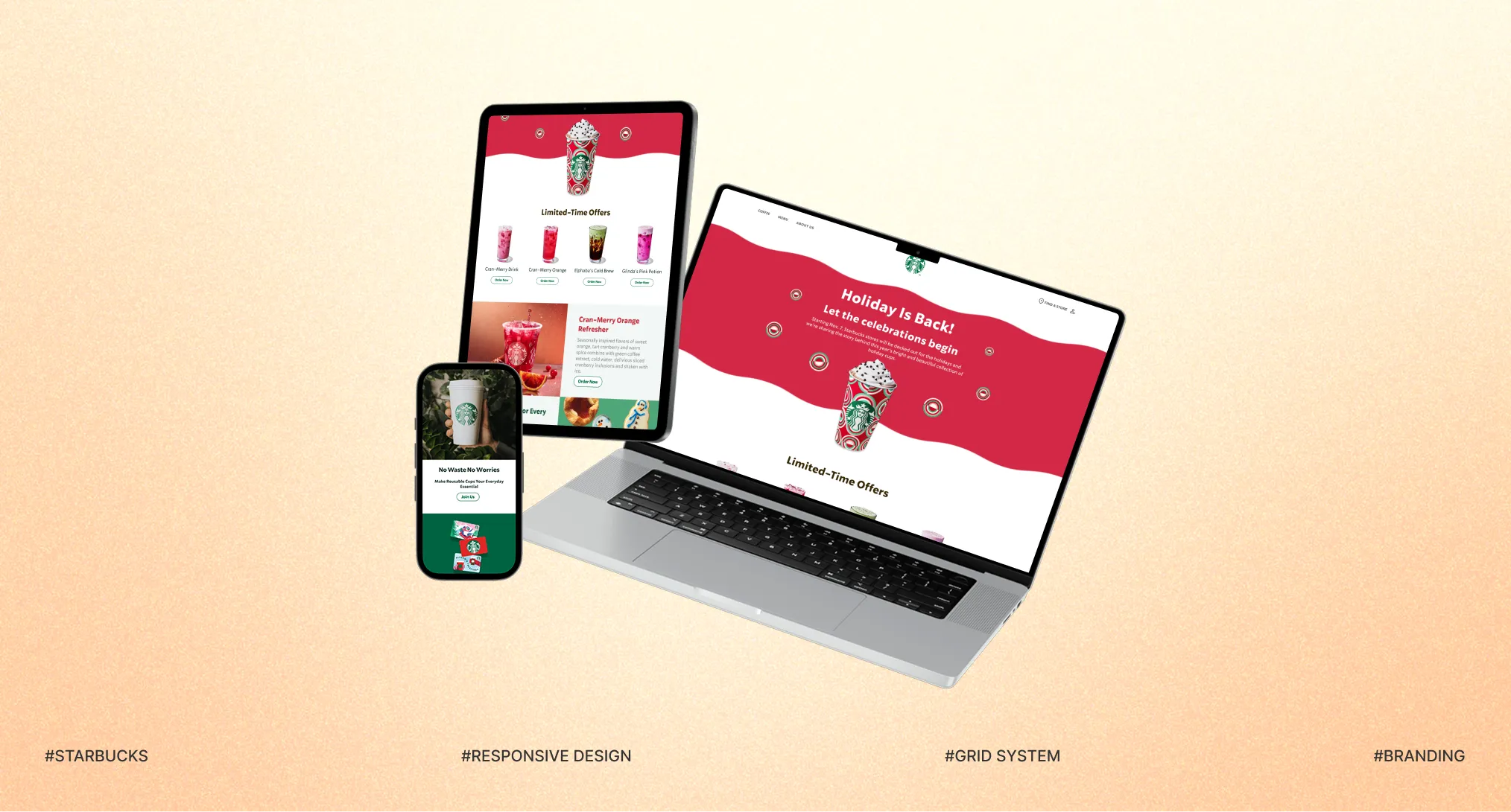
Redesigning for Stronger Brand Storytelling
Project Overview
Starbucks’ seasonal campaigns are more than promotions—they are carefully crafted brand experiences. This project redesigns the seasonal landing page as a cohesive experience that connects seasonal atmosphere, brand storytelling, and the user journey across devices.
- Project type
- Solo Project
- Duration
- 3 Weeks
- Role
- UX/UI Design
- Tools
- Figma
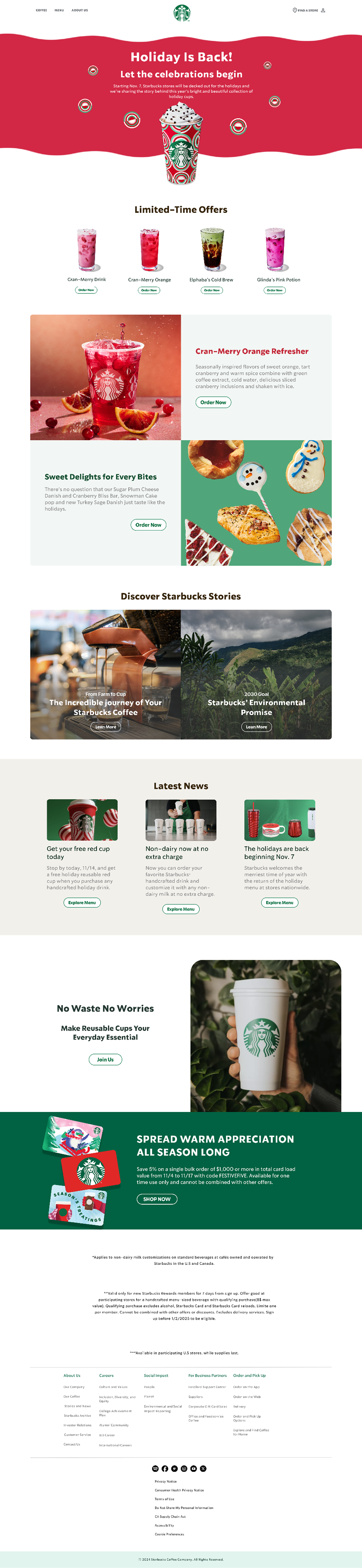
From a Simple Grid to a Seasonal Experience
Before
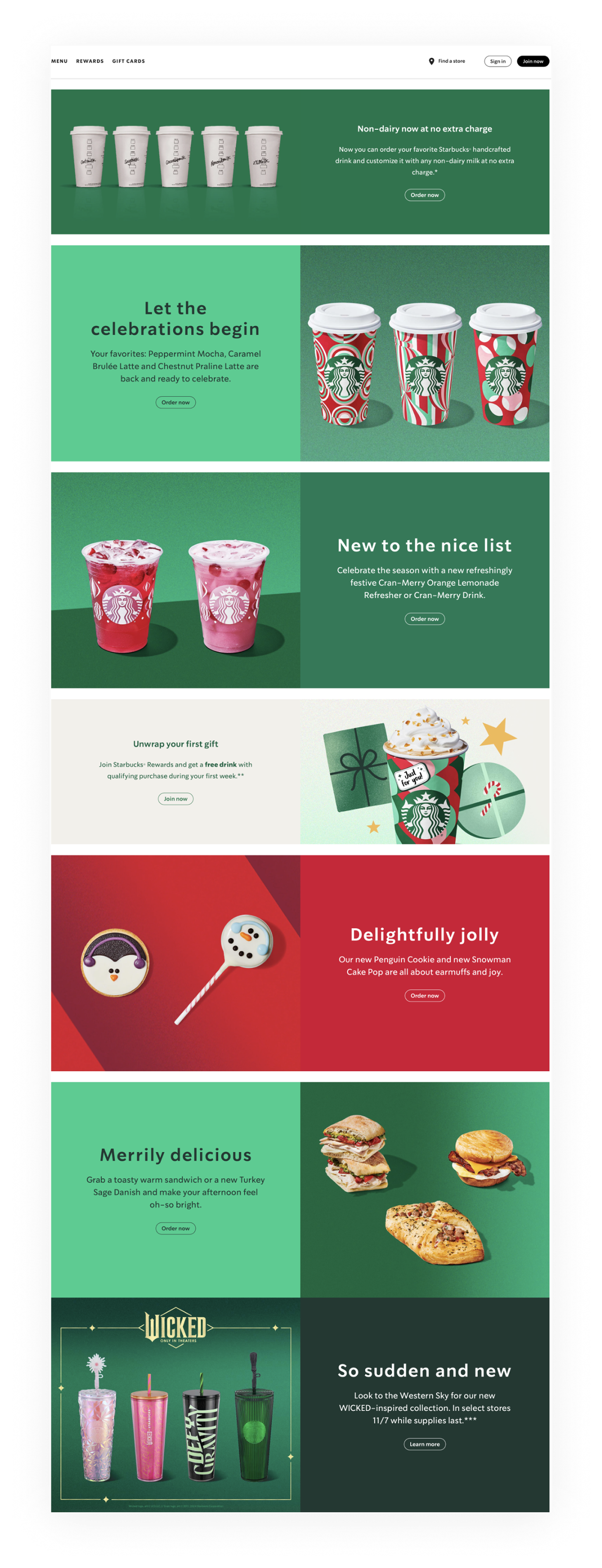
After
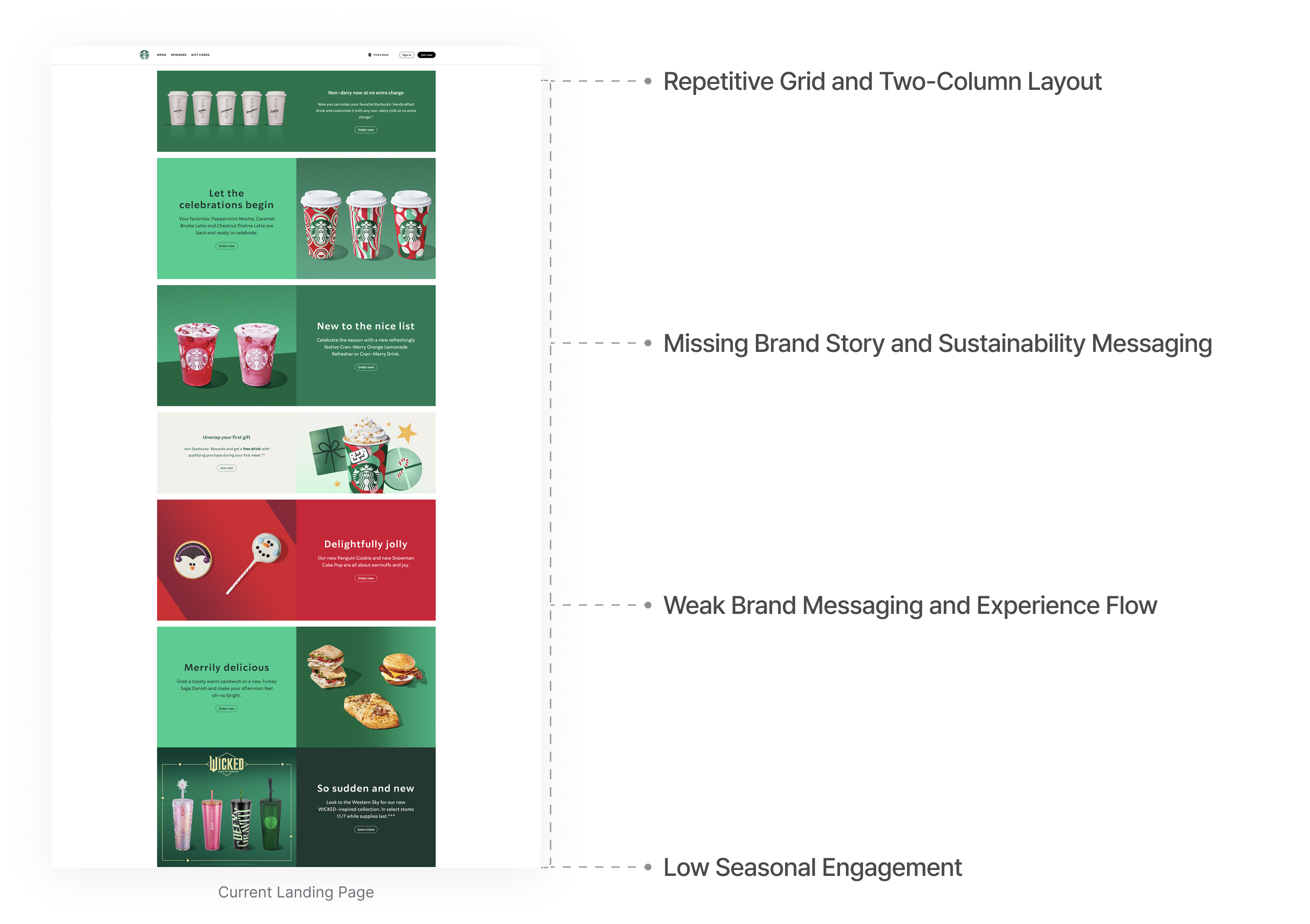
Current Problem
A Simple Grid, A Weakened Brand Story
The existing Starbucks landing page relied on a repetitive, two-column grid structure, limiting the depth of the brand experience.
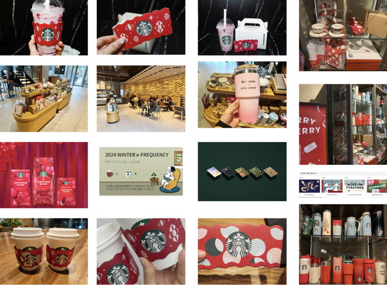
Market Research
How Seasonal Identity Is Expressed Beyond the Screen
Starbucks’ seasonal identity extends beyond digital interfaces into products, packaging, spaces, and in-store experiences. This research examined how seasonal identity is expressed across online and offline touchpoints.
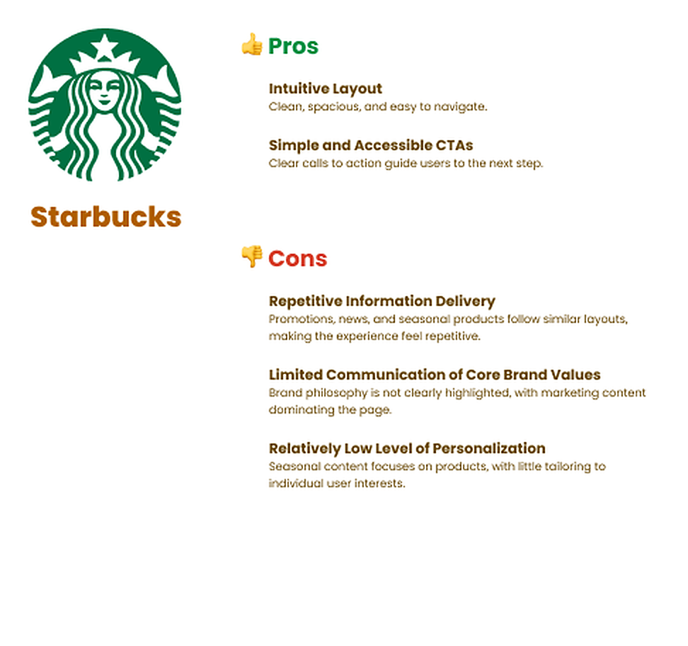
Competitor Research
How Competitors Communicate Brand and Seasonality
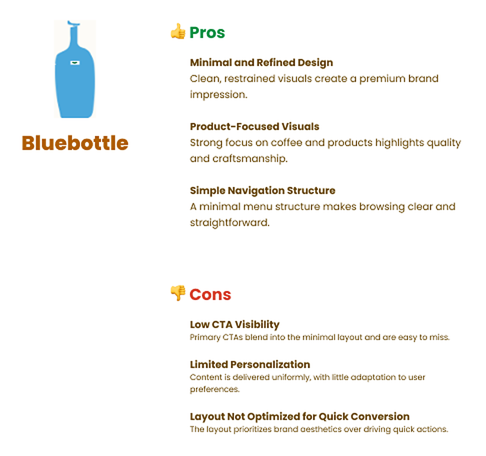
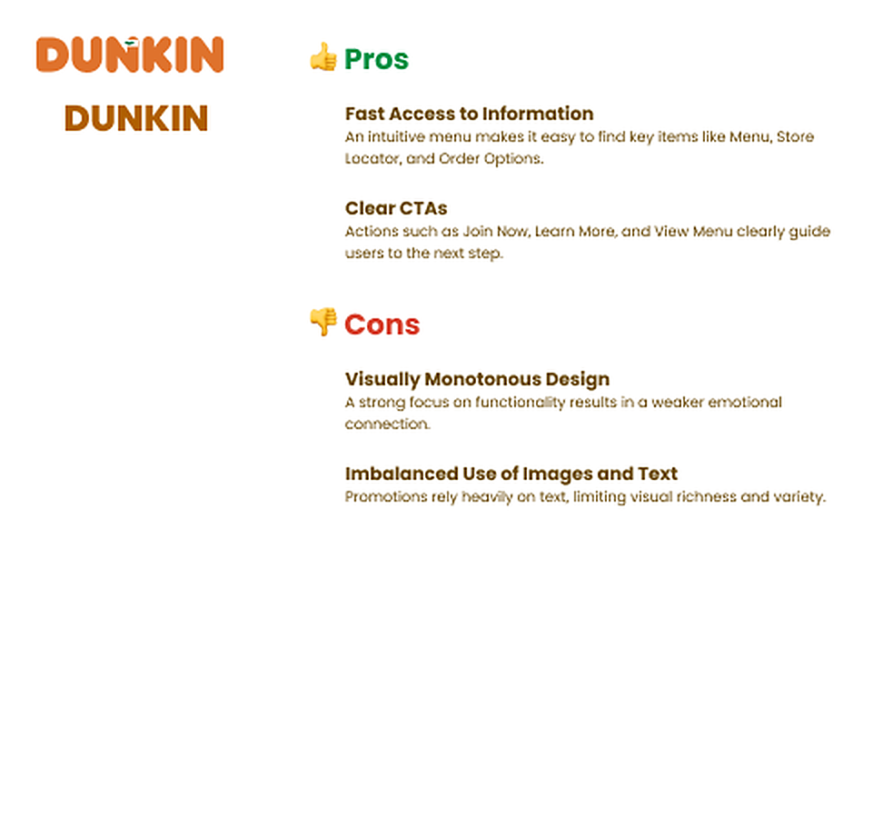
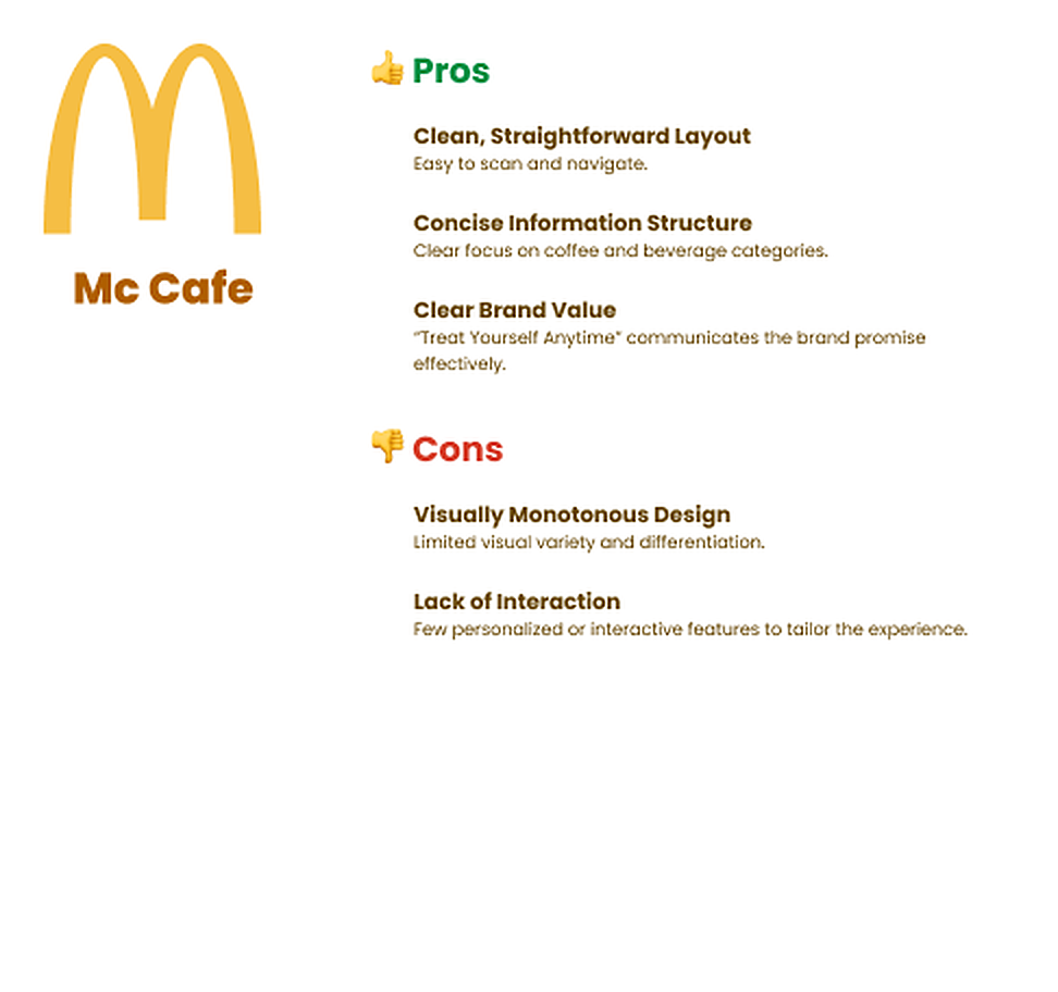
This analysis compares how major coffee brands communicate brand values, product focus, and seasonality through their landing pages, identifying strengths, limitations, and opportunities for differentiation.
Design Goal
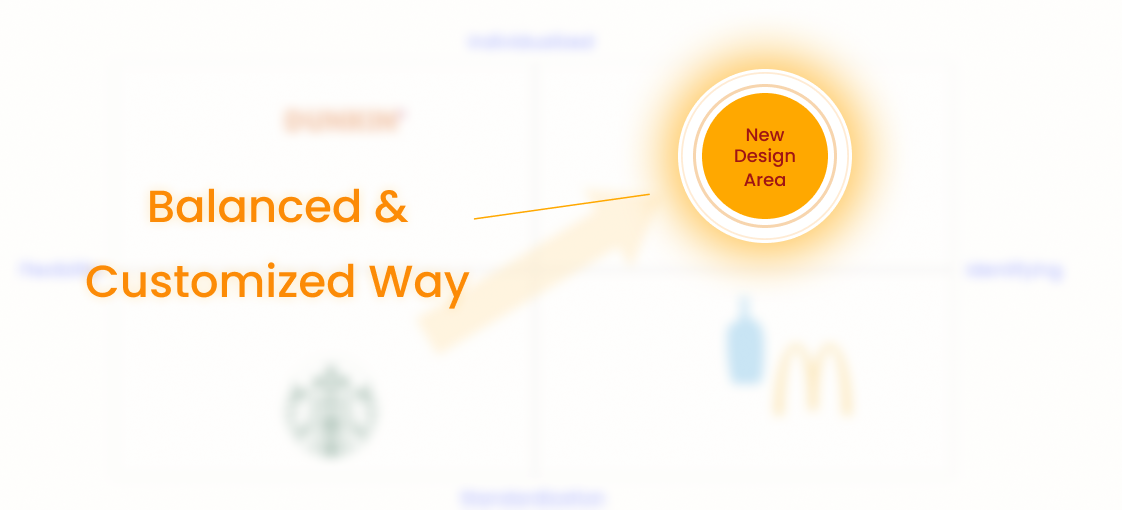
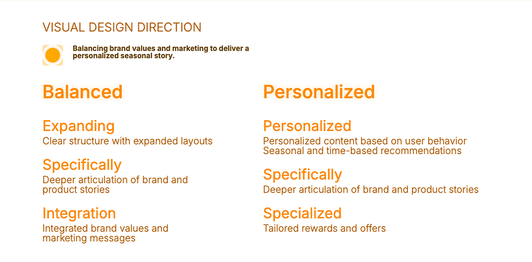
From Metric Insights to a Balanced, Personalized Design Direction
I defined the design direction by balancing brand values and marketing elements, while enabling personalized seasonal storytelling beyond campaign-driven content.
Core Challenge
How Might I Strengthen Brand Storytelling on the Landing Page?
Solution
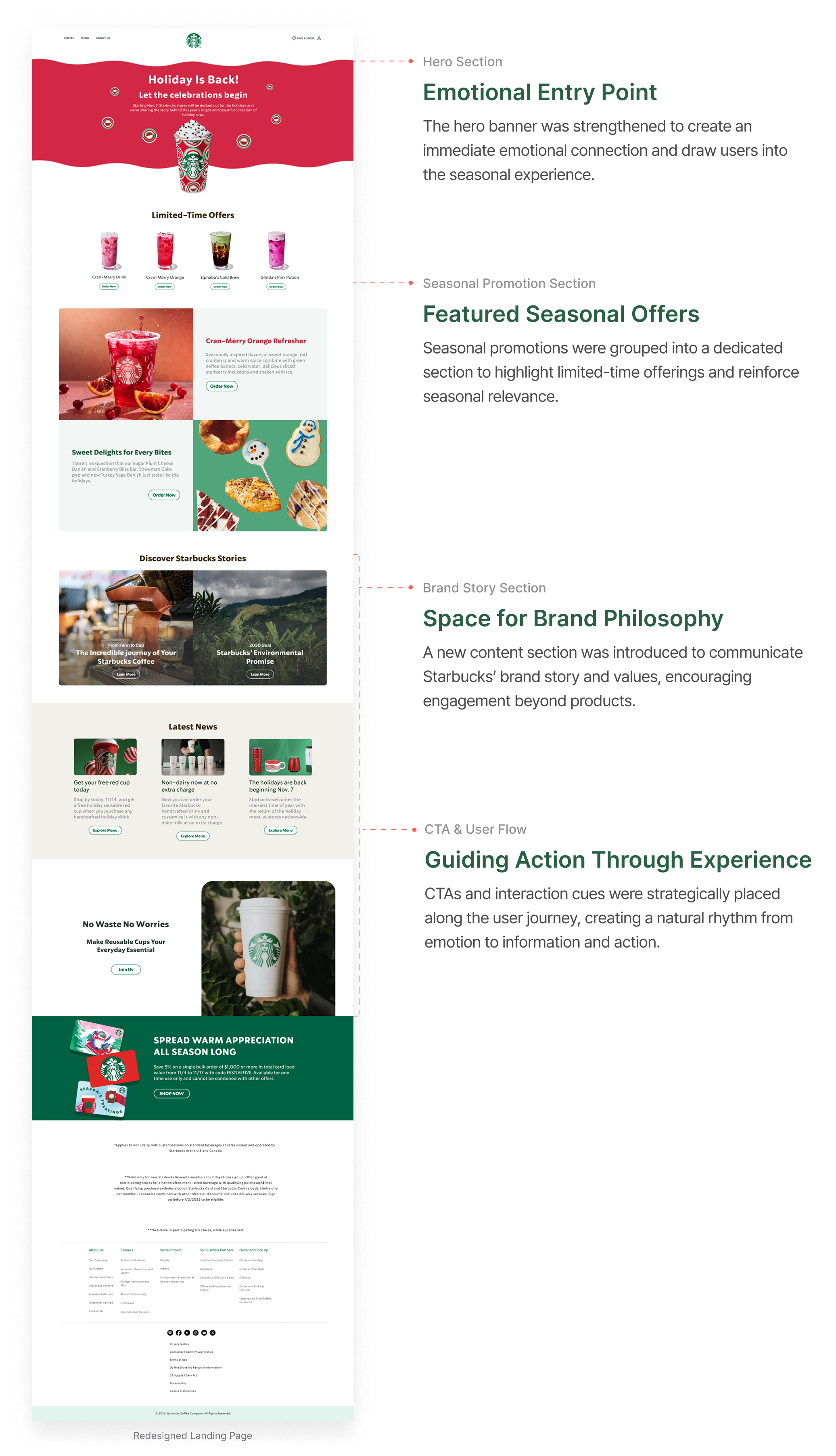
From an Information-Driven Structure to an Experience-Led Flow
The redesigned experience begins with seasonal emotion and guides users through brand storytelling. I restructured the page to connect seasonality, brand philosophy, and user experience into a cohesive flow.
Grid System
Designed for Consistency and Scalability
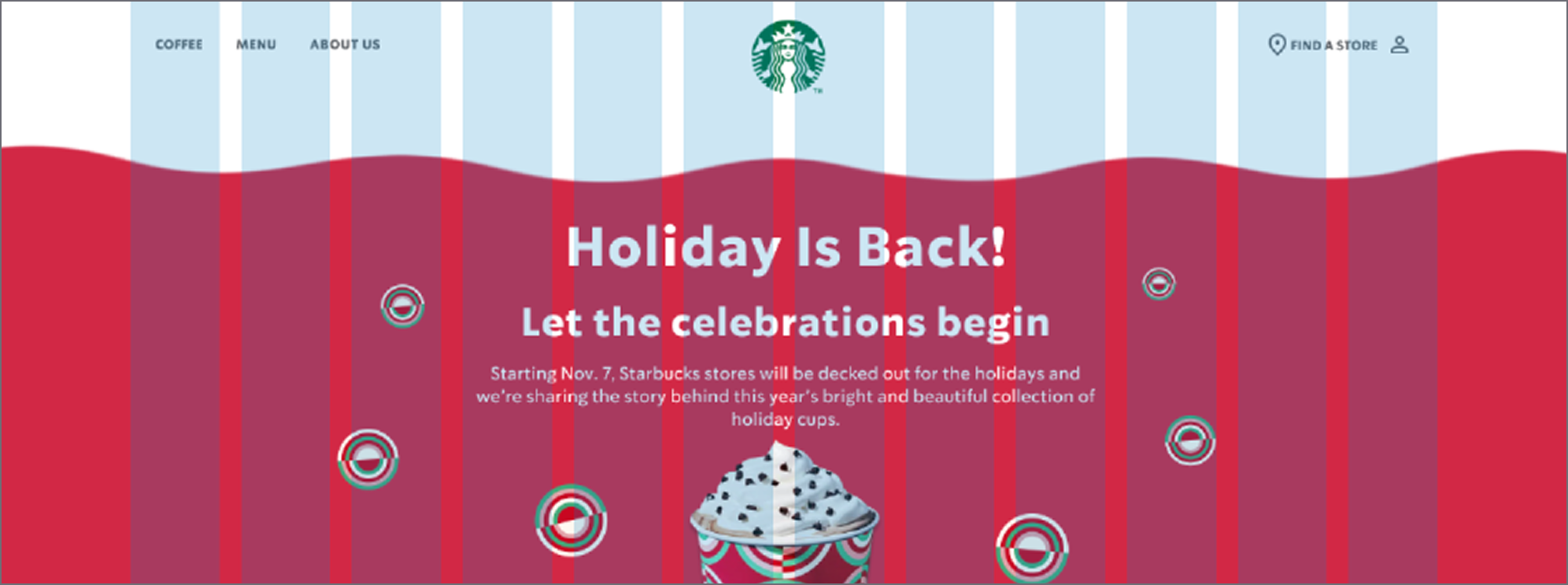
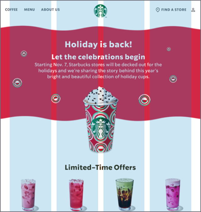
Desktop (1440px)
12 Columns, Margin 143px, Gutter 20
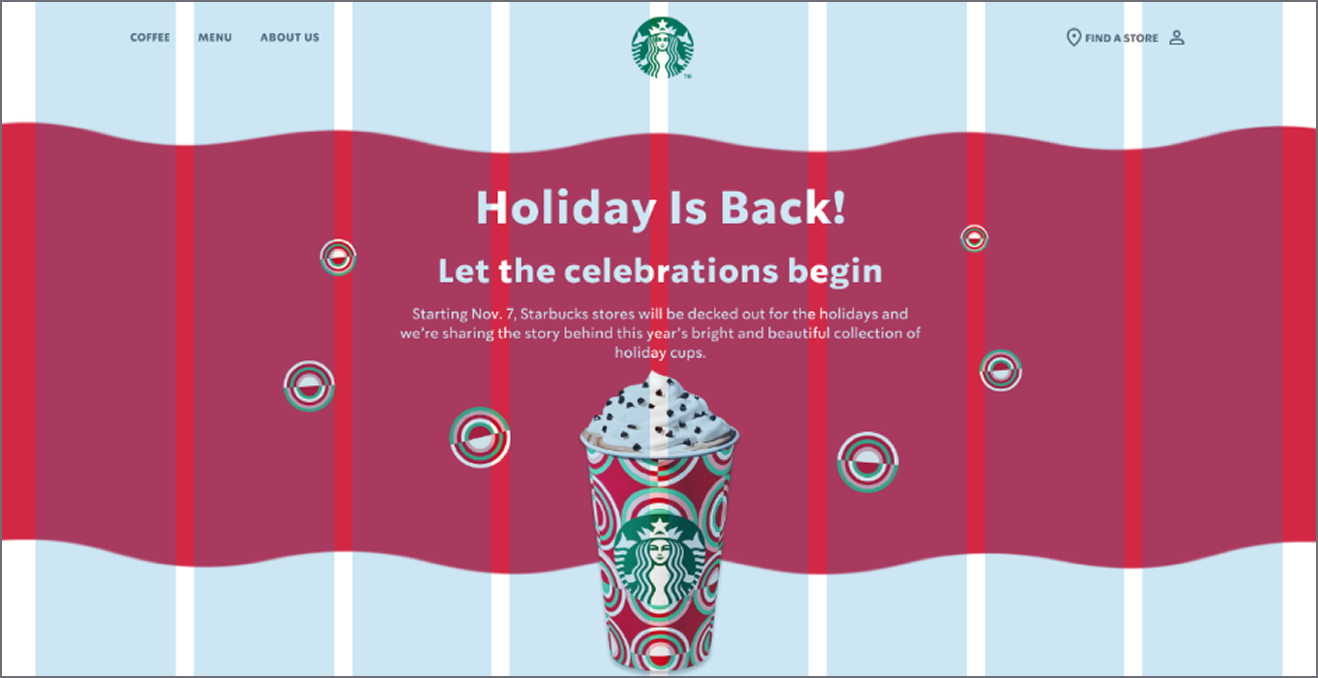
Tablet (874px)
8 Columns, Margin 24px, Gutter 20
Mobile (375px)
4 Columns, Margin 16px, Gutter 20
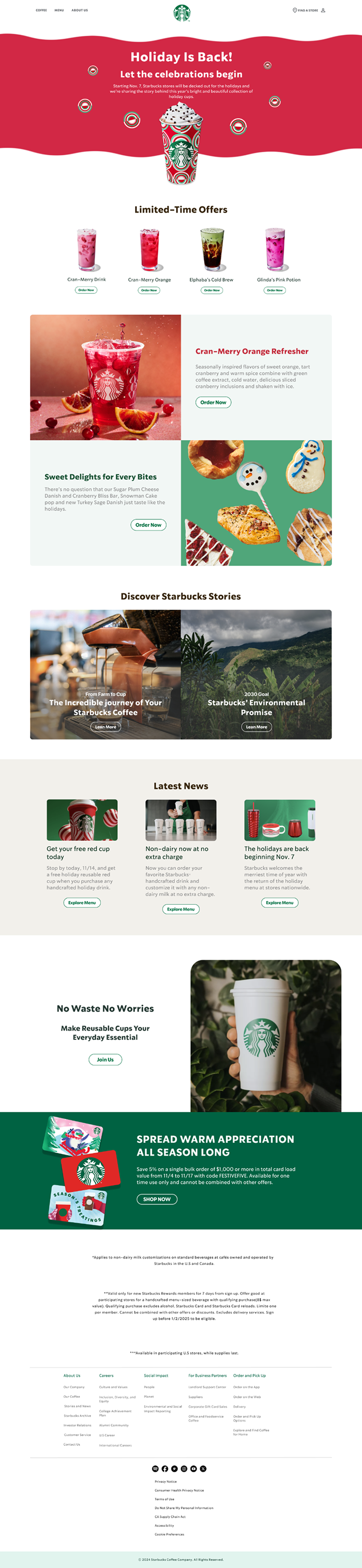
Responsive Web Design
Optimized Layouts for Desktop, Tablet, and Mobile
Desktop (1440px)
Tablet (874px)

Mobile (375px)