Work is scattered across tools
Conversations, tasks, schedules and files live in different tools, so the team's flow keeps breaking.
Wingo lifts the scattered work at once and gathers it into one flow.
A wing that lightly connects a team's scattered work. I proposed a rebrand of the collaboration tool WITIM built around a single metaphor, the character Wingo.
WITIM is a collaboration platform for teams of 5 to 30 that brings chat, projects, calendar, tasks, files, attendance and notifications into one screen. The goal of this renewal was to turn the impression of a "heavy all-in-one" into "a flow that connects lightly." I put a winged character, Wingo (Wing + Go), at the center and tied everything from the name to the color, brand film and touchpoints into one story.
Conversations, tasks, schedules and files live in different tools, so the team's flow keeps breaking.
Wingo lifts the scattered work at once and gathers it into one flow.
Every competitor says "all-in-one," and the more features there are, the more there seems to learn.
The light, quick feel of a wing says "an all-in-one that isn't heavy."
With no memorable personality, there was nothing to extend into motion, video, social or merchandise.
A character that moves with a flap of its wing becomes the anchor for every extension.
Before explaining the metaphor in words, I wanted to show it. I built the scenes with Seedance and Runway into a 15-second film in which work, scattered like clouds, gathers into Wingo's wing.
Conversations and tasks split across tools drift apart.
A closed door opens, and everything scattered pours into one place.
The gathered flow becomes a cyan-lit wing that carries the team to the next step.

WITIM is a team workspace that gathers conversations, tasks, schedules, files, attendance and notifications scattered across tools into one flow.
Its essence isn't "more features." It's the experience of lightly lifting scattered work so the team moves in the same direction. Wingo's wing stands for that: instead of piling up complex work, it organizes it into one flow and moves it forward.
WITIM cuts the time teams waste moving between tools and lets them see and act on what they need in one place.
The slogan puts WITIM's core value in the plainest words: connect scattered work so the team moves lighter, and speed up both decisions and execution. The brand film ends on the same line, so the brand sounds like one voice wherever you meet it.

Wingo combines Wing and Go.
Wing is the wing that lifts scattered work at once and gathers it into one flow. Go is the mobility that moves a stalled team to the next step, fast. The name itself carries the brand promise: move lighter, move faster.
I added a single cyan stroke to the T of the WITIM wordmark and set the Wingo symbol in black and white. I scaled the app icon from 1024px down to 16px to check that the wing and the eye still read at small sizes, and split it into four variants for different backgrounds: light, primary blue, dark and monochrome.
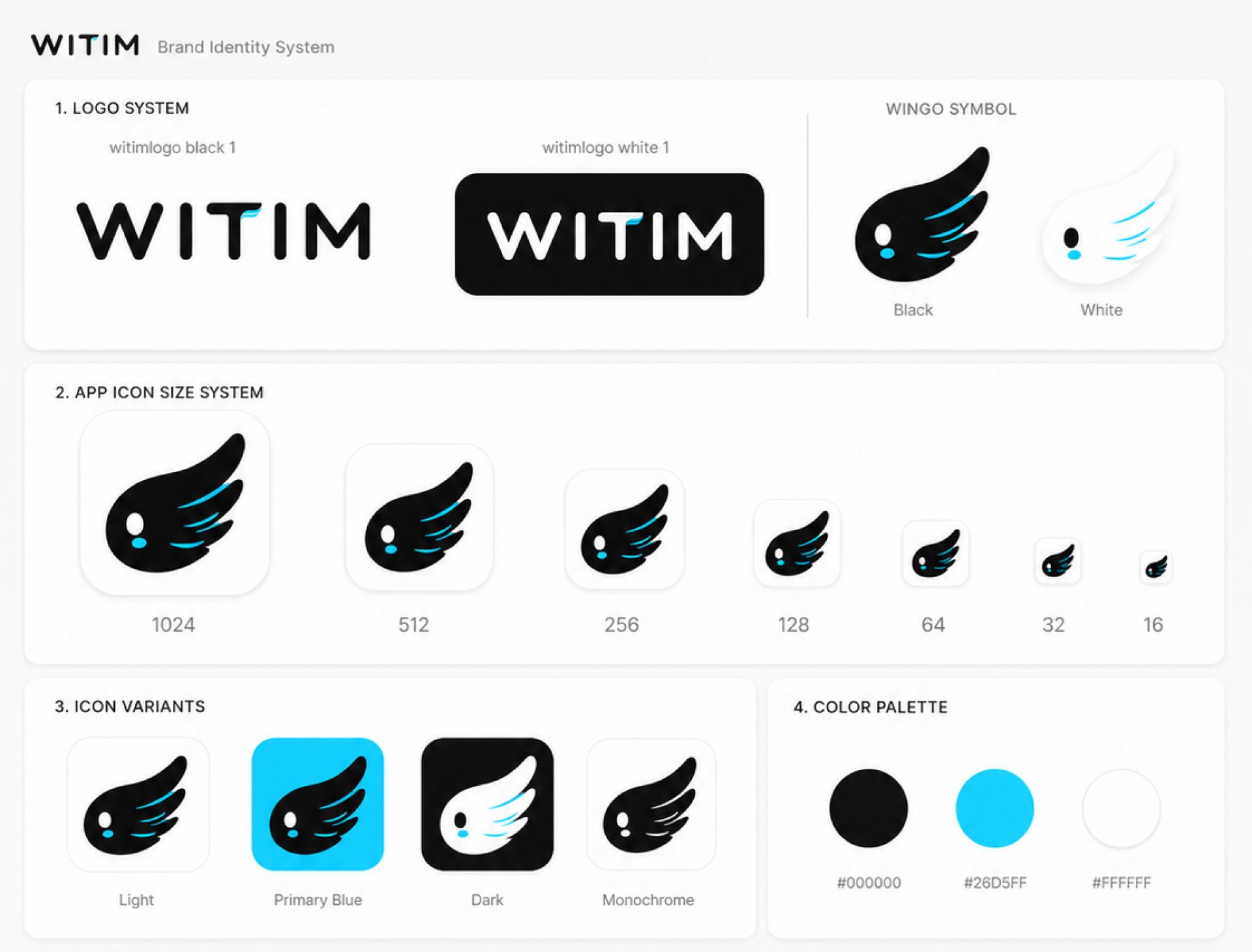
I reduced WITIM's impression to three colors: an ink with a teal cast, a signal cyan as bright as a light, and a paper in the same tone. I re-derived the neutral scale from the cyan undertone of Primary #26D5FF (about 192°) so the three read as one family. Text on Signal is always set in ink #0B1416 for contrast.
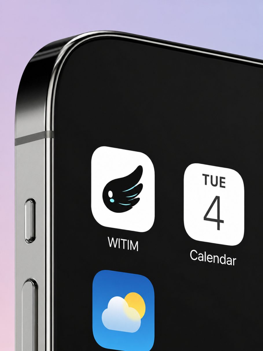
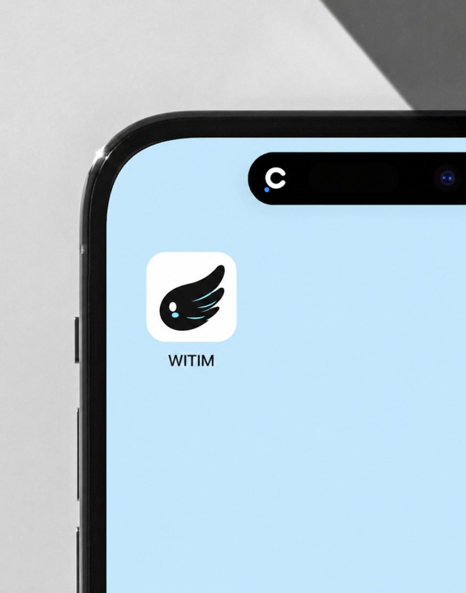
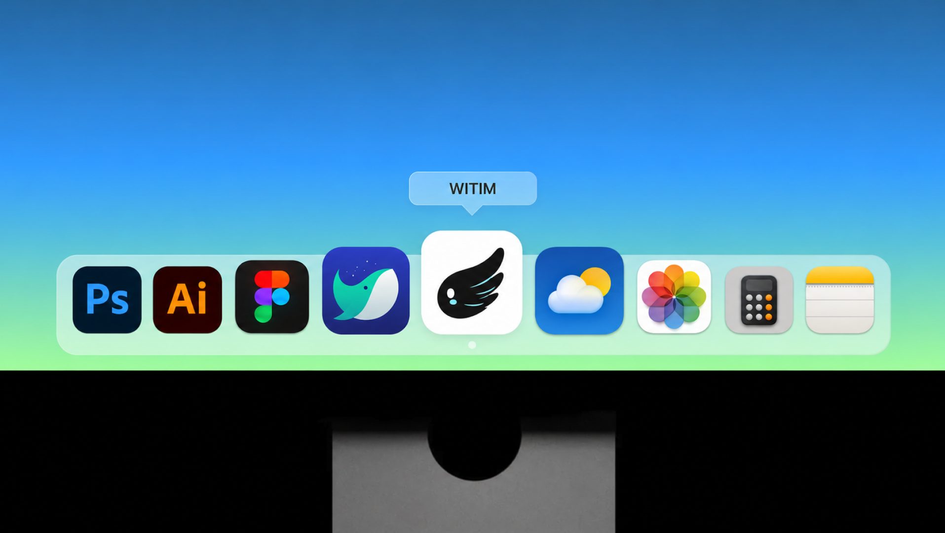
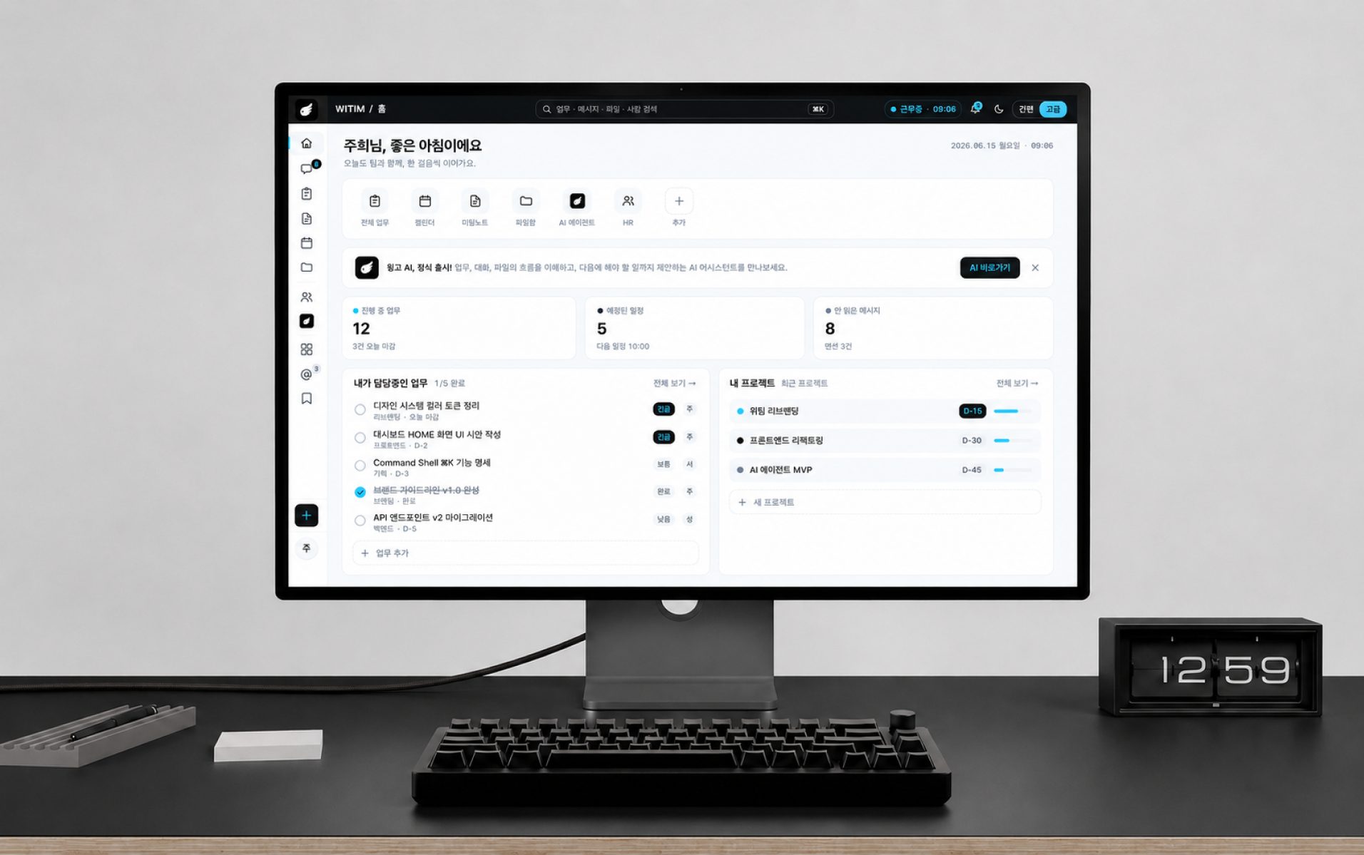
A collaboration tool gets opened dozens of times a day. I placed Wingo where people actually meet it, on the home screen, in a browser tab, in the desktop dock and in the product dashboard, to check that it keeps the same impression as size and background change.

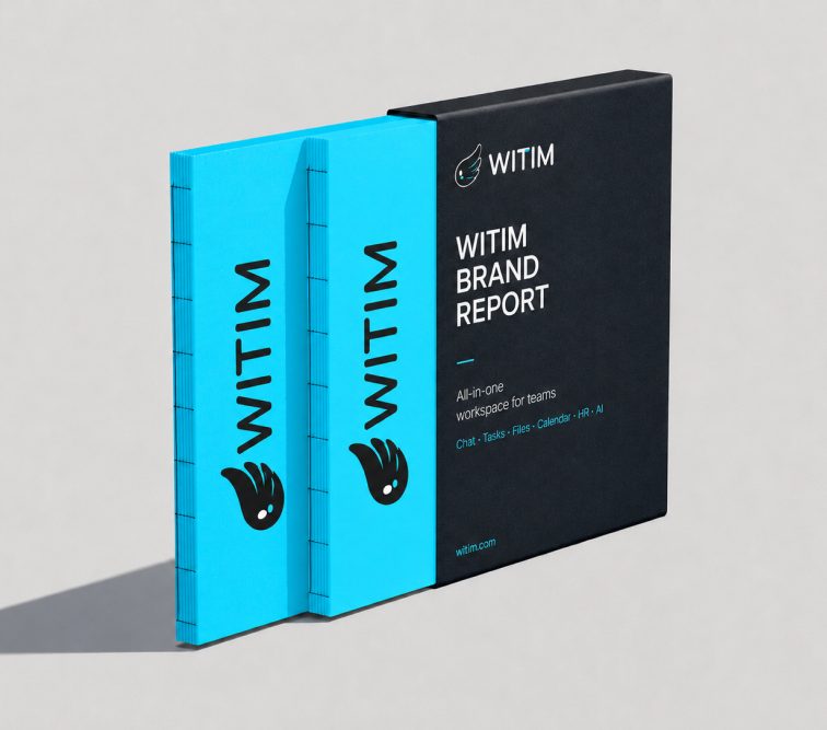
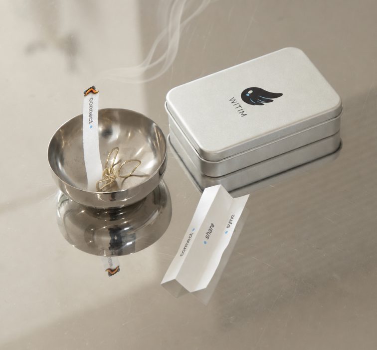
I extended the brand to things people can hold: a brand report, merchandise, a welcome kit for new hires and a subway billboard. To keep one character telling the same story at every touchpoint, each piece uses only the wing symbol and a single cyan.
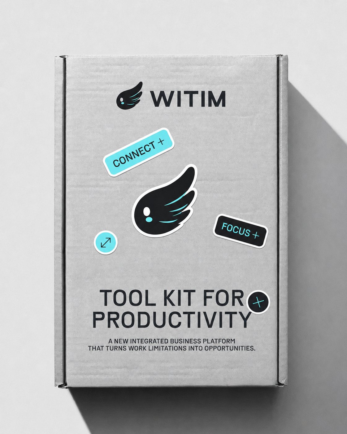
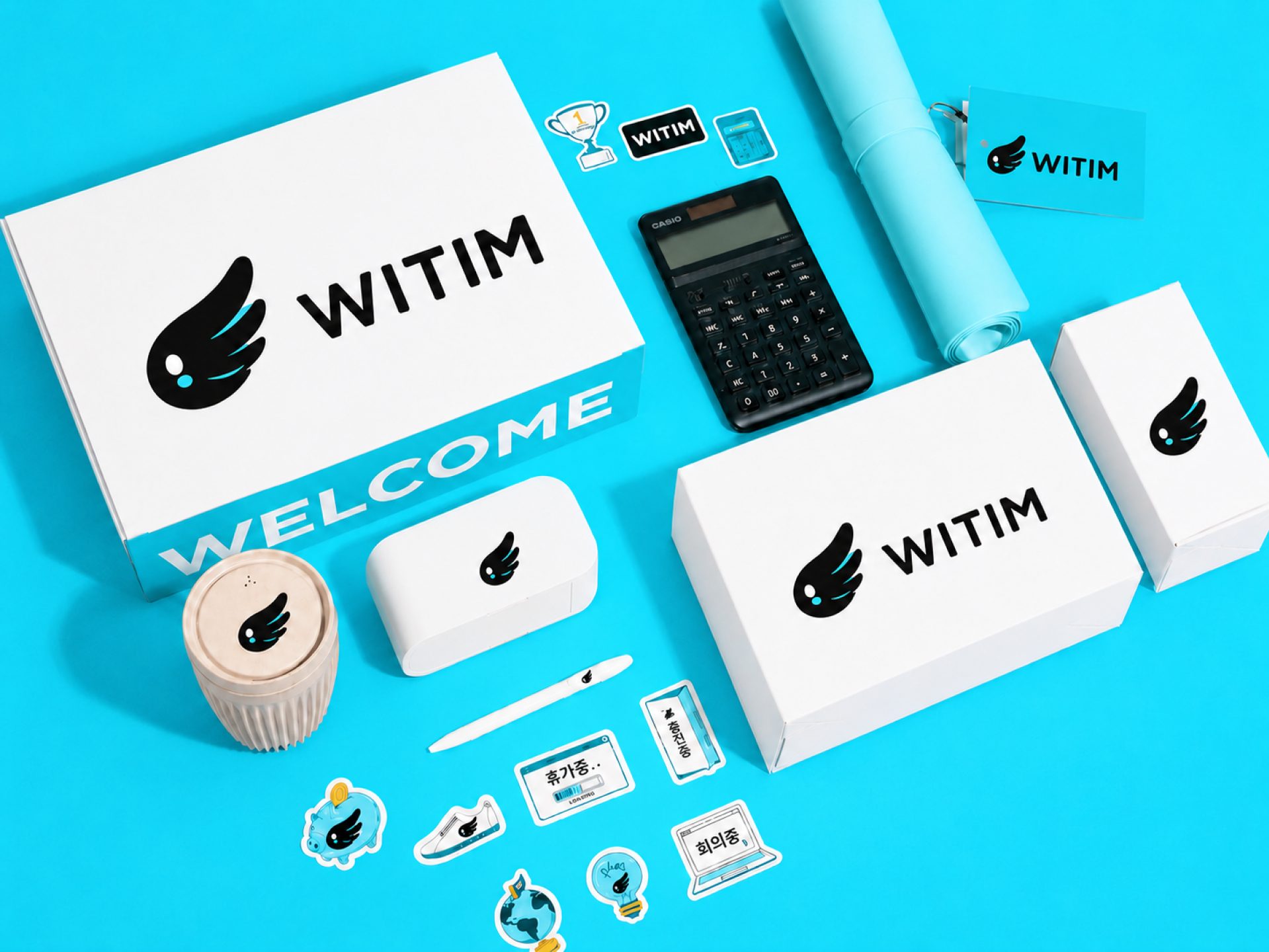
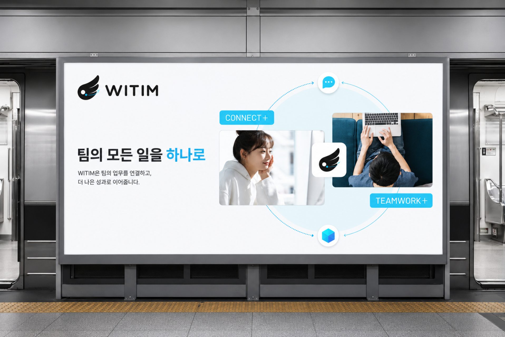
The Wingo proposal wasn't chosen as the final direction in the in-house competitive pitch. Still, it was a project where I took a single metaphor, wing = lightness = flow, through the name, character, color, brand film and touchpoints on my own, end to end.
I made the meaning of the name, the character's shape, the single cyan and the film's scenes all come from the same sentence. Whenever a decision stalled, going back to "does this feel as light as a wing?" gave the answer.
I made the film with Seedance and Runway and the mockups with ChatGPT. Because AI makes it easy to produce many options quickly, I first set an evaluation sheet weighted toward motion potential and how well each option explains the brand, then chose by it.
Work lighter, faster