 Juhee Oh
I worked on creating email templates for WITIM. I brought together the emails needed for situations such as sign-up, invitations, payments, and maintenance, created shared layouts, and handed them over to the development team.
In this post, I share the decisions I made while preparing the templates and what I handed over alongside the designs.
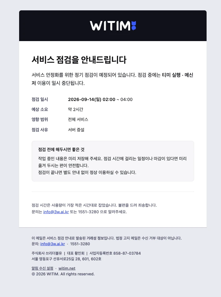
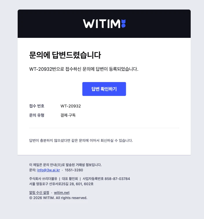
Six Representative Email Templates
Grouping Emails by Purpose
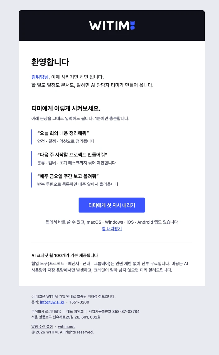
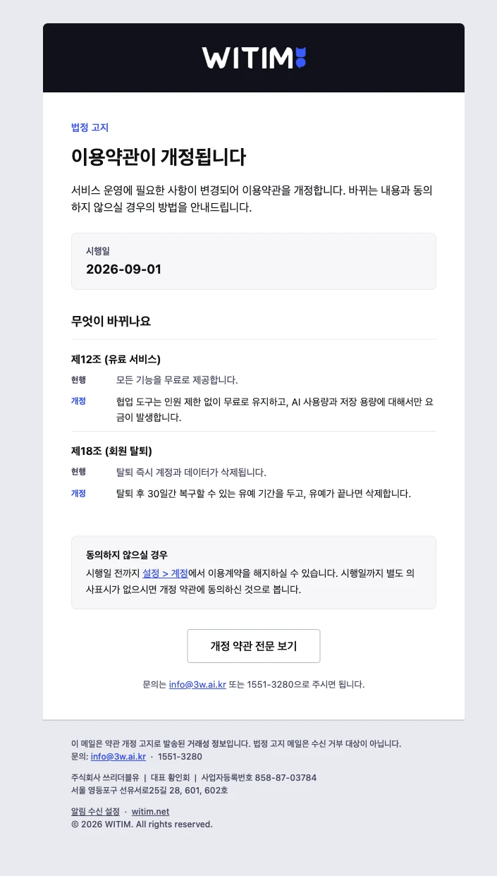
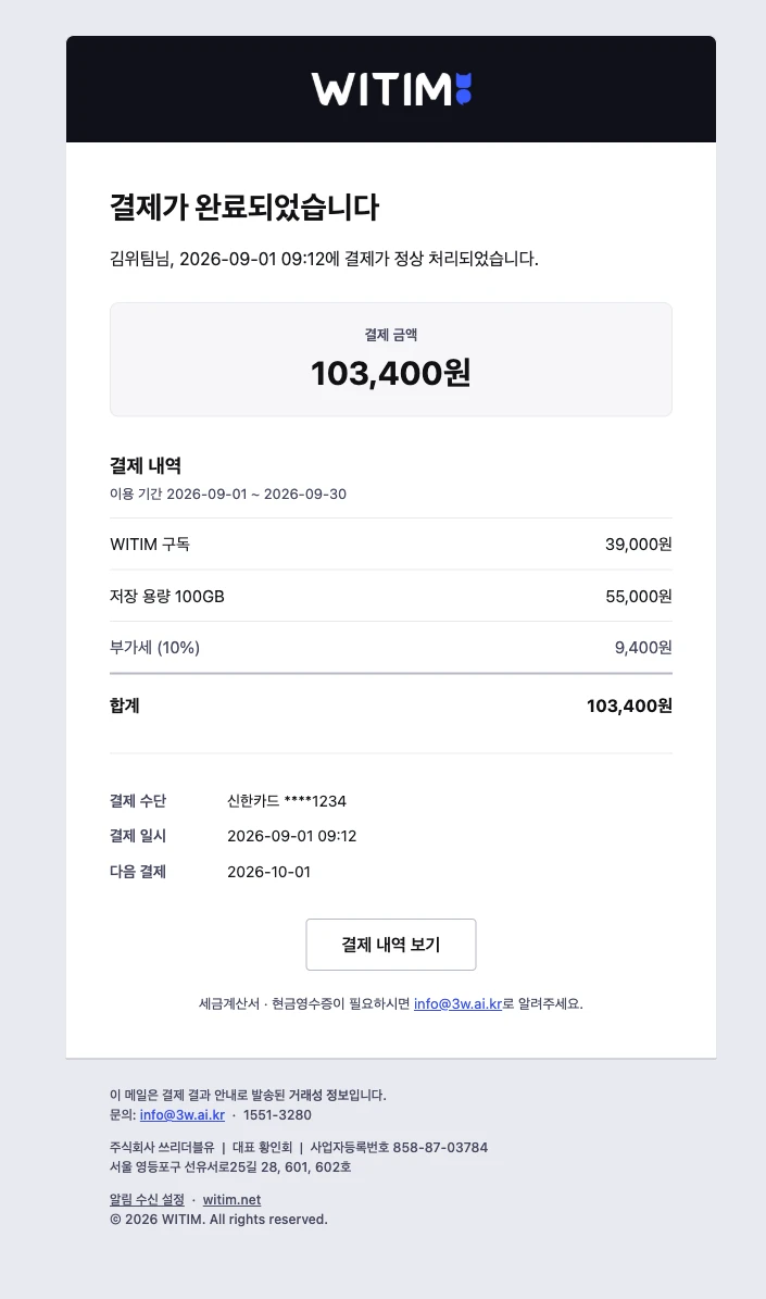
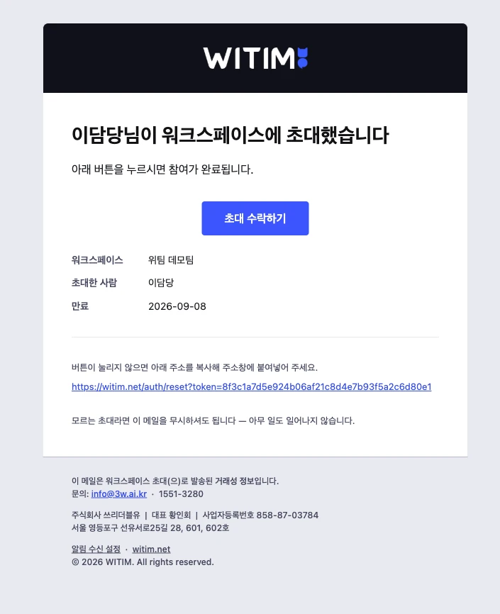
I compared the notification policy with the email list and identified what each email should show first and what the recipient needed to do. Grouping the content around those needs led to six shared layouts.
| Shared layout | What comes first | Examples |
|---|---|---|
| Welcome | How to get started and what to do first | Welcome email |
| Action | The request, action button, and link expiration | Sign-up verification, password reset, workspace invitation |
| Notice | Effective date and a comparison of changes | Terms updates, pricing changes |
| Receipt | Amounts and itemized details | Payment confirmation, upcoming payment, refund |
| Status | Current status, relevant facts, and next steps | Payment failure, service incident |
| Content | Instructions to follow in order | Onboarding, usage tips |
I kept the header and base styles consistent and prepared reusable content blocks for details such as expiration notices, change comparisons, and payment breakdowns. These blocks could be combined to keep new emails consistent with the same design rules.
Making Essential Information Easy to Find
For these emails, communicating essential information clearly mattered more than elaborate visuals. I kept the layouts simple so people opening a sign-up, payment, or maintenance email could quickly find the dates, amounts, and actions they needed.
HTML emails also required attention to file size and differences between email clients. I reduced unnecessary images and code to keep the templates lightweight, using text, tables, and buttons to communicate the content.
Different types of emails also called for different details, such as sender information and unsubscribe instructions. I organized the information, type sizes, and spacing so these details could be included while keeping the main message easy to find.
Adapting WITIM’s Style for Email
I used WITIM’s design system for colors and spacing, keeping buttons, body text, and supporting copy consistent wherever they served the same purpose.
When preparing the markup, I considered differences between email clients. I used table layouts and inline styles, added fallback button markup for Outlook, and wrote a separate preheader for each email—the preview text shown next to the subject in the inbox.
Preparing Variables and Images for Development
For details that change from email to email, such as names, dates, and amounts, I left placeholders like {{userName}}. I documented the fields needed in both the subject and body, with examples, so the development team could connect them to real values.
One thing I learned during this project was that the logo image also needed to be deployed separately. These templates loaded the logo from a URL, so seeing it in a preview on my own computer was only part of the job. The file needed to be hosted on a server and linked through a public URL that recipients could access without signing in.
I sent the development team the logo file along with its intended path and filename. This taught me to check that images actually load in the recipient’s email environment as part of completing an email design.
Ready to Use When Needed
I added the finished HTML emails to the admin as templates, so anyone on the team could choose an email suited to the situation.
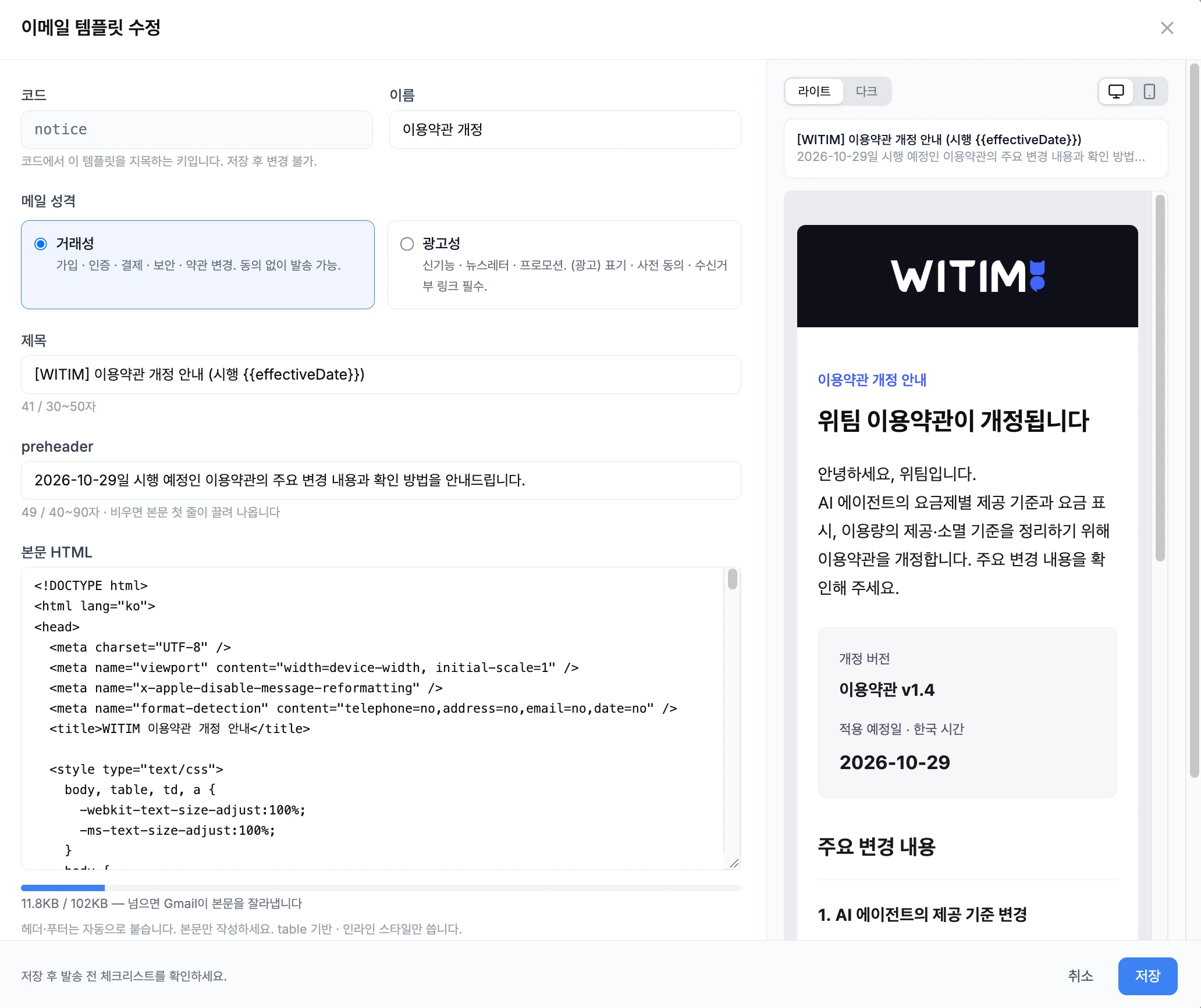
I wanted recipients to find the information they needed easily, and teammates sending an announcement to have a suitable template ready to use. This project gave me a chance to think through both how an email looks to its recipient and how the team will use it.