 Juhee Oh
I made a seven-slide Instagram carousel introducing WITIM. I gave GPT the UI and logo, along with the promotional message and design direction I had already decided on. From copy and slide structure to creating and revising the images, I did everything within GPT.
Deciding What to Communicate
The message I wanted to get across was that teams can start using chat, project, and attendance management in one app for free. I focused on the cost concerns small businesses face when adopting collaboration tools, along with the inconvenience of using separate tools.
I shared this direction and the WITIM UI and logo with GPT and asked it to create an Instagram carousel. I documented the copy and slide structure in a Markdown planning file as I refined them.
I organized the seven slides in this order:
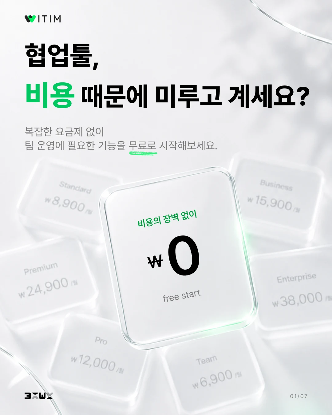
- Acknowledge the cost concern — Ask whether the cost is putting the reader off adopting a collaboration tool.
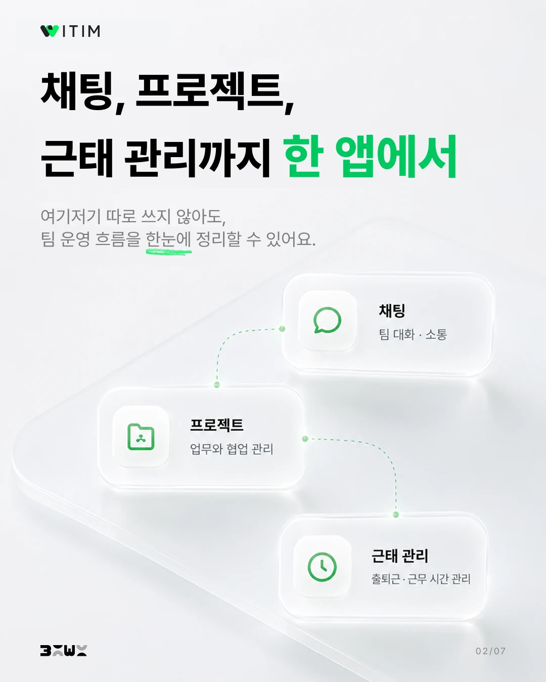
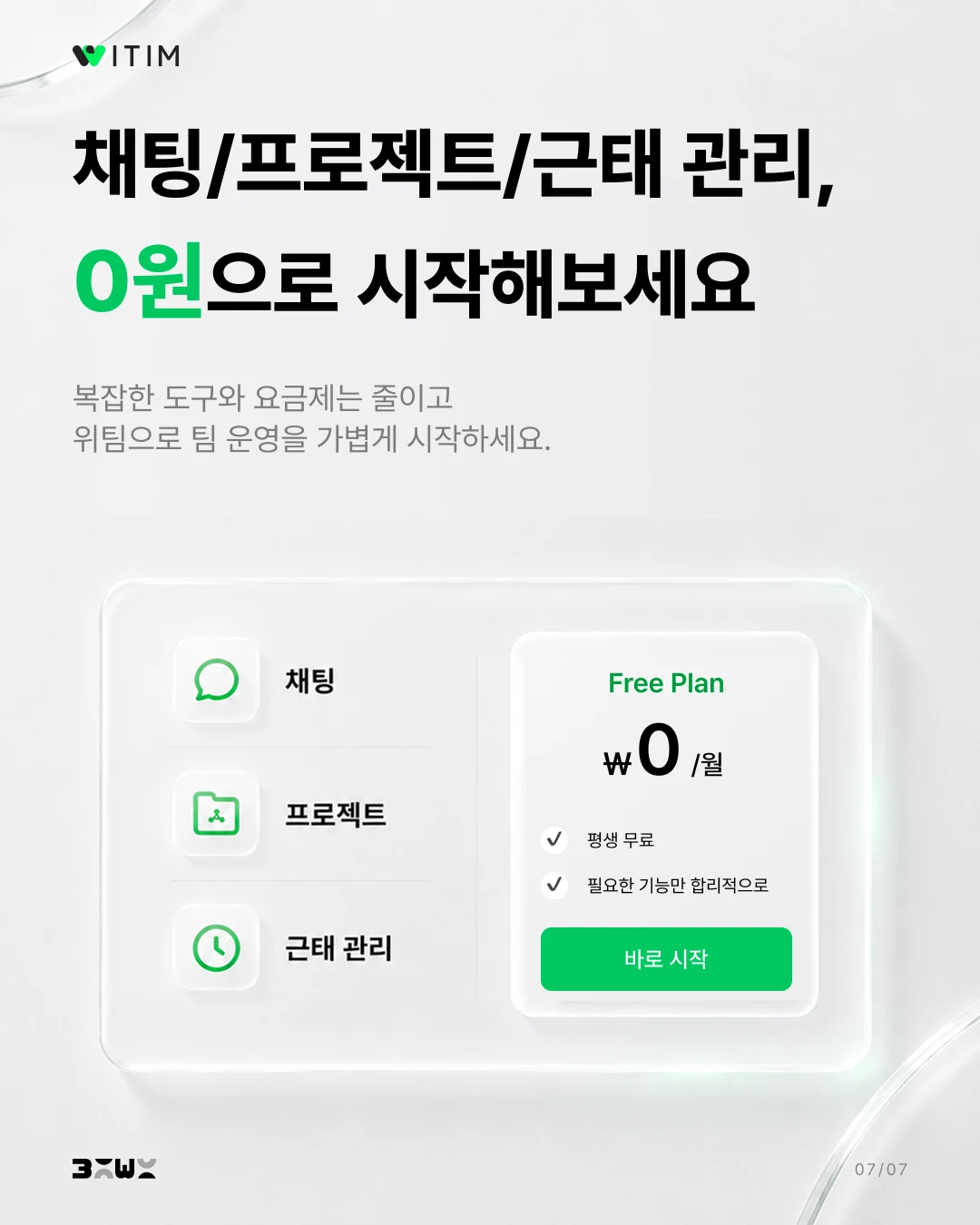
- Introduce what one app can do — Show that chat, project, and attendance management are available together.
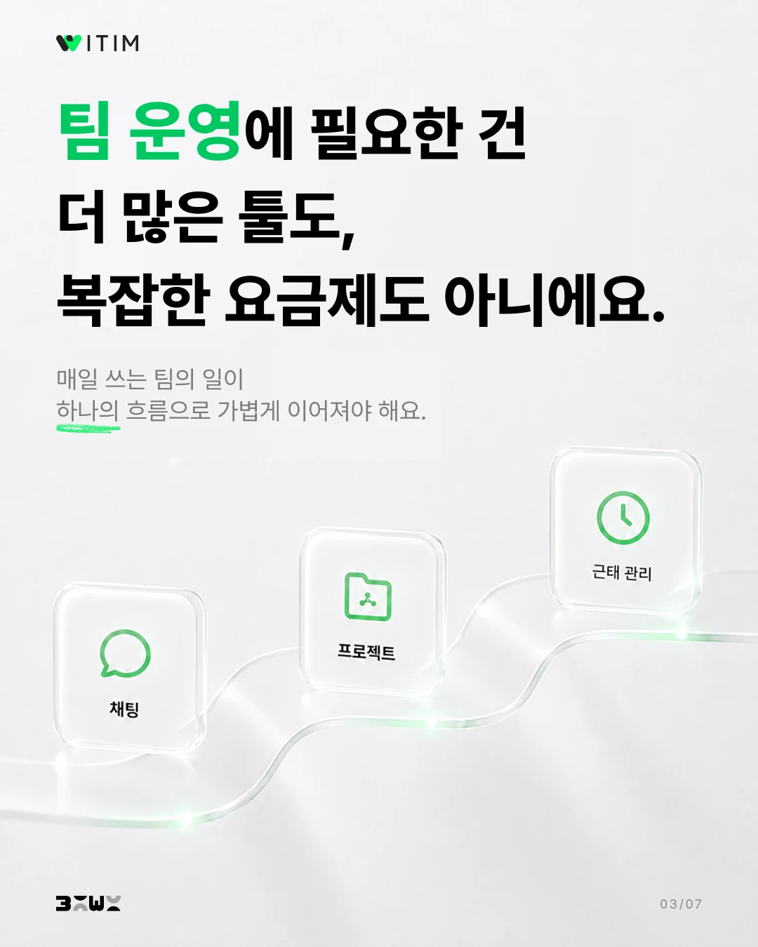
- Explain what teams need — Convey that everyday work should connect in a single flow, rather than requiring more tools and complicated pricing plans.
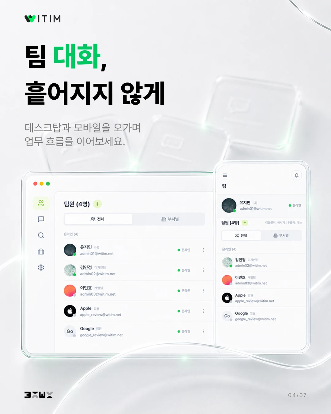
- Show chat — Introduce the screen that brings team conversations together.
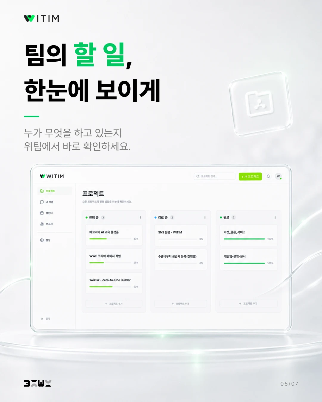
- Show projects — Show how to see who is working on what.
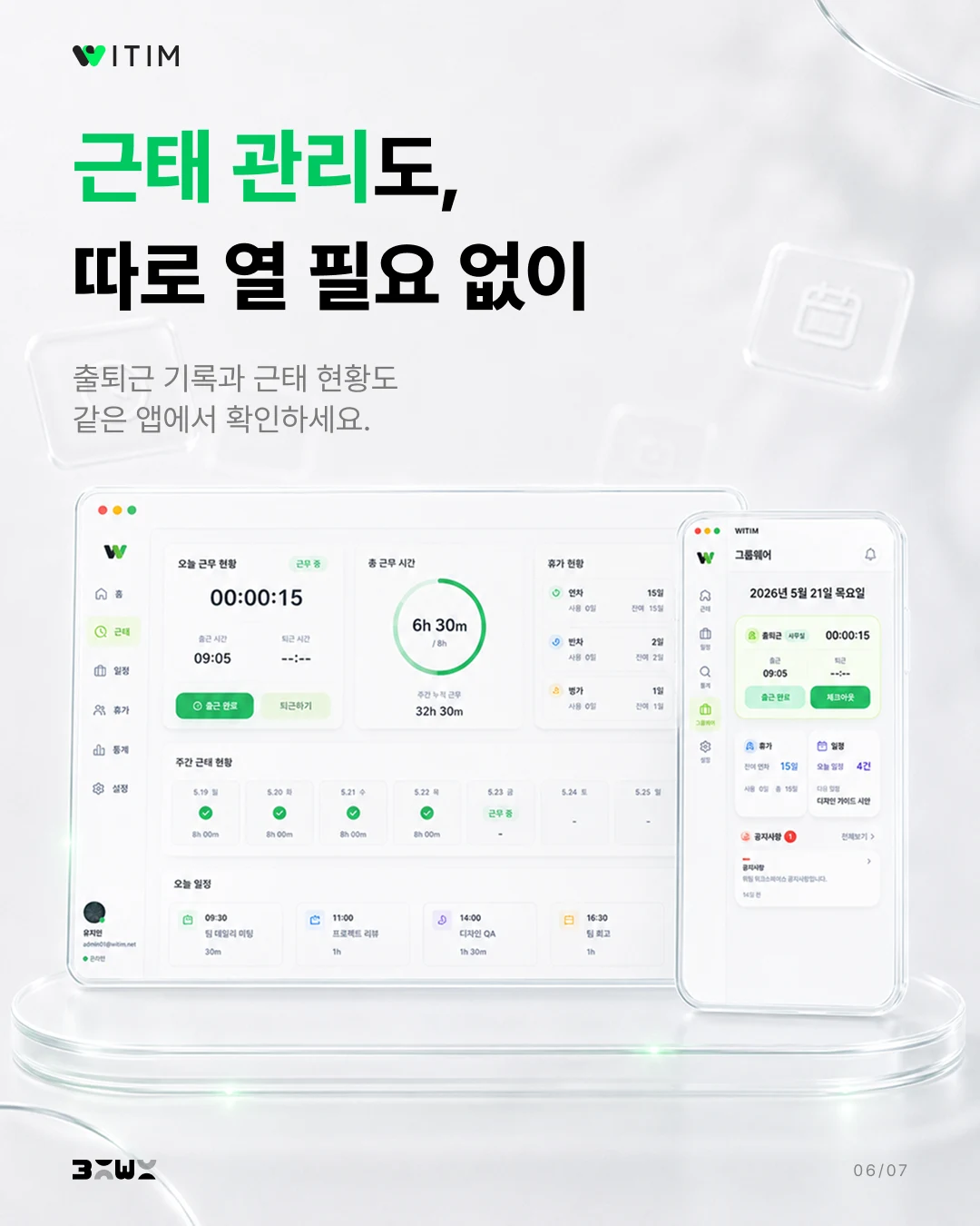
- Show attendance management — Explain that clock-in records and attendance status are available in the same app.
- Invite readers to start for free — Close with a message that they can start using these features at no cost.
Asking for the Glass Look I Wanted
I wanted dimensional visuals with a glass-like texture. I asked GPT for that direction, then developed the design by reviewing the drafts it produced.
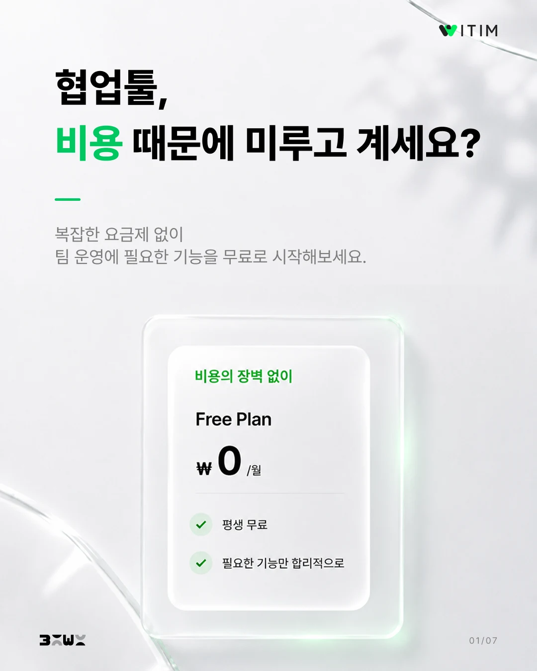
The first draft centered on a single free-plan card. In the final design, I placed several pricing cards in the background and emphasized the zero-cost card in the middle. The contrast makes the message—that teams can get started without a cost barrier—clear at a glance.
Keeping the WITIM UI and Text Clear
Alongside the backgrounds, I paid attention to whether the WITIM UI was clearly visible and the copy was easy to read. The visuals needed to retain the texture I wanted while making the featured functions recognizable.
For the slides with UI screens, I asked for the feature screens to stand out. The text also needed a clear hierarchy between the headline and the supporting copy. I refined the slides so readers could pick up the main message from the headline, then follow it through the explanation and UI.
I reviewed the background, UI, and text together within each slide. As I varied the backgrounds, I kept asking for revisions to make sure the UI stayed visible and the text had the right emphasis.
Varying the Backgrounds While Keeping a Consistent Look
I liked the glass texture, but repeating similar backgrounds across seven slides could make the carousel feel monotonous. I asked for variations from slide to slide while maintaining the overall visual direction.
Keeping a consistent style is different from repeating the same image. As I reviewed the drafts, I tried to introduce variations that suited each slide’s content.
Bringing the Seven Slides Together
I handled the copy, structure, and image creation within GPT. I shared the message and design direction I had chosen, then reviewed and revised the results to bring them closer to what I wanted.
Because readers would move through several slides, I paid particular attention to keeping the carousel visually consistent without making it repetitive. Throughout that process, I adjusted the slides so the WITIM UI and text stayed clear.