User-first design
Drop the supplier-centered menu and rebuild navigation around the tasks visitors look for first.
I redesigned the website of an export-driven seafood company around one path: an overseas buyer getting from the first page to an inquiry.
Yeosu Saegomak processes cockles from Yeoja Bay in Yeosu and exports them overseas. On its old website, the path from seeing a product to sending an inquiry was hard to find. I defined that problem and proposed it before our first meeting, then took the work through information architecture and a design system to page design and frontend build.
I audited 34 screens of the old site, grouped what I found into four problems, and paired each with a direction. What follows is that proposal, rebuilt for this page.
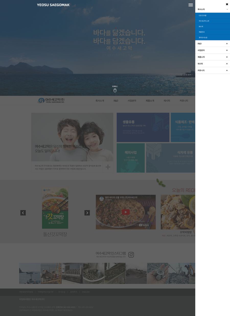
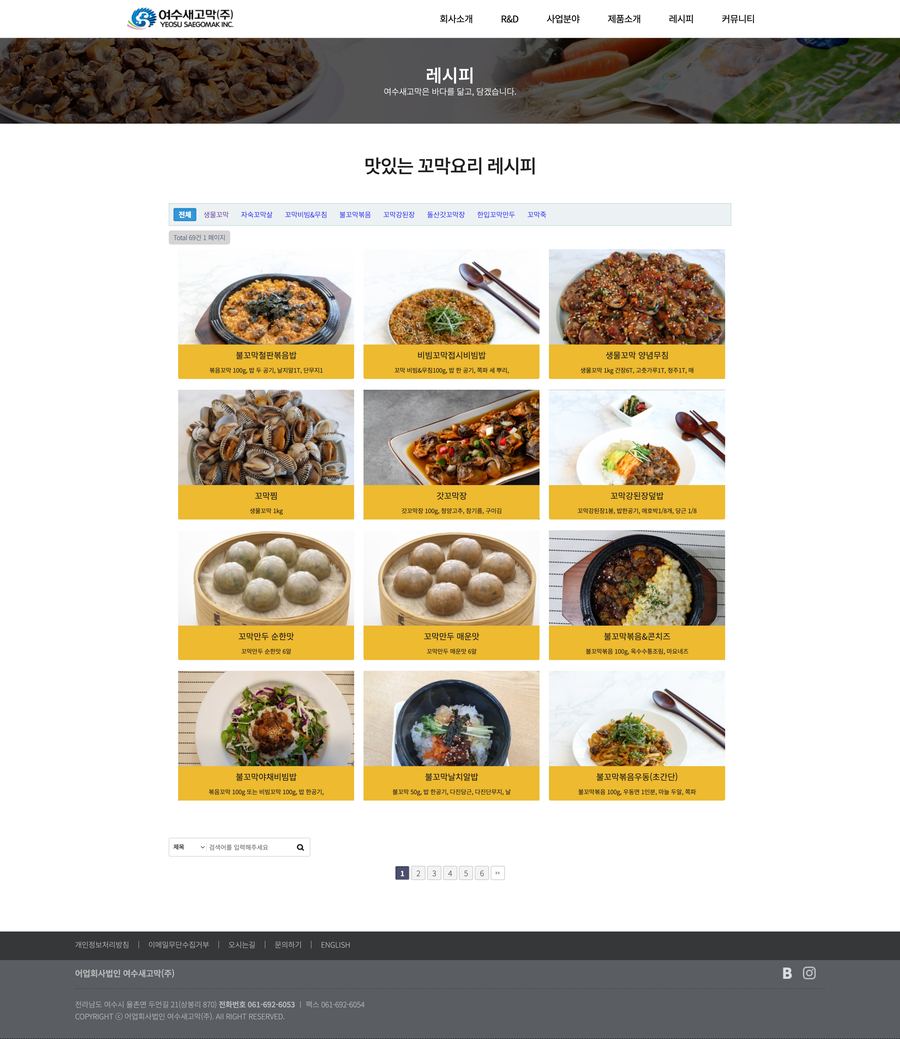
Visitors fell into three groups: overseas buyers, domestic partners and consumers. Each wanted to check something different and go somewhere different. The goal was to get every one of them through the information they need and straight to their next step.

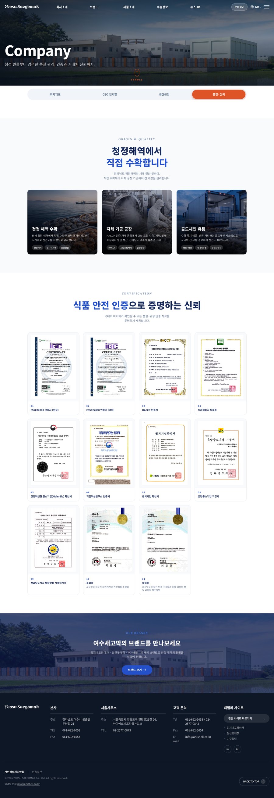
Deep navy, a blue gradient and heavy headlines for a trustworthy first impression.
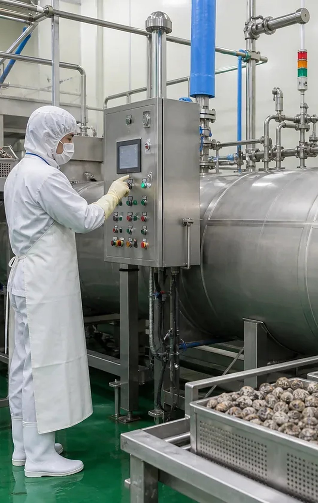
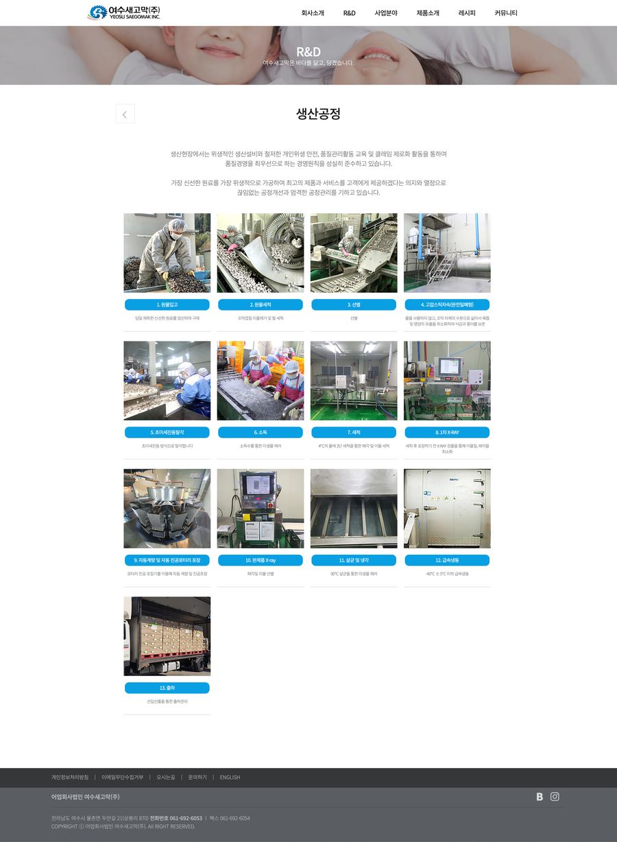
The HACCP facility and 13-step production process, shown in real photos.
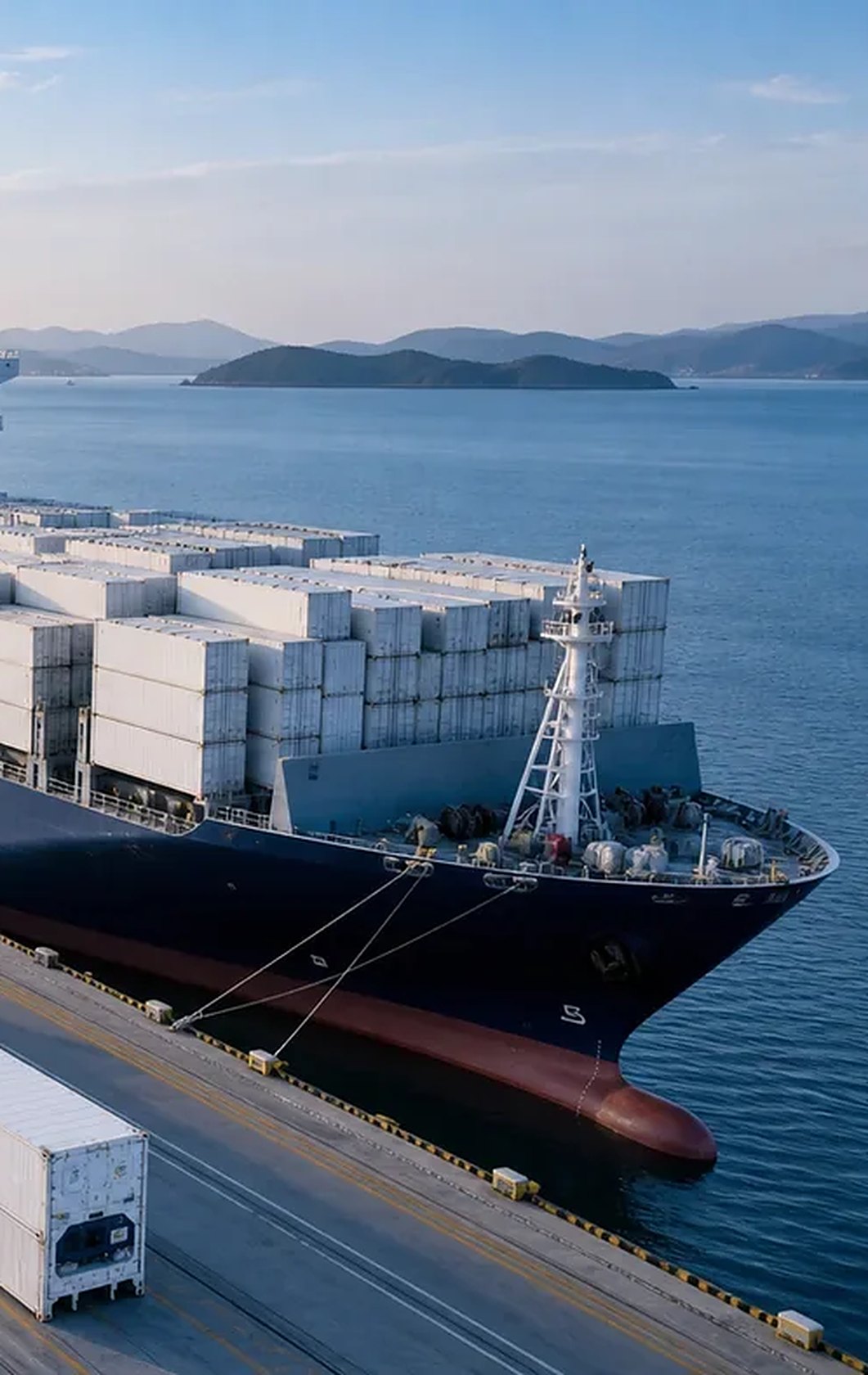
An export catalog, markets and certifications that answer a buyer’s questions first.
Rather than taking the client's requests as they were, I made the case for the structure from the buyer's point of view.
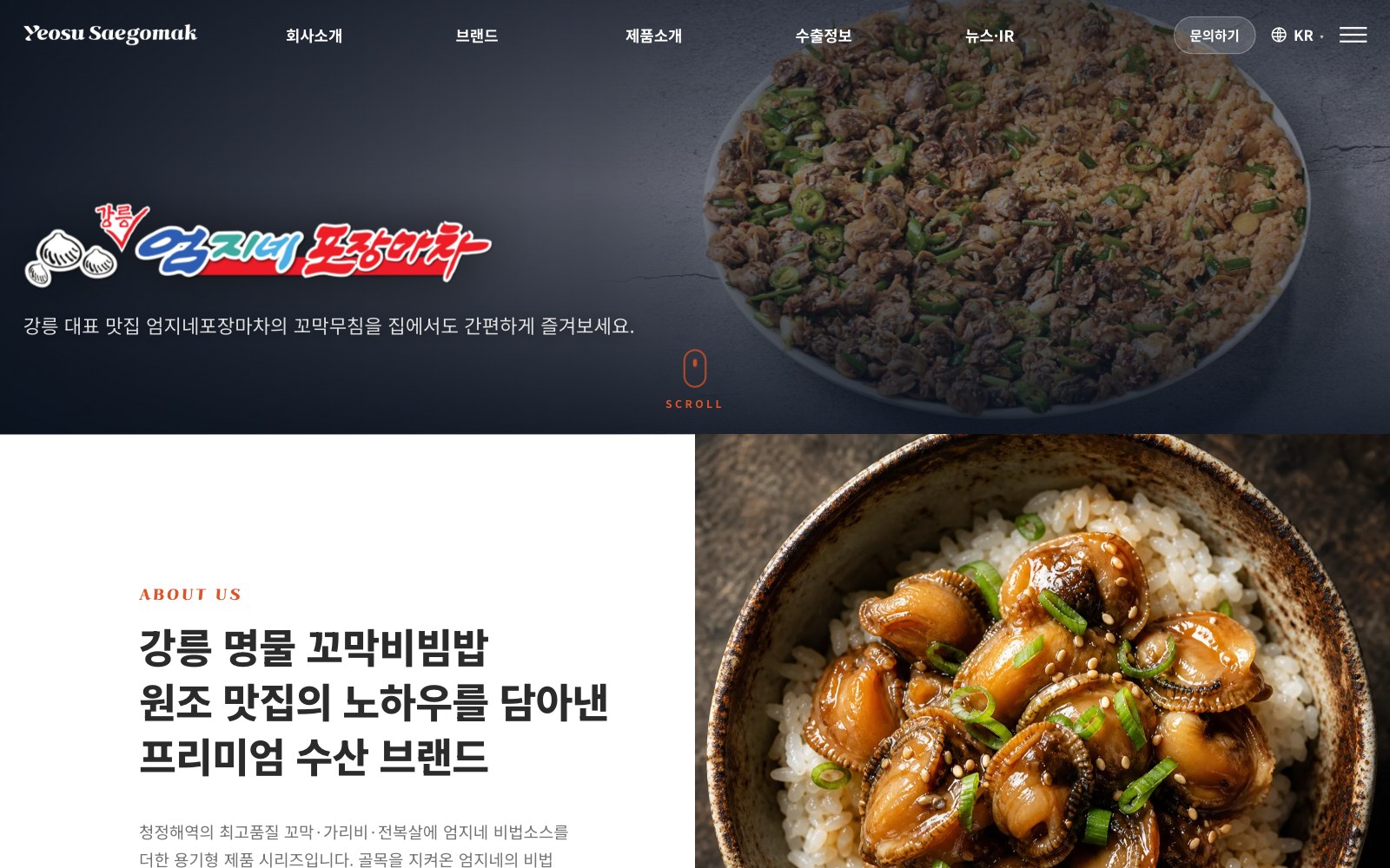
Brands became a top-level menu
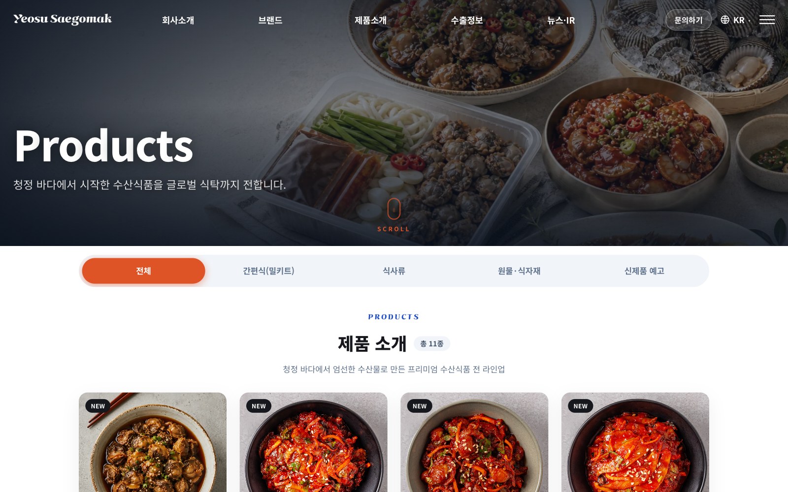
Meal kit · Ingredient · Raw tabs
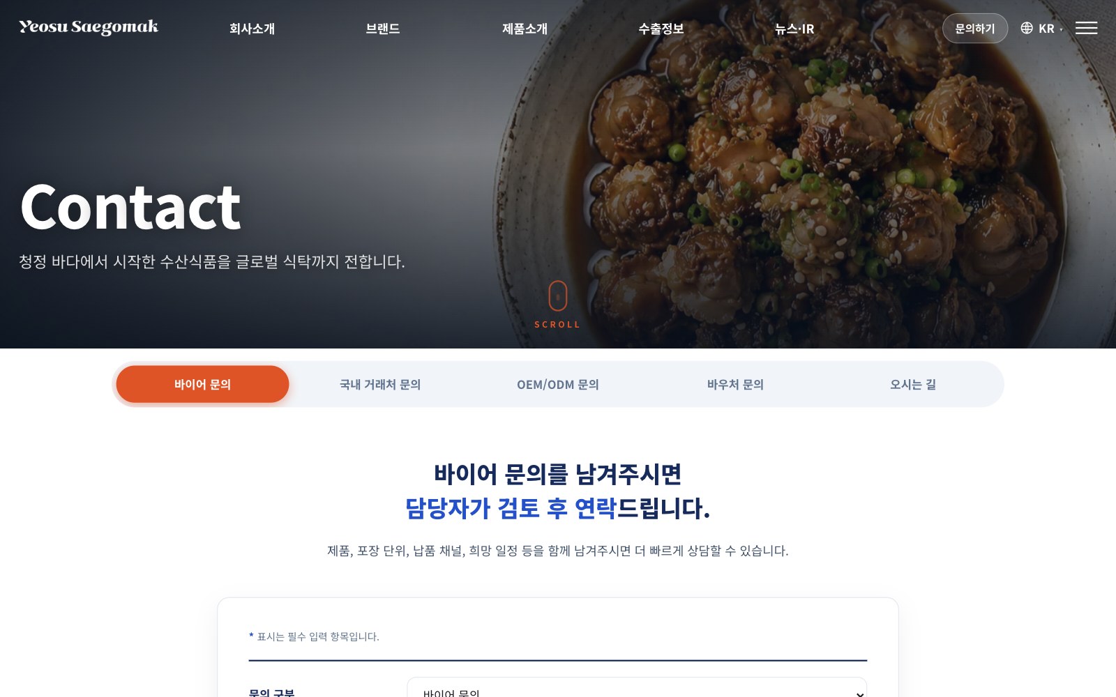
An inquiry button in the GNB on every page
2026.05.20 · Account details are redacted.
| No. | Question | Client answer | What it changed |
|---|---|---|---|
| 1-1 | Domain registrar and admin account | Keep the existing domain | |
| 2-3 | Do you have a brand guide (colors, fonts)? | No required fonts or colors. Will decide after seeing drafts | Defined a new design system |
| 3-2 | Affiliate structureInclude: Chilsan crab / Exclude: Inamjang | Decided in the meeting | Brands: Umjine Pocha · Chilsan · Yeosu Olim |
| 3-3 | Existing content to merge into notices and press | Use the press releases that are live (new products) | Merged into News & IR |
| 3-4 | What should lead the hero? | Our brand story, more than the products | Brands became a top-level menu |
| 3-7 | How many product categories? | Grouping by brand might work | Brand stories live in Brands; products are sorted by type |
| 3-8 | Main menu (GNB)Final menu after merging notices and press | 3W to draft | Confirmed after we drafted the sitemap |
| 5-1 | English company name, product names, intro copy | Will send the catalog file | Same structure in KO and EN (i18n) |
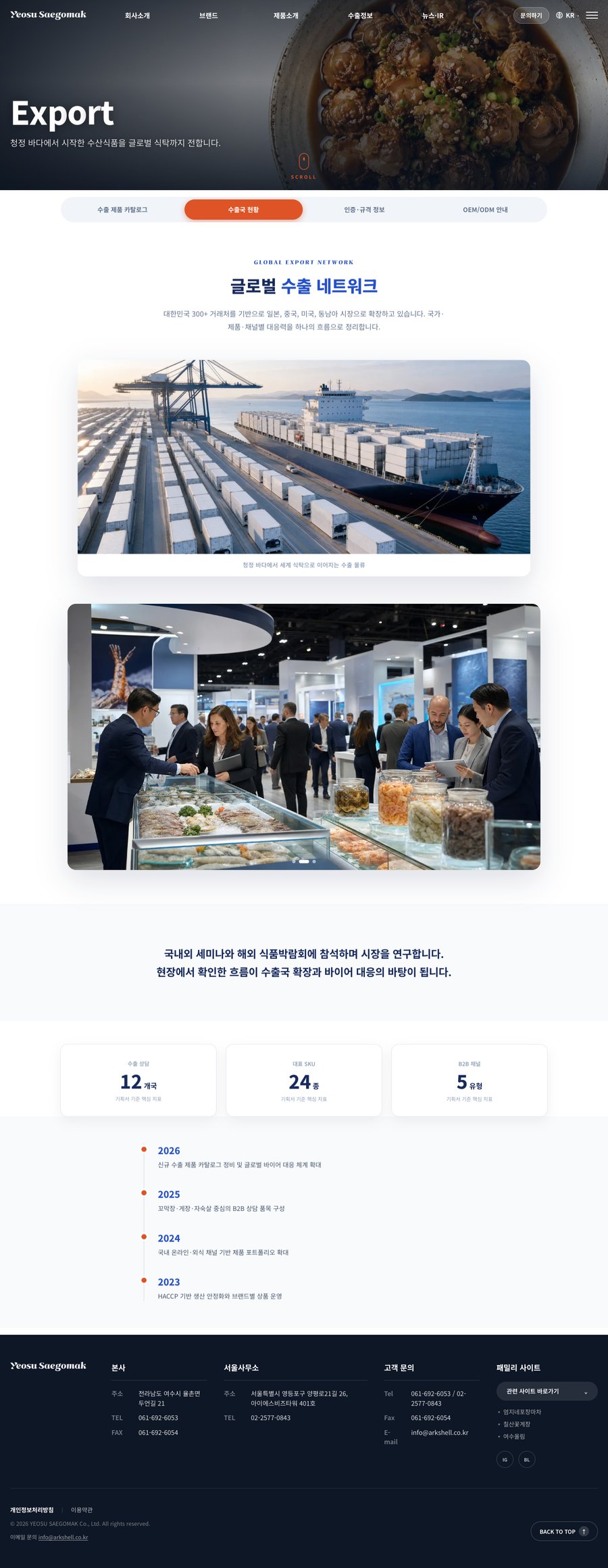
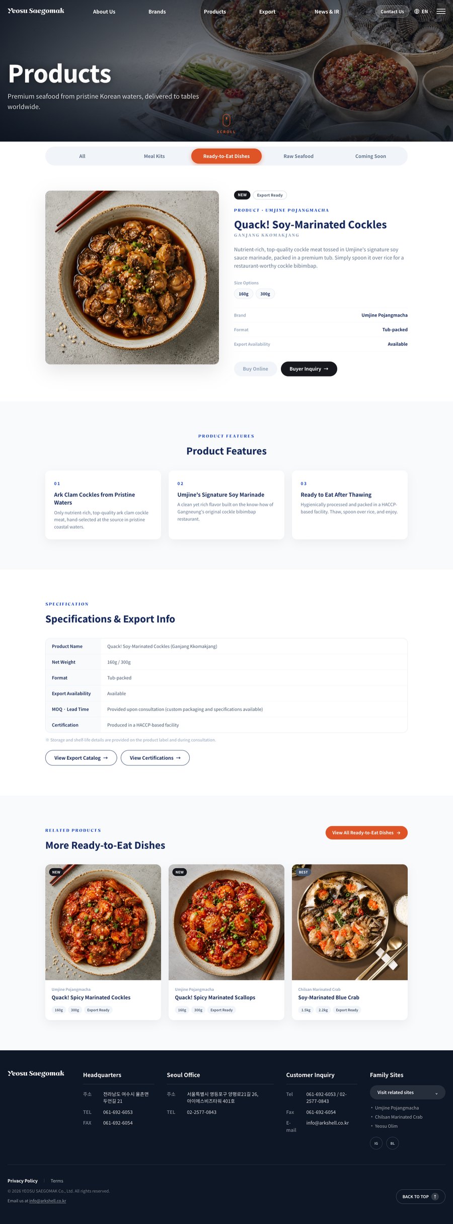
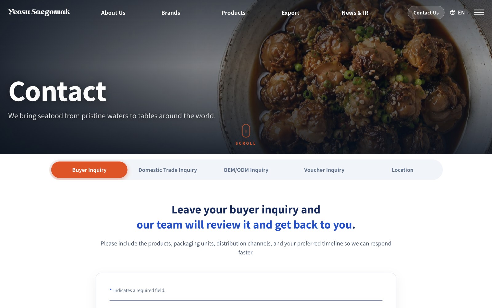
These are the live pages a buyer moves through: see the brand, pick products, check export terms, and send an inquiry.
See each export brand on its own page
Filter products by type with tabs
See products, markets, certifications and OEM in one place
Ask straight from the GNB
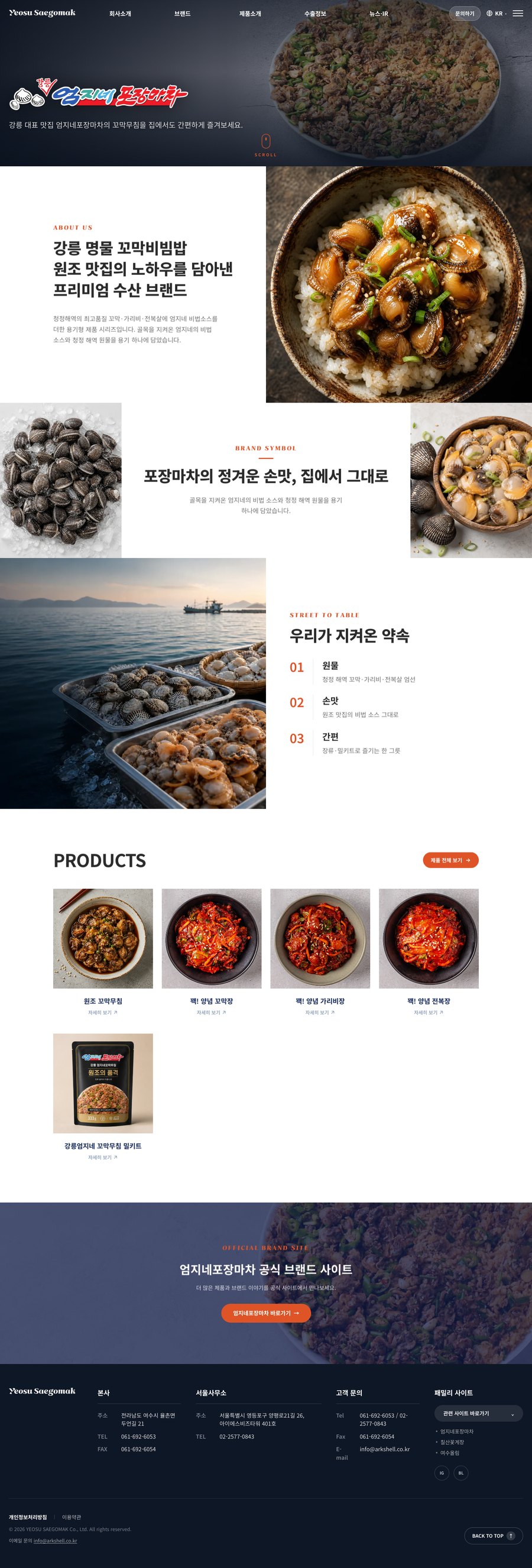
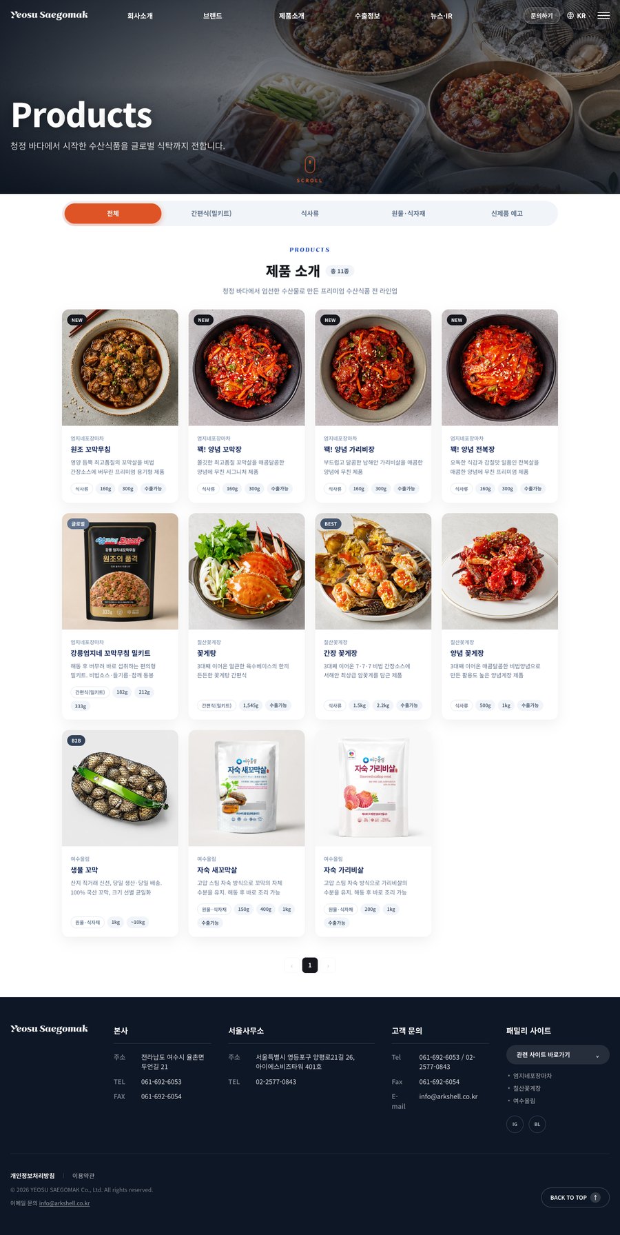
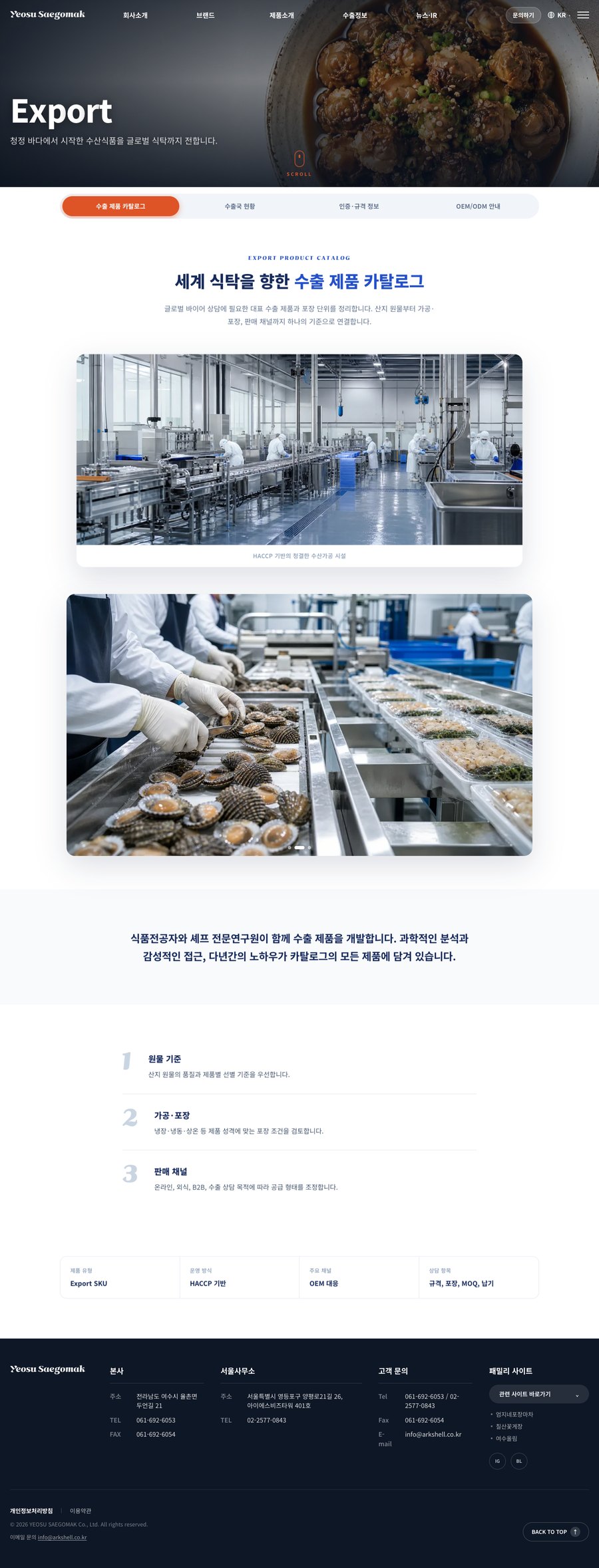
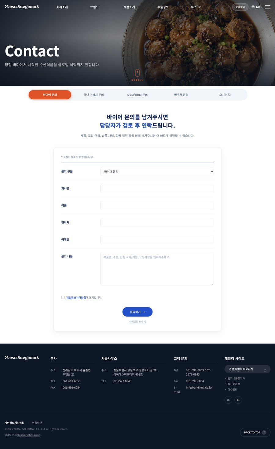
In the first meeting the client asked for a site as dynamic as a big corporation's. I built the first draft to that brief, with a video hero, and the feedback came back that it felt cramped, with far too much scrolling. I reworked the second draft around that feedback.
With buyers loading the site from abroad, I proposed cutting the heavy interactions.
Fewer full-screen scenes, so visitors reach what they want faster.
Yeosu Saegomak’s brands now show from the first screen.
When the client asked for a site as dynamic as a big corporation's, what they really wanted was less the motion itself than to look like a company buyers could trust. I learned to confirm the goal behind a request before acting on its wording.
To give overseas buyers a solid, trustworthy impression, I built the color and type rules around blue and navy. As a global site made under an export voucher program, it uses Noto Sans KR, which covers many languages evenly. And since this is a food brand, inquiry buttons and active tabs get an appetizing orange.
#2450C9Base · Emphasis · CTA#172A5CHeadings · GNB#DE5427Active tab · Inquiry button#2A5BE6 → #173BBDLanding · Export backgrounds#0F1A47Footer · Dark backgrounds#16181DBody text#3D6FD8Hover · Secondary emphasis#C1461FPoint hover| Page title | Export | 76 / 800 / −1.9 |
| Section | 세계 식탁을 향한 수출 제품 카탈로그 | 40 / 800 / −0.4 |
| Intro | 청정 바다에서 시작한 수산식품을 글로벌 식탁까지 | 20 / 400 |
| Card title | 본사 | 18 / 700 |
| Body | 산지 원물의 품질과 제품별 선별 기준을 우선합니다. | 16 / 400 / 1.8 |
| Label | EXPORT PRODUCT CATALOG | 13 / 400 / +0.18em |
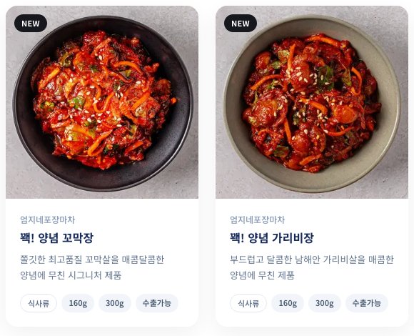
Badge · Brand · Name · Description · Spec chips (160g · 300g · export-ready)
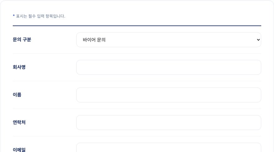
Type · Company · Name · Phone · Email · Message
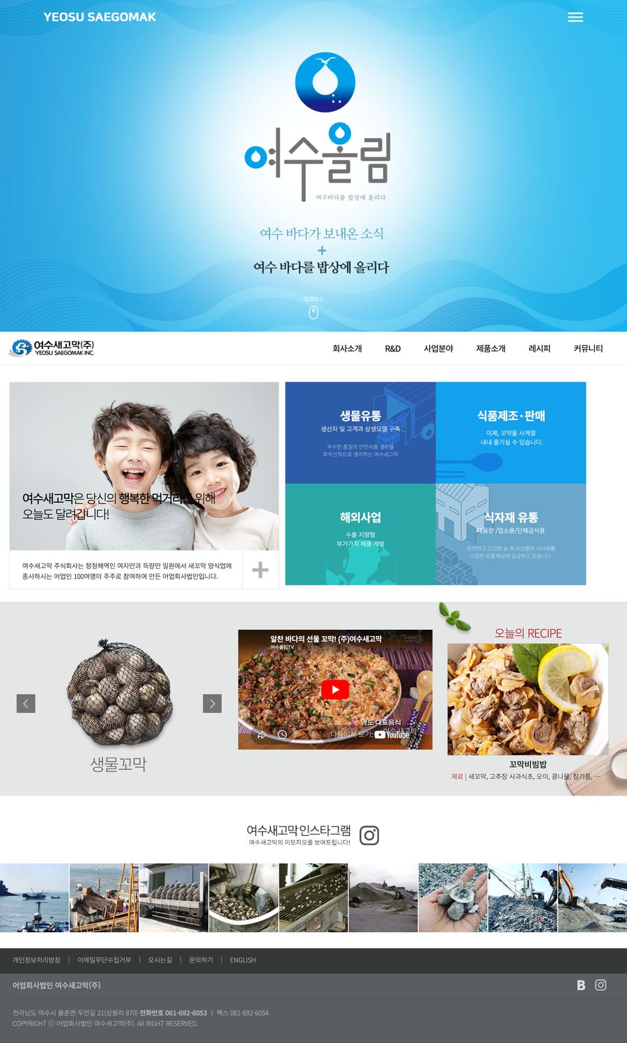
On the left, the old page. On the right, the full new page. As you scroll, the old page stays put while the new one runs to the end.






Hover over a phone to scroll its screen
To meet the export-support program’s requirements, I added an English site with the same structure through i18n.
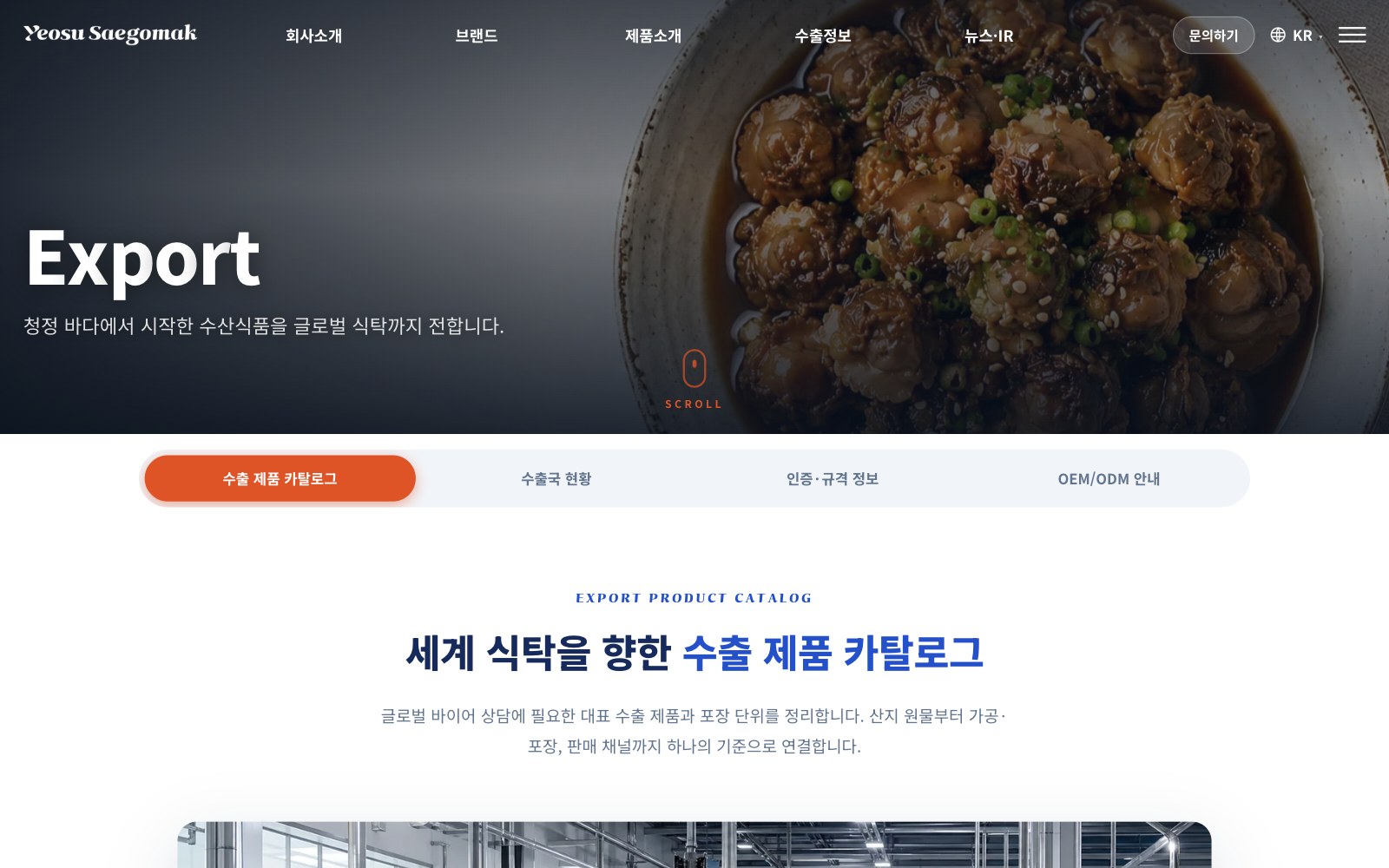
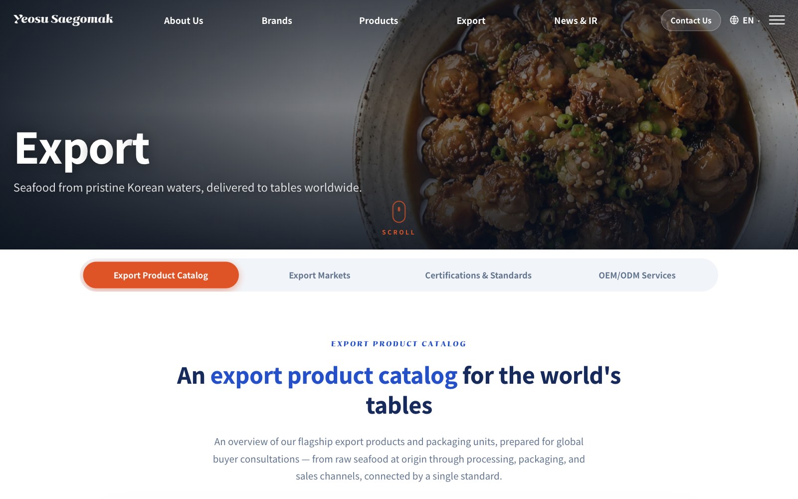
Instead of Figma mockups, I designed directly in code with Codex and Claude Code. I set the design rules first and kept the AI inside them.
I ran separate AI agents for research, planning, design, frontend and QA in parallel, so work that would take a long time in sequence moved forward together.
Before building, I wrote specs such as DESIGN SITEMAP COPY TONE MOTION, plus an audit of the old site’s structure. Every later change was measured against them.
So the AI wouldn’t fill gaps on its own, it stopped and asked whenever a decision was needed. We talked briefly, I set the direction, and then it built.
Even for a single production banner, I had four versions built (floating cards, diagonal split, timeline and accordion), put them side by side and picked one.